- This topic has 17 replies, 3 voices, and was last updated 3 years, 9 months ago by
David.
-
AuthorPosts
-
August 31, 2022 at 4:50 pm #2329936
Sascha
Hi
on this site, I have activated “Use Navigation as Header” in the Customizer and added a Header-Element to merge the content with the header. In the nav-panel I have set “Navigation Alignment to “Left”, which is the required position and not possible to achieve, when I disable ” Use Navigation as Header”, afaik.
But the hero-container does not merge with the header.
When I disable “Use Navigation as Header”, I cannot align the navigation to the left anymore, only swapping position with the logo, which is not what I want.
Any idea about how to solve this?
Thank you in advance and kind regards,
SaschaAugust 31, 2022 at 5:14 pm #2329941Fernando Customer Support
Hi Sascha,
To clarify, are you wanting to move the nav to the left of the logo on “Navigation as Header”?
If yes, you can try adding this in Additional CSS:
div#primary-menu {
    order: -1;
}
September 1, 2022 at 5:23 am #2330411Hi, thank you for your reply, I was not able to explain properly, so I try again:
It should look like on this previous/current Site.
Aligned left: 1. Logo – 2. NavMenu
Aligned Right: 3. Newsletter ButtonThe numbers 1-3 represent the L2R order of these items.
How to achieve this?
Thank you in advance and kind regards,
SaschaSeptember 1, 2022 at 6:49 am #2330465David
StaffCustomer SupportHi there,
are you going to want the sticky navigation ? If so i would recommend you do use the:
Use Navigation as Header
If you want to enable that, then let me know and ill provide the CSS for that layout you require.September 6, 2022 at 7:55 am #2335056Thanks David, I have now activated “Use Navigation as Header” via Customizer > Header. I still don’t understand, why the Header-Element “Merge” feature activated does not apply. Is this the normal case?
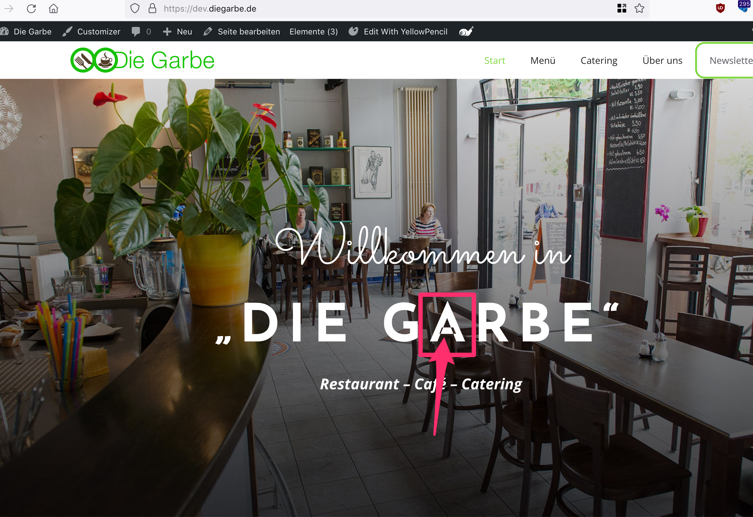
By the way, I have realized 2 issues regarding the Hero Title “DIE GARBE”:
1. The letter “A” seems to be corrupted, as you can see here
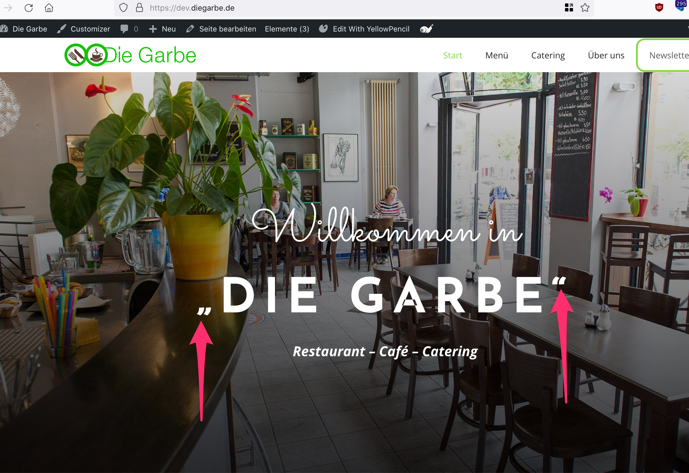
2. The quotation marks look different from the ones in orig-page, as you can see here.
If you compare the headline between https://diegarbe.de/ (Orig) and https://dev.diegarbe.de/ (Dev) you can see what a mean. Can you guide me about how to solve this?
Thank you in advance and kind regards,
SaschaSeptember 6, 2022 at 8:55 am #2335106StaffCustomer SupportIn your Header Element, enable the option to edit the Navigation Colors, there you can set the background to transparent.
Add this CSS to make the alignent:
@media(min-width: 769px) {
    #site-navigation  {
        padding-top: 20px;
        padding-bottom: 20px;
    }
    #site-navigation .navigation-branding {
        margin-right: unset;
    }
    .main-nav {
        margin-left: 20px;
        margin-right: auto;
    }
}
Your other questions:
1. The
Alooks correct to me, maybe browser cache needs clearing?2. The
""you need to edit the text and use the correct quote marks.September 6, 2022 at 2:29 pm #2335307Hello,
“In your Header Element, enable the option to edit the Navigation Colors, there you can set the background to transparent.”
Done. But it’s still not merging with the complete header.
Also, I needed to add a secondary header, which should be merged.
Furthermore, the nav-menu is still not positioned right to the logo. Please check the reference-page: https://diegarbe.de
I need to recreate this on https://dev.diegarbe.de/
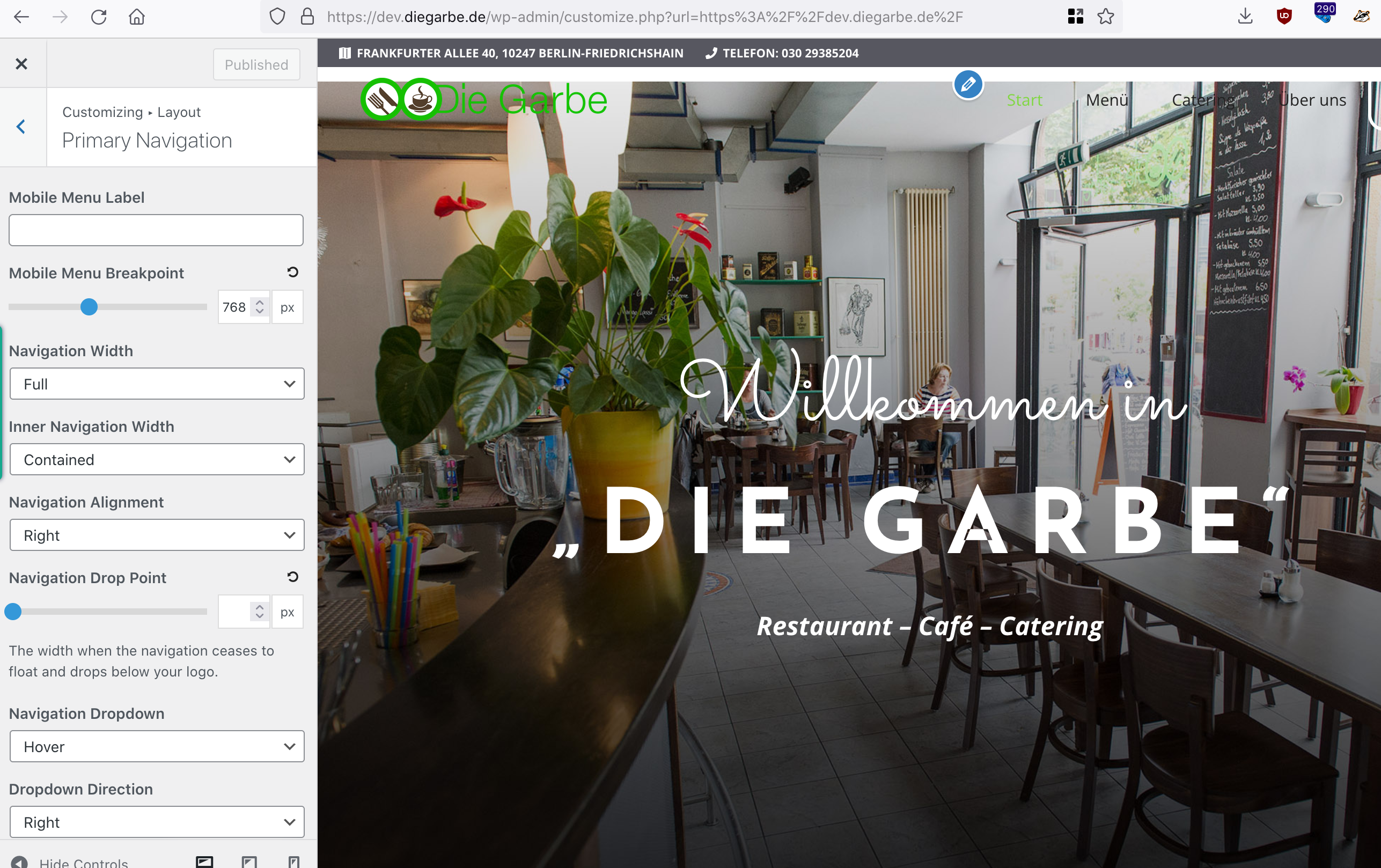
Currently, these 3 Elements are relevant for the header: http://media.macbay.net/_support/gb-ukzsdf_28C7F2AC.png
These are the Customizer Settings: http://media.macbay.net/_support/asdo8fuwef_28C7F33B.png
Thank you in advance and kind regards,
SaschaSeptember 6, 2022 at 6:16 pm #2335396Hi Sascha,
Let’s tackle the issue with regards to merging, and move to the other issues afterwards.
Try removing the top padding in Appearance > Customize > Layout > Container.
September 7, 2022 at 5:41 am #2335859Thanks, Fernando, just removed the top-padding as advised.
Now let’s move the nav-menu (except for the “Newsletter” button, which is added as menu_bar_items hook), next to the logo.
Can you please help me with this?
Thank you in advance and kind regards,
SaschaSeptember 7, 2022 at 5:50 am #2335867StaffCustomer SupportThe CSS i provided here does that:
https://generatepress.com/forums/topic/how-to-align-the-nav-menu-to-the-left/#post-2335106
Just remove the first rule if you don’t want the padding.
So it looks like this:@media(min-width: 769px) { #site-navigation .navigation-branding { margin-right: unset; } .main-nav { margin-left: 20px; margin-right: auto; } }September 7, 2022 at 2:35 pm #2336384Thanks David, seems to work well 🙂
Now I need to apply the same position to the sticky-header.
I have already created one and applied some CSS in order to change the colors of the sticky-menu:
/* Sticky Menu Items Colour */ .main-navigation.navigation-stick .main-nav ul li a, .main-navigation.navigation-stick a:not([aria-label*='Close']) { color: var(--contrast-2) !important; } .main-navigation.navigation-stick .main-nav ul li a:hover{ text-decoration:underline !important; } .header-wrap #site-navigation .inside-navigation #primary-menu #menu-mainmenu > .menu-item > a:hover{ text-decoration:underline !important; }Can you help me to make the sticky-menu appear at the same position as the menu before the scrolling?
Oh, and I would also like to apply a smoother transition as soon as the sticky header occurs, like on this site: https://diegarbe.de
How to apply this effect?Thank you in advance and kind regards,
SaschaSeptember 7, 2022 at 10:38 pm #2336551Let’s tackle the sticky menu alignment first. Can you modify the CSS provided by David to this?:
@media(min-width: 769px) { :is(#site-navigation,#sticky-navigation) .navigation-branding { margin-right: unset; } .main-nav { margin-left: 20px; margin-right: auto; } }September 8, 2022 at 6:29 am #2336972Hi,
in Customizer, I have just replaced this
@media(min-width: 769px) { #site-navigation .navigation-branding { margin-right: unset; } .main-nav { margin-left: 20px; margin-right: auto; } }with this:
@media(min-width: 769px) { :is(#site-navigation,#sticky-navigation) .navigation-branding { margin-right: unset; } .main-nav { margin-left: 20px; margin-right: auto; } }and now the nav-menu is perfectly aligned, thanks for that 🙏
So now for the “smooth transition”, how to make this happen?
Thank you in advance and kind regards,
SaschaSeptember 8, 2022 at 7:04 am #2337017StaffCustomer SupportIn Customizer > Layout > Sticky Navigation, choose the Fade transition
September 9, 2022 at 12:21 am #2337650Thanks, David, but then the nav-menu will first disappear and then fade-in. I would prefer to have the transition exactly like on the orig-site. Is there a workaround for this?
-
AuthorPosts
- You must be logged in to reply to this topic.