- This topic has 57 replies, 5 voices, and was last updated 3 years, 5 months ago by
Fernando.
-
AuthorPosts
-
October 3, 2022 at 11:52 am #2361886
francesco
Thanks, it works correctly. but I would like to customize it. is it possible to create a margin? the button appears larger than the search bar.
October 3, 2022 at 8:53 pm #2362177Ying
StaffCustomer SupportCan you provide your site link so I can take a look at the search bar?
You can use the private info field.
October 4, 2022 at 12:37 am #2362320site
October 4, 2022 at 12:41 am #2362325Fernando Customer Support
Hi Francesco,
This is how it looks like viewing the Search from our end: https://share.getcloudapp.com/jkuWvmrX
It’s different from your screenshot. May we know how you would like it to look like?
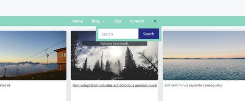
October 4, 2022 at 12:56 am #2362342I would like to create a similar effect
October 4, 2022 at 1:16 am #2362367Try adding this CSS:
.inside-navigation.grid-container form.search-form .search-field {
    background-color: #fff;
}

.inside-navigation.grid-container form.search-form {
    background-color: #8ad6c1;
    padding: 10px;
    display: flex;
    align-items: center;
}
October 4, 2022 at 2:31 am #2362425it works, but in the mobile version is it possible that the search button remains in the bar as in the picture? carry all the current code.
October 4, 2022 at 10:16 am #2363069StaffCustomer SupportIf the search button goes up, it will look like this:
https://www.screencast.com/t/DoiTqcxQSg10Where would you like the close button to be?
October 4, 2022 at 1:20 pm #2363266as in the picture
October 4, 2022 at 2:13 pm #2363302StaffCustomer Support@media (max-width: 768px) { form.search-form.navigation-search.nav-search-active { display: flex; } button.nav-search-button { margin-right: 56px; border: none; } }October 6, 2022 at 1:16 am #2364917Thanks, everything seems to work perfectly now.
Can I ask if all these CSS are needed or do I need to make further changes?
@media (min-width: 1025px) {
    form.search-form.navigation-search.nav-search-active {
        width: 31%;
        transform: translateX(-50%);
        left: 40%;
    }
}

@media (min-width: 769px) and (max-width: 1024px) {
        form.search-form.navigation-search.nav-search-active {
        width: 35%;
        transform: translateX(-50%);
        left: 41%;
    }
}
.masonry-load-more {
    text-align: center;
}

@media (min-width: 769px) {
.inside-navigation.grid-container {
    width: fit-content;
}
form.search-form.navigation-search.nav-search-active {
    top: 45px;
	  width: 70%;
	  left: 65%;
}

.navigation-search.nav-search-active {
    display: flex;
}

.inside-navigation.grid-container form.search-form .search-field {
    background-color: #fff;
}

.inside-navigation.grid-container form.search-form {
    background-color: #8ad6c1;
    padding: 10px;
    display: flex;
    align-items: center;
    }

}

@media (max-width: 768px) {
    form.search-form.navigation-search.nav-search-active {
    display: flex;
}

button.nav-search-button {
    margin-right: 56px;
    border: none;
}
}
They are CSS related to the search bar.
October 6, 2022 at 1:42 am #2364933I think you can remove these:
@media (min-width: 1025px) {
    form.search-form.navigation-search.nav-search-active {
        width: 31%;
        transform: translateX(-50%);
        left: 40%;
    }
}

@media (min-width: 769px) and (max-width: 1024px) {
        form.search-form.navigation-search.nav-search-active {
        width: 35%;
        transform: translateX(-50%);
        left: 41%;
    }
}
Then, edit this:
form.search-form.navigation-search.nav-search-active {
    top: 45px;
	  width: 70%;
	  left: 65%;
}
to this:
form.search-form.navigation-search.nav-search-active {
    top: 45px;
	  width: 70%;
	  left: 65%;
transform: translateX(-50%);
}
October 6, 2022 at 7:16 am #2365199.masonry-load-more { text-align: center;is this part necessary?
October 6, 2022 at 7:20 am #2365206.masonry-load-more { text-align: center; } @media (min-width: 769px) { .inside-navigation.grid-container { width: fit-content; } form.search-form.navigation-search.nav-search-active { top: 45px; width: 70%; left: 65%; transform: translateX(-50%); } @media (max-width: 768px) { form.search-form.navigation-search.nav-search-active { display: flex; } button.nav-search-button { margin-right: 56px; border: none; } } .navigation-search.nav-search-active { display: flex; } .inside-navigation.grid-container form.search-form .search-field { background-color: #fff; } .inside-navigation.grid-container form.search-form { background-color: #8ad6c1; padding: 10px; display: flex; align-items: center; } } @media (max-width: 768px) { form.search-form.navigation-search.nav-search-active { display: flex; } button.nav-search-button { margin-right: 56px; border: none; } }October 6, 2022 at 7:41 am #2365225I have a problem, when I press search it opens the article below.
-
AuthorPosts

- You must be logged in to reply to this topic.