Archived topic
drop-down search bar
57 replies · Started by francesco on September 29, 2022
sorry for the reopening of the post, but I noticed this problem. i checked the css but i can't find the problem.
.masonry-load-more {
    text-align: center;
}

@media (min-width: 769px) {
.inside-navigation.grid-container {
    width: fit-content;
}
form.search-form.navigation-search.nav-search-active {
    top: 45px;
	  width: 50%;
	  left: 75%;
transform: translateX(-50%);
}

@media (max-width: 768px) {
    form.search-form.navigation-search.nav-search-active {
    display: flex;
}

button.nav-search-button {
    margin-right: 56px;
    border: none;
}
}

.navigation-search.nav-search-active {
    display: flex;
}

.inside-navigation.grid-container form.search-form .search-field {
    background-color: #fff;
}

.inside-navigation.grid-container form.search-form {
    background-color: #dcf7f5;
    padding: 10px;
    display: flex;
    align-items: center;
    }

}

@media (max-width: 768px) {
    form.search-form.navigation-search.nav-search-active {
    display: flex;
}

button.nav-search-button {
    margin-right: 56px;
    border: none;
}
}

.navigation-search {
    z-index: 9999;
}

.navigation-search input[type="search"],
.navigation-search input[type="search"]:active,
.navigation-search input[type="search"]:focus {
    background-color: #fff;
}

/* After Post Social Share Design by technicaltricks.info*/

.technicaltricks-social-wrapper {
    margin: 30px 0;
    font-size: 0;
}

.technicaltricks-social-wrapper span {
    font-weight: bold;
    padding-right: 10px;
    font-size: 16px;
}

.technicaltricks-social-sharing {
    font-size: 17px;
    padding: 7px 20px;
}

@media only screen and (max-width: 600px) {
    .technicaltricks-social-sharing {
        font-size: 17px;
        padding: 6px 17px;
        display: inline-block;
    }
	.technicaltricks-social-wrapper {
    margin: 30px 0px;
    font-size: 0;
}

}

.technicaltricks-social-sharing svg {
    position: relative;
    top: 0.15em;
    display: inline-block;
}

.technicaltricks-social-sharing:first-of-type {
    border-radius: 100px 0 0 100px;
}

.technicaltricks-social-sharing:last-of-type {
    border-radius: 0 100px 100px 0;
}

.technicaltricks-social-facebook {
    fill: #fff;
    background-color: rgba(59, 89, 152, 1);

}

.technicaltricks-social-facebook:hover {
    background-color: rgba(59, 89, 152, .8);
}

.technicaltricks-social-twitter {
    fill: #fff;
    background-color: rgba(29, 161, 242, 1);
}

.technicaltricks-social-twitter:hover {
    background-color: rgba(29, 161, 242, .8);
}

.technicaltricks-social-pinterest {
    fill: #fff;
    background-color: rgba(189, 8, 28, 1);
}

.technicaltricks-social-pinterest:hover {
    background-color: rgba(189, 8, 28, .8);
}

.technicaltricks-social-linkedin {
    fill: #fff;
    background-color: rgba(0, 119, 181, 1);
}

.technicaltricks-social-linkedin:hover {
    background-color: rgba(0, 119, 181, .8);
}

.technicaltricks-social-whatsapp {
    fill: #fff;
    background-color: rgba(37, 211, 102, 1);
}

.technicaltricks-social-whatsapp:hover {
    background-color: rgba(37, 211, 102, .8);
}

.technicaltricks-social-reddit {
    fill: #fff;
    background-color: rgba(255, 87, 0, 1);
}

.technicaltricks-social-reddit:hover {
    background-color: rgba(255, 87, 0, .8);
}

.wp-block-latest-posts.wp-block-latest-posts__list li {
    padding-bottom: 15px;
    border-bottom: 1px solid rgb(38, 42, 130);
}

.main-nav > ul li ul.sub-menu li.menu-item:hover > a {
    background-color: #8ad6c1;
    color: #262a82;
}

.generate-back-to-top,
.generate-back-to-top:visited {
    bottom: 70px; /* 50px from the bottom of your screen */
}

@media(min-width: 769px) and (pointer: fine) {

    .paging-navigation p a:hover,
    .wp-block-latest-posts.wp-block-latest-posts__list li a:hover,
    .generate-columns-container article.post:hover h2 {
        text-decoration: underline;
    }

}

.border-hover:not(:hover) h2 {
    border-color: transparent !important;
}

@media(min-width: 769px) {
    .main-navigation ul.menu > li > ul {
        width: unset;
        left: 0 !important;
        right: 0;
    }
}Can you explains what the problem is ?
As you can see from the image there is a blue border in the search button.
Change this:
button.nav-search-button {
    margin-right: 56px;
    border: none;
}
to
button.nav-search-button {
    margin-right: 45px;
    border: none;
}
Please be noted, there're duplicated CSS codes, make sure you remove the duplicated ones.
Sorry ying, what would be the duplicate CSS codes?
this?
@media (max-width: 768px) {
    form.search-form.navigation-search.nav-search-active {
    display: flex;
}

button.nav-search-button {
    margin-right: 56px;
    border: none;
}
}In the CSS you attached here:
https://generatepress.com/forums/topic/drop-down-search-bar/page/4/#post-2408126
This CSS appeared twice, you should only keep one of them.
@media (max-width: 768px) {
    form.search-form.navigation-search.nav-search-active {
    display: flex;
}

button.nav-search-button {
    margin-right: 56px;
    border: none;
}
}OK yes. I believe it is correct now.
.masonry-load-more {
    text-align: center;
}

@media (min-width: 769px) {
.inside-navigation.grid-container {
    width: fit-content;
}
form.search-form.navigation-search.nav-search-active {
    top: 45px;
	  width: 50%;
	  left: 75%;
transform: translateX(-50%);
}

.navigation-search.nav-search-active {
    display: flex;
}

.inside-navigation.grid-container form.search-form .search-field {
    background-color: #fff;
}

.inside-navigation.grid-container form.search-form {
    background-color: #dcf7f5;
    padding: 10px;
    display: flex;
    align-items: center;
    }

}

@media (max-width: 768px) {
    form.search-form.navigation-search.nav-search-active {
    display: flex;
}

button.nav-search-button {
    margin-right: 45px;
    border: none;
}
}

.navigation-search {
    z-index: 9999;
}

.navigation-search input[type="search"],
.navigation-search input[type="search"]:active,
.navigation-search input[type="search"]:focus {
    background-color: #fff;
}

/* After Post Social Share Design by technicaltricks.info*/

.technicaltricks-social-wrapper {
    margin: 30px 0;
    font-size: 0;
}

.technicaltricks-social-wrapper span {
    font-weight: bold;
    padding-right: 10px;
    font-size: 16px;
}

.technicaltricks-social-sharing {
    font-size: 17px;
    padding: 7px 20px;
}

@media only screen and (max-width: 600px) {
    .technicaltricks-social-sharing {
        font-size: 17px;
        padding: 6px 17px;
        display: inline-block;
    }
	.technicaltricks-social-wrapper {
    margin: 30px 0px;
    font-size: 0;
}

}

.technicaltricks-social-sharing svg {
    position: relative;
    top: 0.15em;
    display: inline-block;
}

.technicaltricks-social-sharing:first-of-type {
    border-radius: 100px 0 0 100px;
}

.technicaltricks-social-sharing:last-of-type {
    border-radius: 0 100px 100px 0;
}

.technicaltricks-social-facebook {
    fill: #fff;
    background-color: rgba(59, 89, 152, 1);

}

.technicaltricks-social-facebook:hover {
    background-color: rgba(59, 89, 152, .8);
}

.technicaltricks-social-twitter {
    fill: #fff;
    background-color: rgba(29, 161, 242, 1);
}

.technicaltricks-social-twitter:hover {
    background-color: rgba(29, 161, 242, .8);
}

.technicaltricks-social-pinterest {
    fill: #fff;
    background-color: rgba(189, 8, 28, 1);
}

.technicaltricks-social-pinterest:hover {
    background-color: rgba(189, 8, 28, .8);
}

.technicaltricks-social-linkedin {
    fill: #fff;
    background-color: rgba(0, 119, 181, 1);
}

.technicaltricks-social-linkedin:hover {
    background-color: rgba(0, 119, 181, .8);
}

.technicaltricks-social-whatsapp {
    fill: #fff;
    background-color: rgba(37, 211, 102, 1);
}

.technicaltricks-social-whatsapp:hover {
    background-color: rgba(37, 211, 102, .8);
}

.technicaltricks-social-reddit {
    fill: #fff;
    background-color: rgba(255, 87, 0, 1);
}

.technicaltricks-social-reddit:hover {
    background-color: rgba(255, 87, 0, .8);
}

.wp-block-latest-posts.wp-block-latest-posts__list li {
    padding-bottom: 15px;
    border-bottom: 1px solid rgb(38, 42, 130);
}

.main-nav > ul li ul.sub-menu li.menu-item:hover > a {
    background-color: #8ad6c1;
    color: #262a82;
}

.generate-back-to-top,
.generate-back-to-top:visited {
    bottom: 70px; /* 50px from the bottom of your screen */
}

@media(min-width: 769px) and (pointer: fine) {

    .paging-navigation p a:hover,
    .wp-block-latest-posts.wp-block-latest-posts__list li a:hover,
    .generate-columns-container article.post:hover h2 {
        text-decoration: underline;
    }

}

.border-hover:not(:hover) h2 {
    border-color: transparent !important;
}

@media(min-width: 769px) {
    .main-navigation ul.menu > li > ul {
        width: unset;
        left: 0 !important;
        right: 0;
    }
}I noticed something else. on mobile the “X key” to close the search bar does not seem to work.
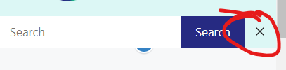
Hum...Can you try this:
1. Remove this line margin-right: 56px; from the below CSS:
button.nav-search-button {
    margin-right: 56px;
    border: none;
}
2. Add this CSS:
@media (max-width: 768px) {
    .menu-bar-items {
        z-index: 2;
        position: relative;
    }
    form.search-form.navigation-search.nav-search-active {
        max-width: calc(100% - 46px);
    }
}correct?
If I may ask, why is CSS needed to solve this problem?
button.nav-search-button {
    border: none;
}
}

@media (max-width: 768px) {
    .menu-bar-items {
        z-index: 2;
        position: relative;
    }
    form.search-form.navigation-search.nav-search-active {
        max-width: calc(100% - 46px);
    }
}Correct.
If I may ask, why is CSS needed to solve this problem?
Because it's a custom designed search bar.
I also wanted to ask you, I removed this CSS because it is completely useless or am I wrong?
.main-nav > ul li ul.sub-menu li.menu-item:hover > a {
    background-color: #8ad6c1;
    color: #262a82;
}It's alright to remove that. This code alters the background color and text color of the submenu items on hover. Moreover, these colors can also be altered through Appearance > Customize > Colors > Primary Navigation, thus you shouldn't need that.