[Support request] share buttons obscuring text

Home Forums Support [Support request] share buttons obscuring text

Home Forums Support share buttons obscuring text

Viewing 4 posts - 1 through 4 (of 4 total)
  • Author
    Posts
  • #1466075
    Rob

    A visitor has sent me an email saying that in her browser, the share buttons obscure the text in the article: share buttons obscuring text

    So I checked how my site renders in other browsers (at browserling) and this is what it looks like: browserling

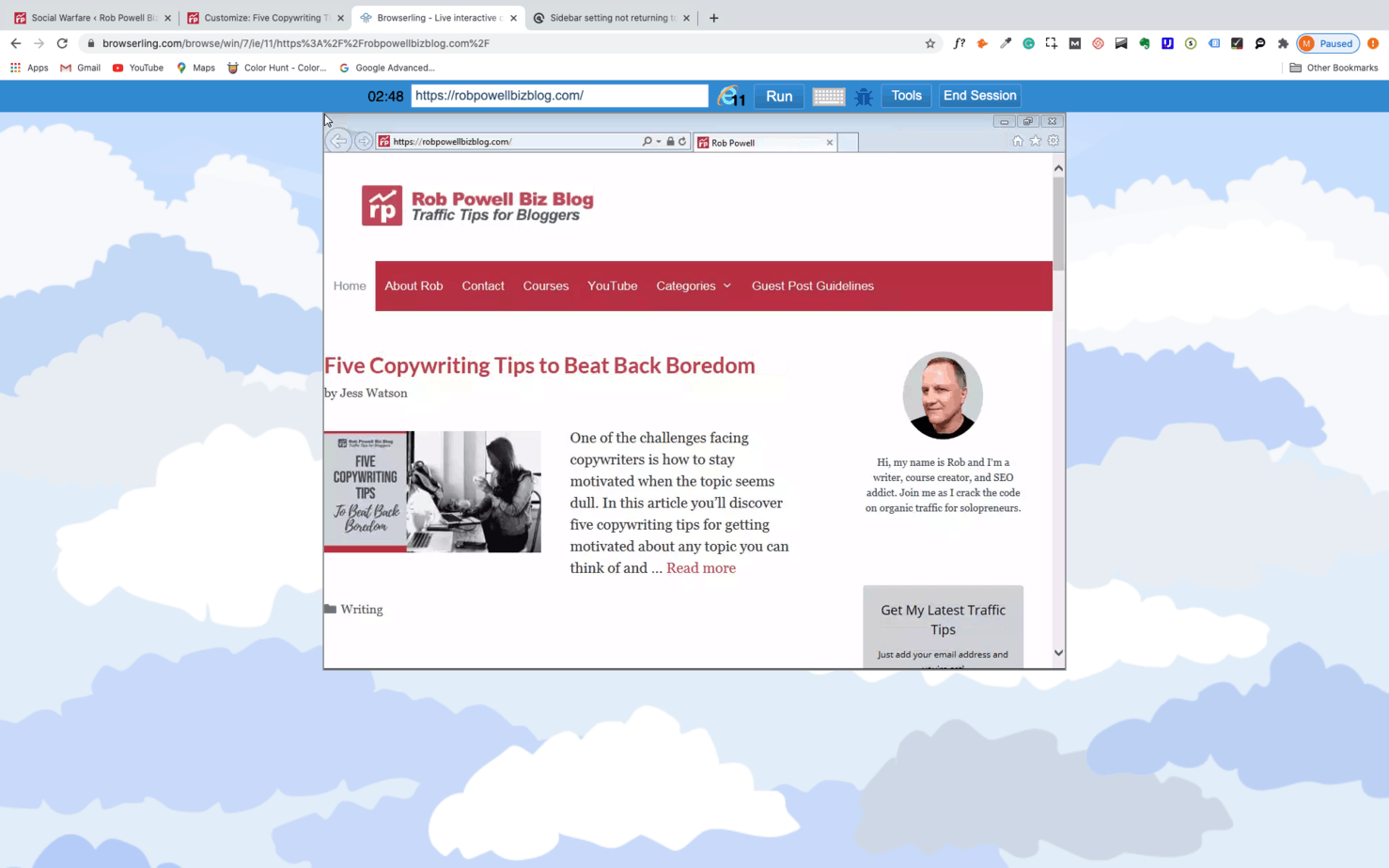
    These are my settings for Layout > Sidebars: settings in GP for Layout, Sidebars

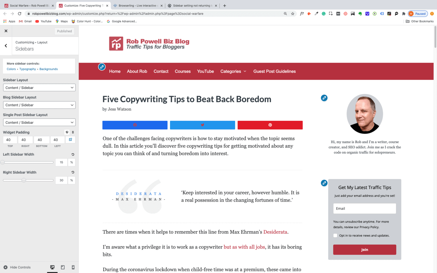
    It seems I have two problems: (1) in Browserling, the Home Page needs some padding at the far left as some of the content is off-page, (2) I need to create a left-side gutter or margin in the single-post layout so that the share buttons don’t sit on top of the text.

    I’ve tried adjusting various settings but I’m getting a bit confused now. Perhaps I should just return to the default settings for Layout > Sidebars?

    Any help you can offer would be much appreciated.

    Thanks,

    Rob

    #1466125
    Leo
    Staff
    Customer Support

    Hi there,

    Any chance you can link us to the site in question?

    You can use the private information field.

    Let me know 🙂

    #1466252
    Rob

    Hi Leo, thanks for that – the link is below:

    #1466802
    David
    Staff
    Customer Support

    Hi there,

    in Customizer > Layout > Container you have 0 left padding.
    The floating icons on left appear on scroll and take up around 80px space.
    So you would either need to add 80px of left padding ( which feels like a lot ) or check the social share plugin if there is a smaller icon option.

Viewing 4 posts - 1 through 4 (of 4 total)
  • You must be logged in to reply to this topic.