- This topic has 18 replies, 4 voices, and was last updated 4 years, 6 months ago by
Elvin.
-
AuthorPosts
-
October 18, 2021 at 2:28 am #1966931
Ceramica Sud Curlante
I ask you if it is possible to create a menu of custom icons like the one on my old site
October 18, 2021 at 4:08 am #1967009David
StaffCustomer SupportHi there,
if you edit your menu, in the Navigation label field you can add an
<img>HTML before the text.
Example of img html can be found here:https://www.w3schools.com/tags/tag_img.asp
It would then require a little CSS to stack the image on top of the text. Which i can help with once you set that up.
October 18, 2021 at 10:33 am #1967559hello i inserted the icons.
It seems to me that he is fine too.
If you have further advice to give me, they are welcomeOctober 18, 2021 at 10:34 am #1967560October 18, 2021 at 10:49 am #1967571Ying
StaffCustomer SupportHi there,
Give this CSS a try:
.main-nav > ul > li > a {
    display: flex;
    flex-direction: column;
    align-items: center;
}

.main-nav > ul > li > a >font {
    font-size: 10px;
}

.main-nav > ul > li > a > img {
    height: 50px;
    width: 50px;
}
Let me know 🙂
October 18, 2021 at 10:57 am #1967588I have to insert it on the graphic theme Function.php?
October 18, 2021 at 11:46 am #1967624StaffCustomer SupportNo, this is CSS, add it to the customizer > additional CSS 🙂
October 20, 2021 at 3:17 am #1969396I entered the code you provided me with.
it’s perfect
I have only one questionIn your opinion, the smartphone display is fine or can be improved
Thank you
October 20, 2021 at 10:39 am #1969923StaffCustomer SupportYou can give this CSS a try, so there’ll be 4 menu items per row:
.mobile-header-sticky #mobile-header.toggled .main-nav>ul {
    display: flex;
    flex-wrap: wrap;
}
.mobile-header-sticky #mobile-header.toggled .main-nav>ul>li {
    width: 25%;
}
Feel free to change the
25%value 🙂October 21, 2021 at 12:37 am #1970349.main-nav > ul > li > a {
display: flex;
flex-direction: column;
align-items: center;
}.main-nav > ul > li > a >font {
font-size: 10px;
}.main-nav > ul > li > a > img {
height: 50px;
width: 50px;
}the code works, I ask that it is only possible to have an alignment of the whole menu to the left
from desktop view
this is the site
October 21, 2021 at 9:54 am #1970987StaffCustomer SupportI ask that it is only possible to have an alignment of the whole menu to the left
Do you mean switch the positions of logo and navigation on desktop? Navigation on the left and logo on the right?
Let me know 🙂
October 21, 2021 at 10:15 am #1970999logo on the left and product icons starting from the left
October 21, 2021 at 10:39 am #1971029StaffCustomer SupportIsn’t that what you are having right now?
https://www.screencast.com/t/NLU1dws1fxyOctober 22, 2021 at 12:48 am #1971539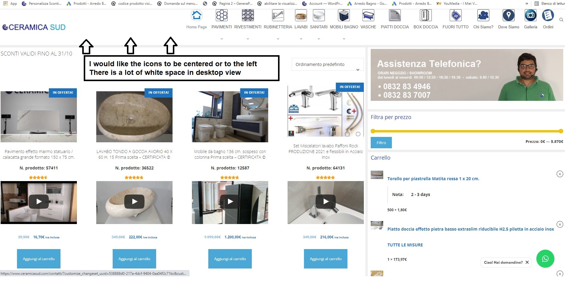 October 22, 2021 at 10:21 am #1972135StaffCustomer Support
Oh I see, try this CSS:
.navigation-branding { margin-right: 0; } -
AuthorPosts
- You must be logged in to reply to this topic.