- This topic has 34 replies, 4 voices, and was last updated 3 years, 3 months ago by
Ying.
-
AuthorPosts
-
January 8, 2023 at 12:46 pm #2488196
francesco
hi, I was wondering if it was possible to make the search bar appear on the right side as in the example.
I’m currently using this CSS
form.search-form.navigation-search.nav-search-active {
    top: 45px;
	  width: 100%;
	  left: 50%;
transform: translateX(-50%);
}

.navigation-search.nav-search-active {
    display: flex;
}

.inside-navigation.grid-container form.search-form .search-field {
    background-color: #f2f2f2;
}

.inside-navigation.grid-container form.search-form {
    background-color: #8ad6c1;
    padding: 10px;
    display: flex;
    align-items: center;
    }

}

@media (max-width: 768px) {
    form.search-form.navigation-search.nav-search-active {
    display: flex;
}

button.nav-search-button {
    border: none;
}
}

@media (max-width: 768px) {
    .menu-bar-items {
        z-index: 2;
        position: relative;
    }
    form.search-form.navigation-search.nav-search-active {
        max-width: calc(100% - 46px);
    }
}

.navigation-search {
    z-index: 9999;
}

.navigation-search input[type="search"],
.navigation-search input[type="search"]:active,
.navigation-search input[type="search"]:focus {
    background-color: #f0f0f0;
}

.main-navigation .main-nav ul li[class*="current-menu-"]:hover > a {
    color: var(--accent) !important;
    background-color: #8ad6c1 !important;
}
and this php
add_filter( 'generate_navigation_search_output', function() {
    printf(
        '<form method="get" class="search-form navigation-search" action="%1$s">
            <input type="search" placeholder="Search" class="search-field" value="%2$s" name="s" title="%3$s"  />
			<button class="nav-search-button">Search</button>
        </form>',
        esc_url( home_url( '/' ) ),
        esc_attr( get_search_query() ),
        esc_attr_x( 'Search', 'label', 'generatepress' )
    );
} );
January 8, 2023 at 5:43 pm #2488294Fernando Customer Support
Hi Francesco,
For reference, can you provide the link to the site in question?
You may use the Private Information field for this: https://docs.generatepress.com/article/using-the-premium-support-forum/#private-information
January 9, 2023 at 2:44 am #2488613hi fernando, done
January 9, 2023 at 3:21 am #2488646David
StaffCustomer SupportHi there,
remove this CSS:
form.search-form.navigation-search.nav-search-active {
    top: 45px;
    width: 100%;
    left: 50%;
    transform: translateX(-50%);
}
and then after all your current CSS add this:
@media(min-width: 1200px) {
    form.search-form.navigation-search.nav-search-active {
        left: 100%;
        top: -10px; /* vertically align */
        max-width: 390px /* linit width to sidebar */
    }
}
@media(max-width: 1199px) and (min-width: 769px) {
    form.search-form.navigation-search.nav-search-active {
        top: 100%;
        left: 50%;
        transform: translateX(-50%);
    }
}
As both of these CSS rules are in their own @media queries you must make sure they are added before or after any other CSS, ie. not inside another media query.
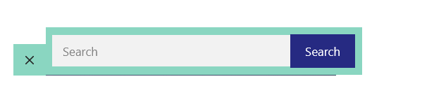
January 9, 2023 at 4:49 am #2488775thanks david, the CSS works correctly but I would like to fix some things, for example I would like to make everything a little more homogeneous and therefore smaller. plus the blue search button has a border that goes over the white search bar slightly and i’d like to fix that.
 January 9, 2023 at 5:21 am #2488795
example
 January 9, 2023 at 5:53 am #2488817StaffCustomer Support
Might be easier if your remove ALL custom CSS you have relating to the Navigation Search and i will do it from scratch.
Let me know when its removed.January 9, 2023 at 6:31 am #2488861done, i kept active the php code for the button.
January 9, 2023 at 6:44 am #2488879StaffCustomer SupportTry adding this CSS:
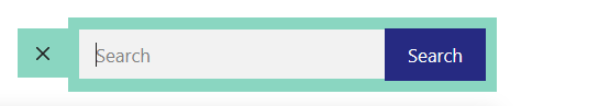
.navigation-search.nav-search-active {
    top: 100%;
    display: flex;
    background-color: #8ad6c1;
}
.navigation-search.nav-search-active button {
    border: 0;
}
#site-navigation .navigation-search input[type="search"] {
    background-color: #fff;
    height: 40px;
    align-self: center;
    margin-left: 2px;
}
@media(min-width: 1200px) {
    #site-navigation .navigation-search.nav-search-active {
        top: unset;
        left: 100%;
        max-width: 390px;
    }
}
January 9, 2023 at 6:55 am #2488899thanks david, it seems to work very well, but I would like to ask you if you can also change the length. I also noticed that for the tablet and mobile versions everything is offset
January 9, 2023 at 7:06 am #2488918StaffCustomer SupportI made an edit to the code above, ie. added the
max-width: 390px;property to the last CSS rule.What is the issue on mobile / tablet ? Can you share a screenhshot ?
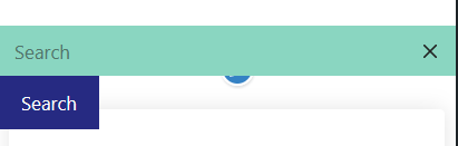
January 10, 2023 at 5:11 am #2489995hi david, telephone version
 January 10, 2023 at 5:27 am #2490009
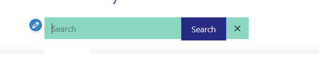
I would like to reproduce this effect or something similar, in the mobile version the blue search button stays bigger as you can see.
 January 10, 2023 at 5:47 am #2490026
Could it be okay to leave the button on the left instead of the right?
January 10, 2023 at 8:01 am #2490336StaffCustomer SupportCan you remove the CSS i provided and then add it back in, at the very top or the very bottom of your CSS.
Currently it is inside another @media query which is why its not working on smaller screens. -
AuthorPosts
- You must be logged in to reply to this topic.