
Archived topic
customize search bar
34 replies · Started by francesco on January 8, 2023
hi, I was wondering if it was possible to make the search bar appear on the right side as in the example.
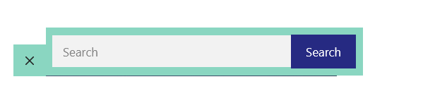
I'm currently using this CSS
form.search-form.navigation-search.nav-search-active {
    top: 45px;
	  width: 100%;
	  left: 50%;
transform: translateX(-50%);
}

.navigation-search.nav-search-active {
    display: flex;
}

.inside-navigation.grid-container form.search-form .search-field {
    background-color: #f2f2f2;
}

.inside-navigation.grid-container form.search-form {
    background-color: #8ad6c1;
    padding: 10px;
    display: flex;
    align-items: center;
    }

}

@media (max-width: 768px) {
    form.search-form.navigation-search.nav-search-active {
    display: flex;
}

button.nav-search-button {
    border: none;
}
}

@media (max-width: 768px) {
    .menu-bar-items {
        z-index: 2;
        position: relative;
    }
    form.search-form.navigation-search.nav-search-active {
        max-width: calc(100% - 46px);
    }
}

.navigation-search {
    z-index: 9999;
}

.navigation-search input[type="search"],
.navigation-search input[type="search"]:active,
.navigation-search input[type="search"]:focus {
    background-color: #f0f0f0;
}

.main-navigation .main-nav ul li[class*="current-menu-"]:hover > a {
    color: var(--accent) !important;
    background-color: #8ad6c1 !important;
}
and this php
add_filter( 'generate_navigation_search_output', function() {
    printf(
        '<form method="get" class="search-form navigation-search" action="%1$s">
            <input type="search" placeholder="Search" class="search-field" value="%2$s" name="s" title="%3$s"  />
			<button class="nav-search-button">Search</button>
        </form>',
        esc_url( home_url( '/' ) ),
        esc_attr( get_search_query() ),
        esc_attr_x( 'Search', 'label', 'generatepress' )
    );
} );Hi Francesco,
For reference, can you provide the link to the site in question?
You may use the Private Information field for this: https://docs.generatepress.com/article/using-the-premium-support-forum/#private-information
hi fernando, done
Hi there,
remove this CSS:
form.search-form.navigation-search.nav-search-active {
    top: 45px;
    width: 100%;
    left: 50%;
    transform: translateX(-50%);
}
and then after all your current CSS add this:
@media(min-width: 1200px) {
    form.search-form.navigation-search.nav-search-active {
        left: 100%;
        top: -10px; /* vertically align */
        max-width: 390px /* linit width to sidebar */
    }
}
@media(max-width: 1199px) and (min-width: 769px) {
    form.search-form.navigation-search.nav-search-active {
        top: 100%;
        left: 50%;
        transform: translateX(-50%);
    }
}
As both of these CSS rules are in their own @media queries you must make sure they are added before or after any other CSS, ie. not inside another media query.
thanks david, the CSS works correctly but I would like to fix some things, for example I would like to make everything a little more homogeneous and therefore smaller. plus the blue search button has a border that goes over the white search bar slightly and i'd like to fix that.

example

Might be easier if your remove ALL custom CSS you have relating to the Navigation Search and i will do it from scratch.
Let me know when its removed.
done, i kept active the php code for the button.
Try adding this CSS:
.navigation-search.nav-search-active {
    top: 100%;
    display: flex;
    background-color: #8ad6c1;
}
.navigation-search.nav-search-active button {
    border: 0;
}
#site-navigation .navigation-search input[type="search"] {
    background-color: #fff;
    height: 40px;
    align-self: center;
    margin-left: 2px;
}
@media(min-width: 1200px) {
    #site-navigation .navigation-search.nav-search-active {
        top: unset;
        left: 100%;
        max-width: 390px;
    }
}thanks david, it seems to work very well, but I would like to ask you if you can also change the length. I also noticed that for the tablet and mobile versions everything is offset
I made an edit to the code above, ie. added the max-width: 390px; property to the last CSS rule.
What is the issue on mobile / tablet ? Can you share a screenhshot ?
hi david, telephone version

I would like to reproduce this effect or something similar, in the mobile version the blue search button stays bigger as you can see.
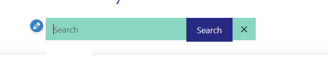
Could it be okay to leave the button on the left instead of the right?
Can you remove the CSS i provided and then add it back in, at the very top or the very bottom of your CSS.
Currently it is inside another @media query which is why its not working on smaller screens.