WooCommerce
WooCommerce was a big focus of ours in this update. We’ve added new features, and improved existing ones. We’ve also improved the design in some areas.
Menu Mini Cart
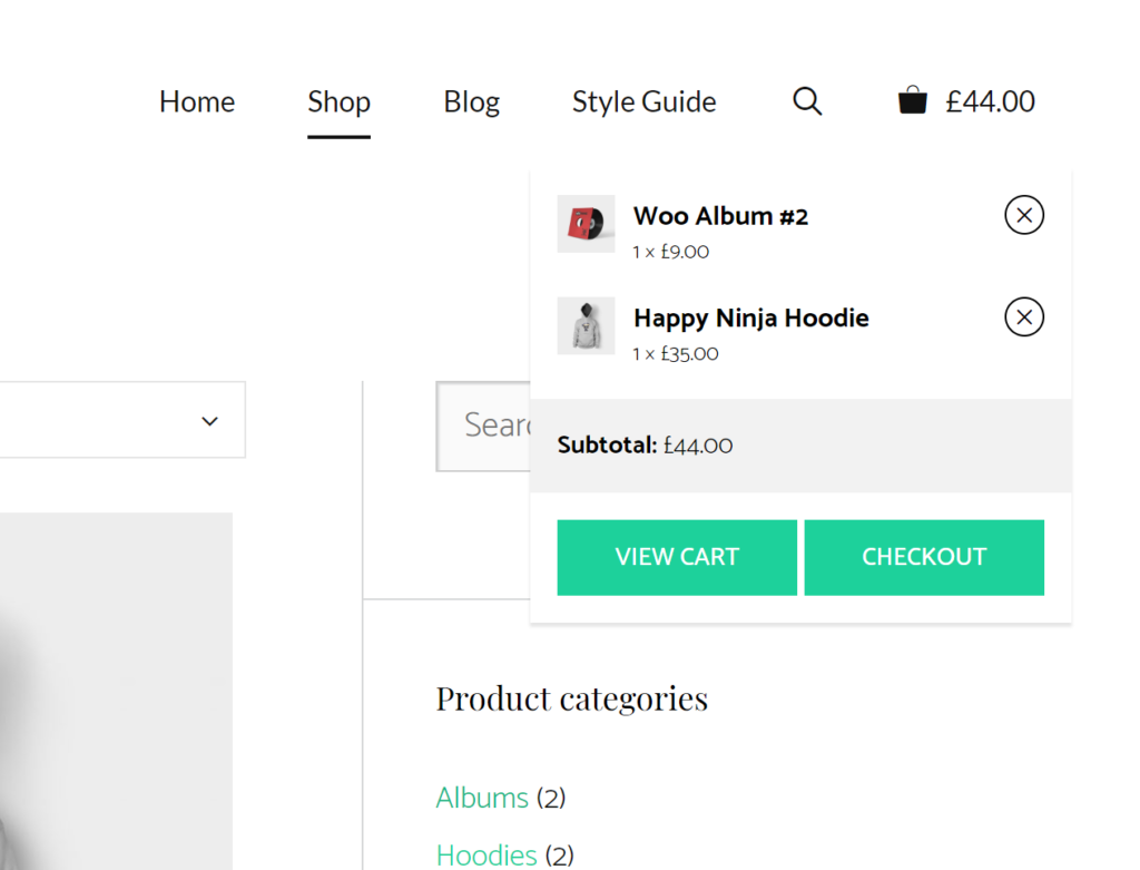
You can now add a mini cart to your cart menu item when you hover over it. This mini cart can be styled using color options in the Customizer.
Number of Items in Cart Menu Item
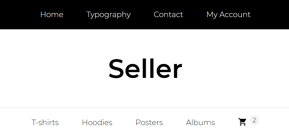
By default, the cart menu item displays the total cost of the items in your cart. You can now change that to show the number of items instead.
Sticky Panel on Add to Cart
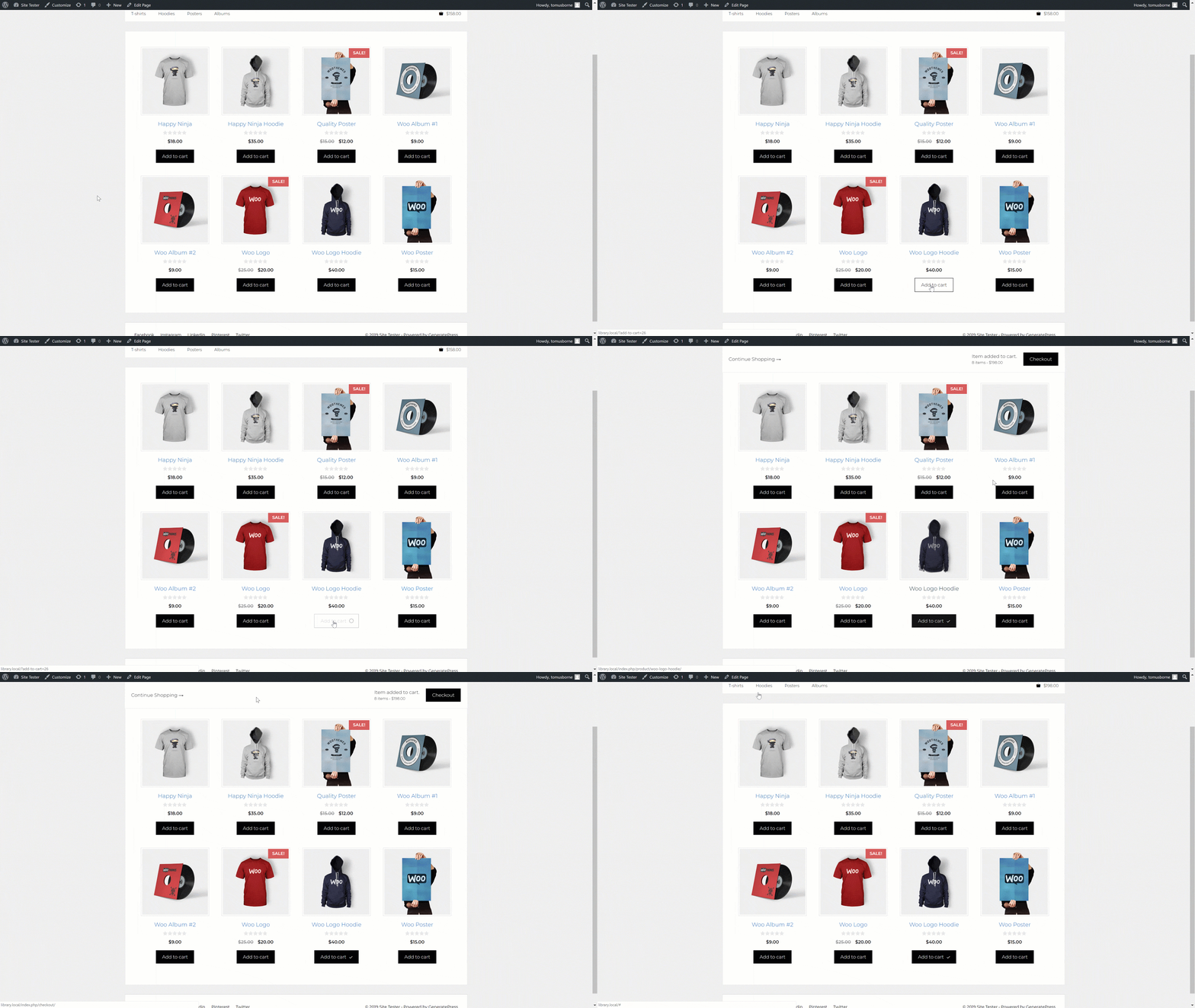
When you add a product to your cart, you can now enable a sticky bar which will appear with a checkout button.
Sticky Add to Cart Panel
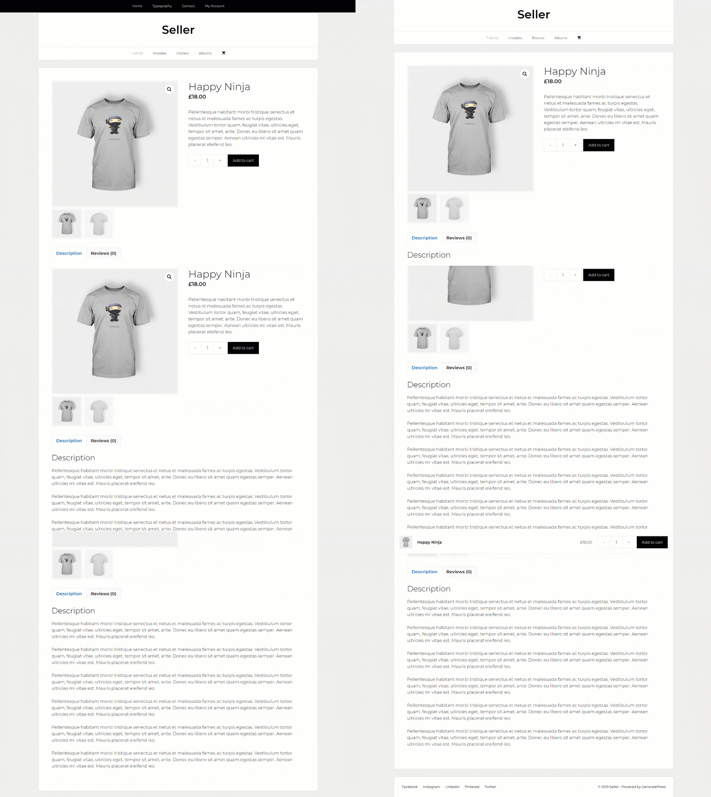
On single product pages, you can choose to show an add to cart panel once you pass the add to cart button on the page.
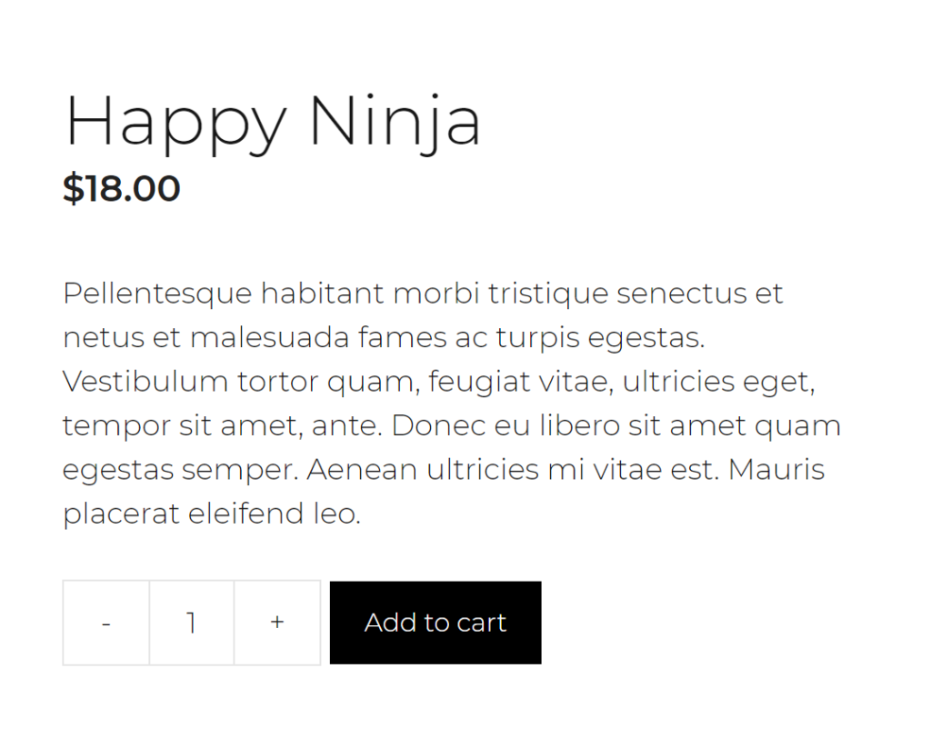
Improved Quantity Fields
We’ve added + and – signs to your quantity fields, and designed them to better fit with the add to cart button. This option is on by default, but can be turned off in the Customizer.
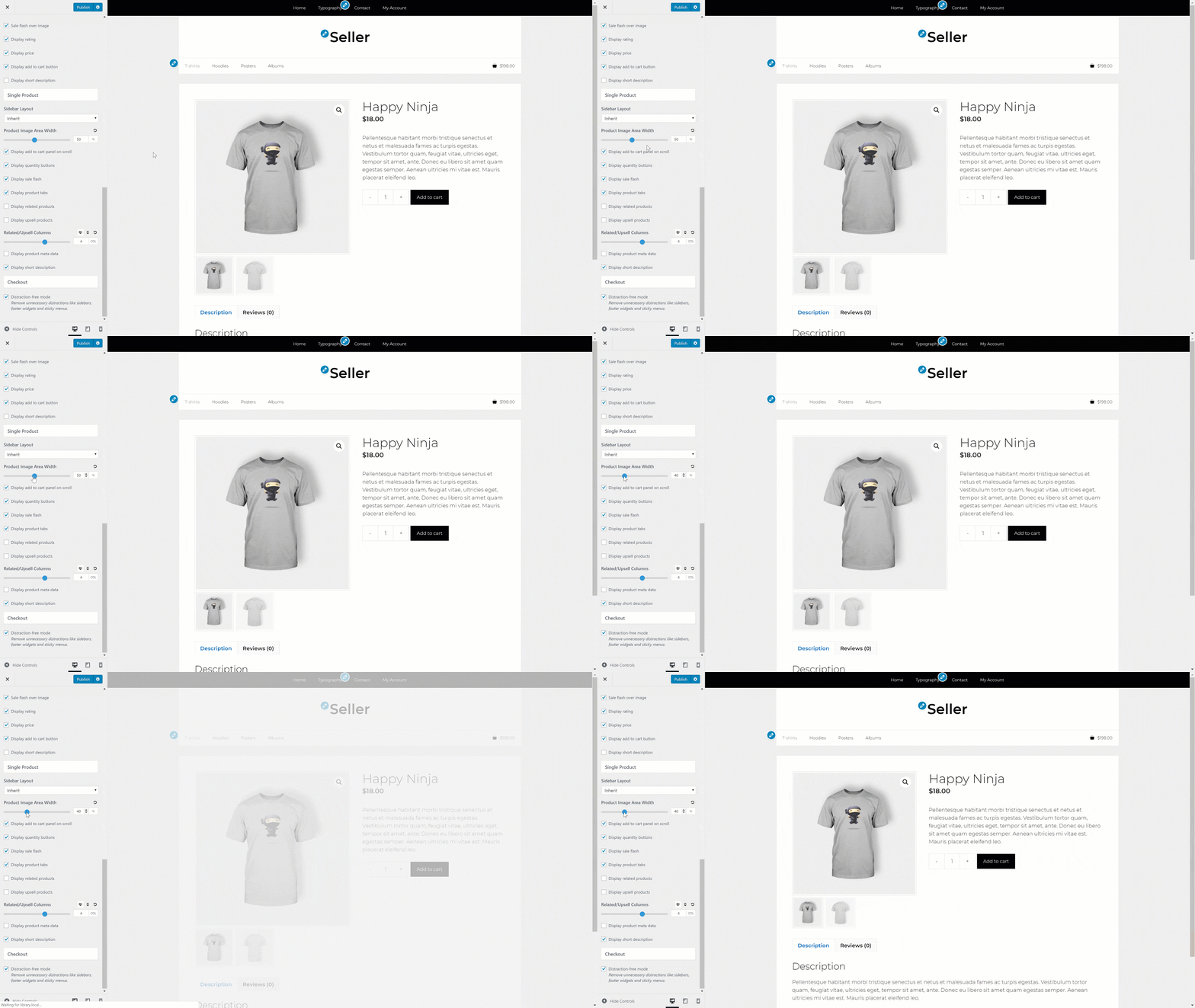
Single Product Image Width
The area which holds your single product image can now be adjusted directly inside the Customizer.
Other WooCommerce Tweaks
- Add color options for
price slider widget - Use CSS grid for the product archives
- Horizontally align add to cart buttons
- Re-design the cart widget
- Improve product tab design to look more like tabs
- Use flexbox for quantity/add to cart alignment
- Improve rating star
styles Improve coupon field design- Improve result count/ordering styling
Navigation as Header
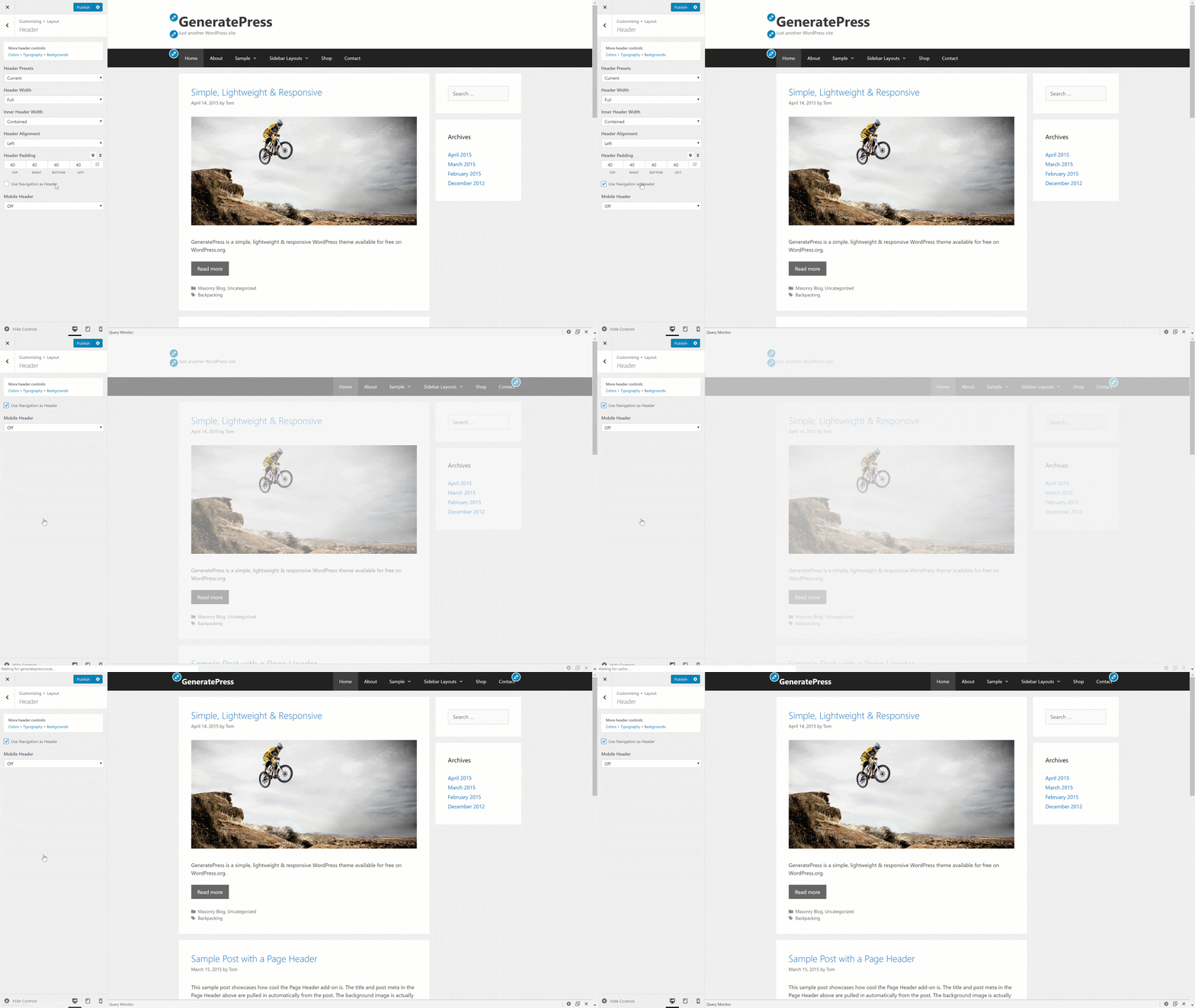
One of our more popular requests is to use the navigation as your header. This is useful if you’re looking for a slim alternative to a classic header.
Previously, you’d have to disable the classic header, add a navigation logo to your navigation and set the placement of the logo to Sticky + Static. While this process works, it involves a lot of steps.
In 1.8, we’ve removed the Navigation Logo and placement options if you’re not using
Using the Navigation as Header option does various things for you:
- Disables the classic site header
- Adds your logo or site title (or both, depending on your settings) into the navigation
- If you’re using a site title, it sets it to your menu item color
- Hides all non-applicable header options in the Customizer
This options vastly simplifies the process for you, while giving you more control. You no longer need to upload a different logo, as it will use your logo set in Customize > Site Identity. If you don’t want a logo, you can just use your site title by leaving the Hide site title option un-checked in Customize > Site Identity.
The site title color and typography options can be altered in Customize > Typography > Header as usual.
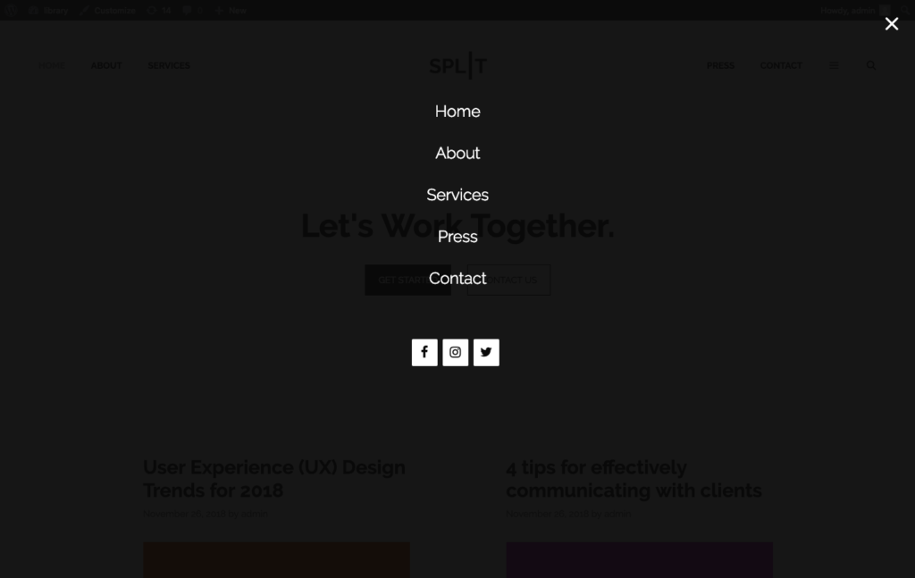
Off Canvas Overlay
We’ve had a slideout navigation/widget area for a while now. In 1.8, we’ve added an option to turn it into a full-screen overlay. We also re-named “Slideout Navigation” to “Off Canvas Panel” throughout the theme.
Mobile Header Branding
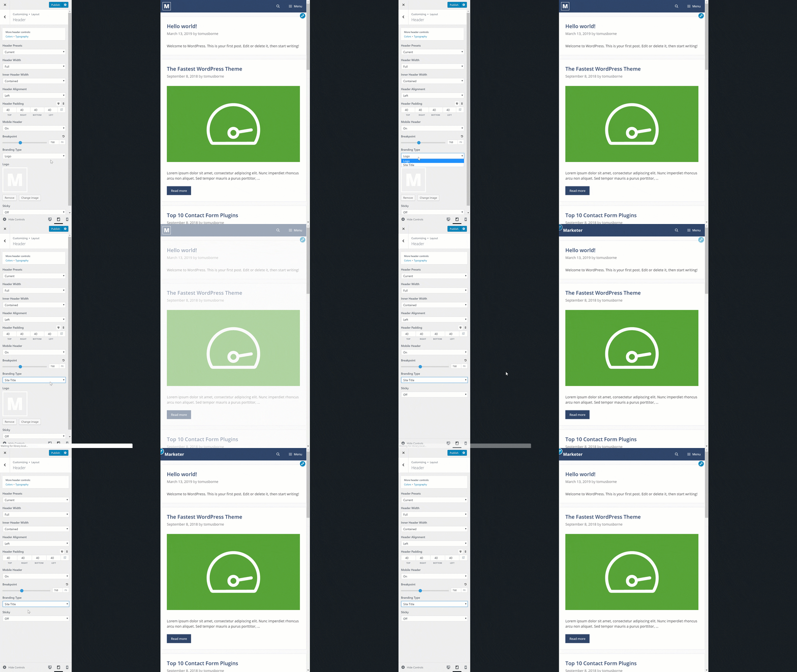
You’ve always been able to upload a logo for your mobile header. Now, you can choose to use your site title instead.
Better Spacing Control
Mobile Padding
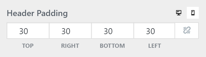
Elements like the header, sidebar widgets and footer widgets now have mobile padding controls.
Content Separator
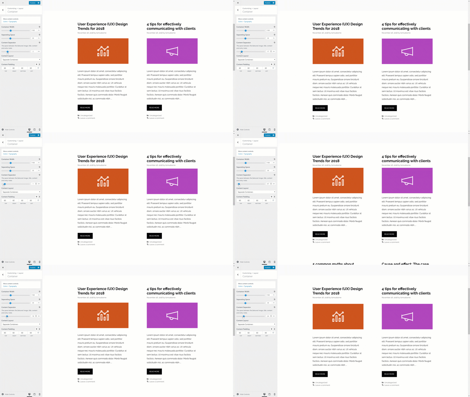
Previously, you weren’t able to adjust the amount of space between your featured images, title, entry meta and footer entry meta. Now, you’re able to do so inside the Customizer.
Site Library Re-Design
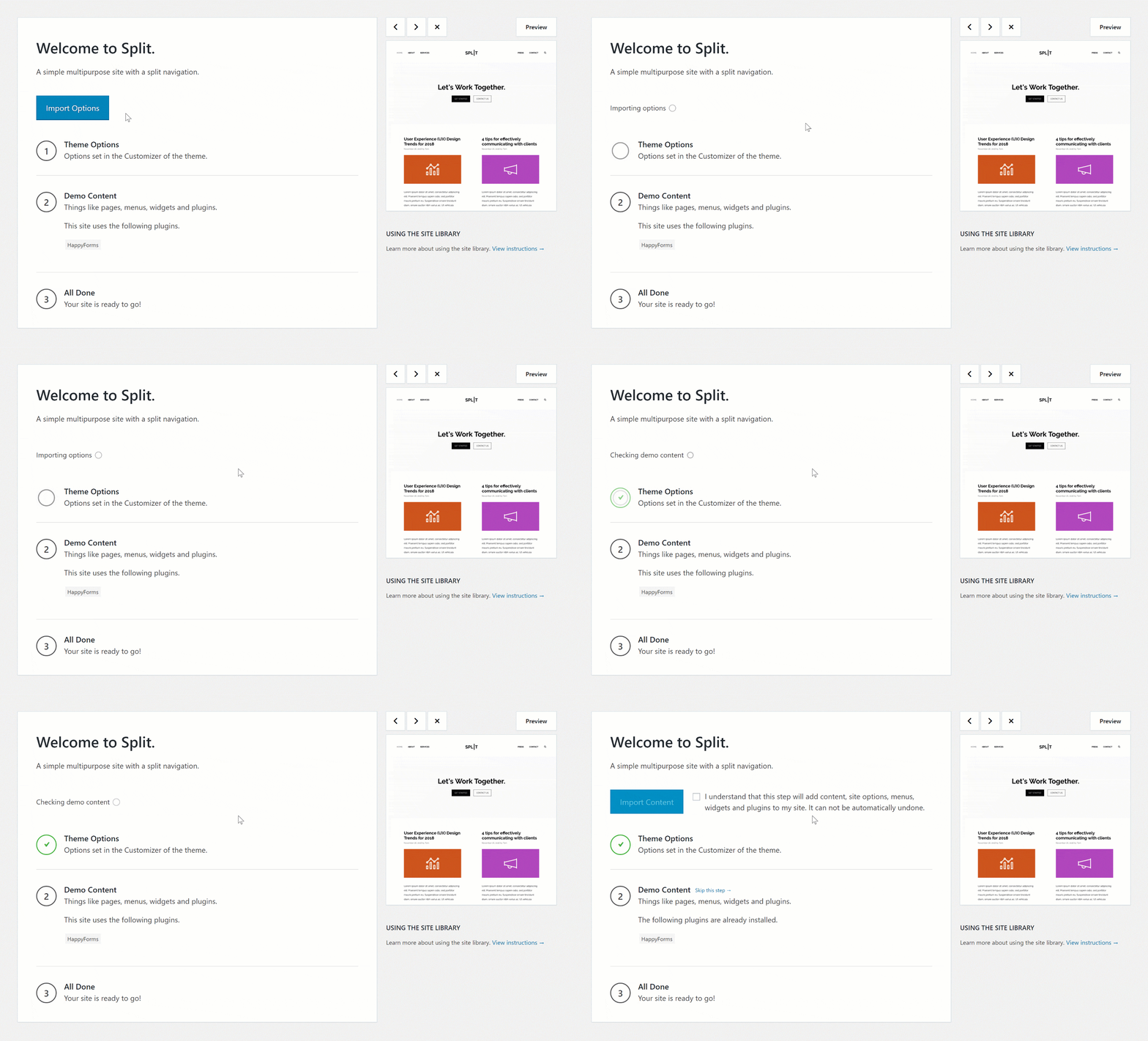
The importer received a little love as well. We re-designed the process and simplified it a bit.
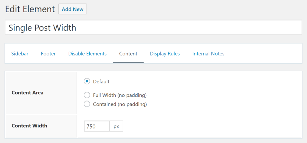
Content Area Width
We’ve added a new option to the Layout Element that allows you to set a custom width for you content area. This is particularly useful when not using any sidebars, as a narrow content area makes your content much easier to read.
Customizer Shortcuts
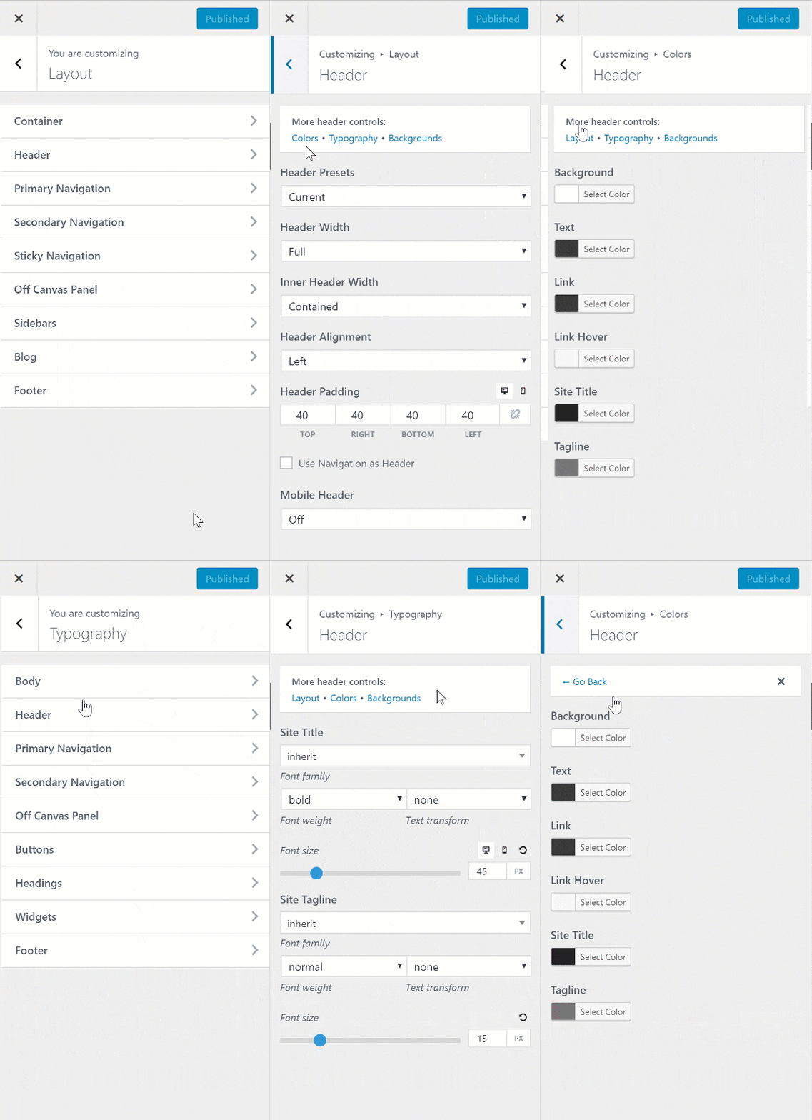
As of right now, we have 4 main panels of options in the Customizer:
- Layout
- Colors
- Typography
- Background Images
In each of these panels, we have various sections, which are consistent throughout each panel. We experimented with merging the Colors, Typography and Background Images section into one section, but things quickly became quite messy/confusing.
So instead, we came up with a shortcut system to take you between panels easily.
Sticky Navigation Logo
Somewhat related to the Navigation as Header option above, you can now upload a different logo for your sticky navigation. This option will only appear if you don’t have the deprecated Navigation Logo option set.
Mobile Header Breakpoint
You can now choose when the mobile header initiates. By default, it happens at 768px. Once GP 2.3 is released, this option will also apply to the regular menu if the mobile header isn’t activated.
Multi-Language Elements
Elements are now translatable using popular plugins like WPML and Polylang.
That’s It!
We’re super proud of GPP 1.8, and hope you like the new features!
As I said above, this is currently an alpha version, so use caution when using it on sites with traffic.
If you have any bug reports or feedback, please report them in our forums.
Full changelog
1.8.0
- Blog: Apply columns filter to masonry grid sizer
- Colors: Merge Footer Widgets and Footer controls in Color panel
- Colors: Remove edit_theme_options capability to Customizer controls (set by default)
- Disable Elements: Make sure mobile header is disabled when primary navigation is disabled
- Elements: Add content width option in Layout Element
- Elements: Fix mobile header logo when mobile menu toggled
- Elements: Add generate_page_hero_location filter
- Elements: Add generate_elements_show_object_ids filter to show IDs in Display Rule values
- Elements: Prevent merged header wrap from conflicting with Elementor controls
- Elements: Change Container tab name to Content
- Elements: Add woocommerce_share option to Hooks
- Elements: Improve WPML compatibility
- Elements: Improve Polylang compatibility
- Elements: Prevent PHP notices when adding taxonomy locations to non-existent archives
- Elements: Add generate_mobile_cart_items hook to hook list
- Elements: Add generate_element_post_id filter
- Elements: Escape HTML elements inside Element textarea
- Elements: Add Beaver Builder templates to the Display Rules
- Menu Plus: Add mobile header breakpoint option
- Menu Plus: Add off canvas overlay option
- Menu Plus: Add navigation as header option
- Menu Plus: Remove navigation logo option if navigation as header set
- Menu Plus: Add sticky navigation logo option
- Menu Plus: Allow site title in mobile header instead of logo
- Menu Plus: Add option to move exit button inside the off canvas panel
- Menu Plus: Change Slideout Navigation name to Off Canvas Panel
- Menu Plus: Only re-focus after slideout close on escape key
- Menu Plus: Give close slideout event a name so it can be removed
- Menu Plus: Remove invalid transition-delay
- Menu Plus: Improve slideout overlay transition
- Menu Plus: Add mobile open/close icons to GPP font
- Menu Plus: Allow dynamic widget classes in off canvas panel (fixes WC range slider widget issue)
- Menu Plus: Basic compatibility with future SVG icons
- Menu Plus: Prevent duplicate IDs when sticky navigation is cloned
- Secondary Nav: Add dropdown direction option
- Secondary Nav: Basic compatibility with future SVG icons
- Sections: Fix section editor issues in WP 5.0
- Sections: Show Better Font Awesome icon in editor
- Sites: Re-design UI
- Sites: Add option to activate as a module like all the other modules
- Sites: Don’t show backup options button if no options exist
- Sites: Make JS action classes more specific to the site library
- Sites: Set mime types of content.xml and widgets.wie
- Spacing: Add header padding option for mobile
- Spacing: Add widget padding option for mobile
- Spacing: Add footer widgets padding option for mobile
- Spacing: Add content separator option
- Spacing: Apply mobile menu item width to mobile bar only
- WooCommerce: Add option for mini cart in the menu
- WooCommerce: Add option to open off overlay panel on add to cart
- WooCommerce: Add option to open sticky add to cart panel on single products
- WooCommerce: Add option to add +/- buttons to the quantity fields
- WooCommerce: Add option to show number of items in cart menu item
- WooCommerce: Add option to choose single product image area width
- WooCommerce: Add color options for price slider widget
- WooCommerce: Use CSS grid for the product archives
- WooCommerce: Horizontally align add to cart buttons
- WooCommerce: Re-design the cart widget
- WooCommerce: Tighten up product info spacing
- WooCommerce: Improve product tab design to look more like tabs
- WooCommerce: Simplify single product image display
- WooCommerce: Use flexbox for quantity/add to cart alignment
- WooCommerce: Improve rating star styles
- WooCommerce: Use product alignment setting for related/upsell products
- WooCommerce: Remove bottom margin from product image
- WooCommerce: Organize colors in the Customizer
- WooCommerce: Remove title attribute from menu cart item
- WooCommerce: Improve coupon field design
- WooCommerce: Improve result count/ordering styling
- WooCommerce: Add gap around WC single product images
- WooCommerce: Remove arrow from checkout button
- WooCommerce: Hide view cart link on add to cart click
- WooCommerce: Organize CSS
- Introduce in-Customizer shortcuts
- Add generate_disable_customizer_shortcuts filter

Leave a comment