
Archived topic
Responsiveness at larger screen sizes - top of image cut off
3 replies · Started by Tom on March 16, 2017
Hi,
First of all, thanks for building such a great theme. My first site is shaping up nicely and GP’s responsiveness is helping it look good on various screen sizes.
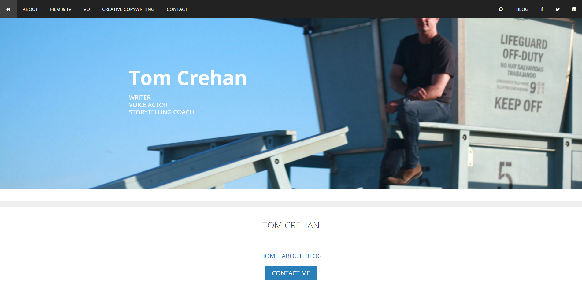
I am running into a bit of an issue with larger size (e.g. 27”) screens. The top of the background image on my home page is getting cut off. It may be doing this on all my pages, but the only one where it matters is my home page because it’s cutting off the top of my head.
Is there a setting I’m missing, or some way to make the image stop growing after a certain screen size?
My site is http://www.TomCrehan.com. Also, I’m using the Beaver Builder plug-in and my background images are set through that page builder and not the WordPress customizer. I don’t know if one way is recommended over another, but that’s the way I did it. Any advice on that is appreciated as well.
Thanks for your help!
Tom
Hi Tom,
Glad you are enjoying GP :)
Not too familiar with BB but there might be a way in the settings to set how you want to show the background image?
Keep in mind that background image is not responsive by nature.
If not you can give this CSS a shot and adjust the percentage as you like:
.fl-node-58a8058897dfe > .fl-row-content-wrap {
    background-position: center 40%;
}
Adding CSS: https://docs.generatepress.com/article/adding-css/
Let me know if this helps.
Hi Leo,
That seems to have worked. I just went with the percentage (40%) you suggested and it now seems to be displaying well at larger screen sizes while still looking good on the smaller ones.
I may post on the Beaver Builder forum to see if they have any other advice or best practices for setting background images, but the immediate crisis is solved. Thanks!
I'll mark this thread as resolved. I appreciate your help!
Tom
Glad I could help :)