Hello,
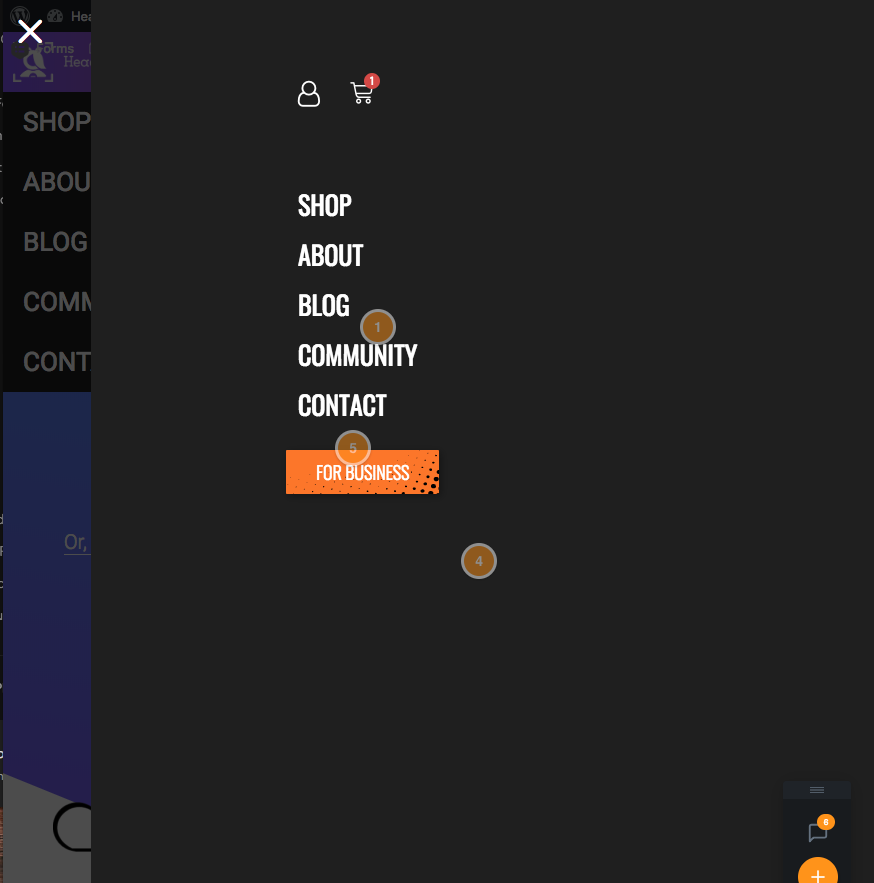
I am using the generate slideout navigation on mobile and tablet. On tablet the original mobile dropdown shows under the slideout as seen in the screenshot below. How can I stop the standard mobile menu from appearing when the hamburger icon is clicked. I am displaying the mobile header on tablet also with:
@media (max-width: 1024px) {
	#mobile-header, .main-navigation .menu-toggle {
		display: block !important;
	}

	.main-navigation ul,
	.gen-sidebar-nav, .main-navigation .sub-menu {
		display: none;
	}

	[class*="nav-float-"] .site-header .inside-header > * {
		float: none;
		clear: both;
	}
}

Thanks!