- This topic has 5 replies, 2 voices, and was last updated 5 years, 4 months ago by
Elvin.
-
AuthorPosts
-
December 10, 2020 at 11:46 pm #1575399
Ben
Hi,
I’m using a container with GenerateBlocks to make a grid, 4 columns, each column has another container with text in and a button. It all works great on mobile and desktop, on desktop the columns are all equal length and on mobile they turn into rows, one above the other. But on the iPad I can’t get the columns to be equal length, and depending on orientation of the iPad, the problem column changes. You can see iPad screenshots here: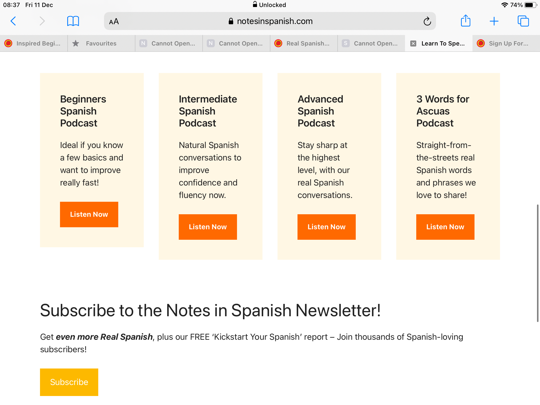
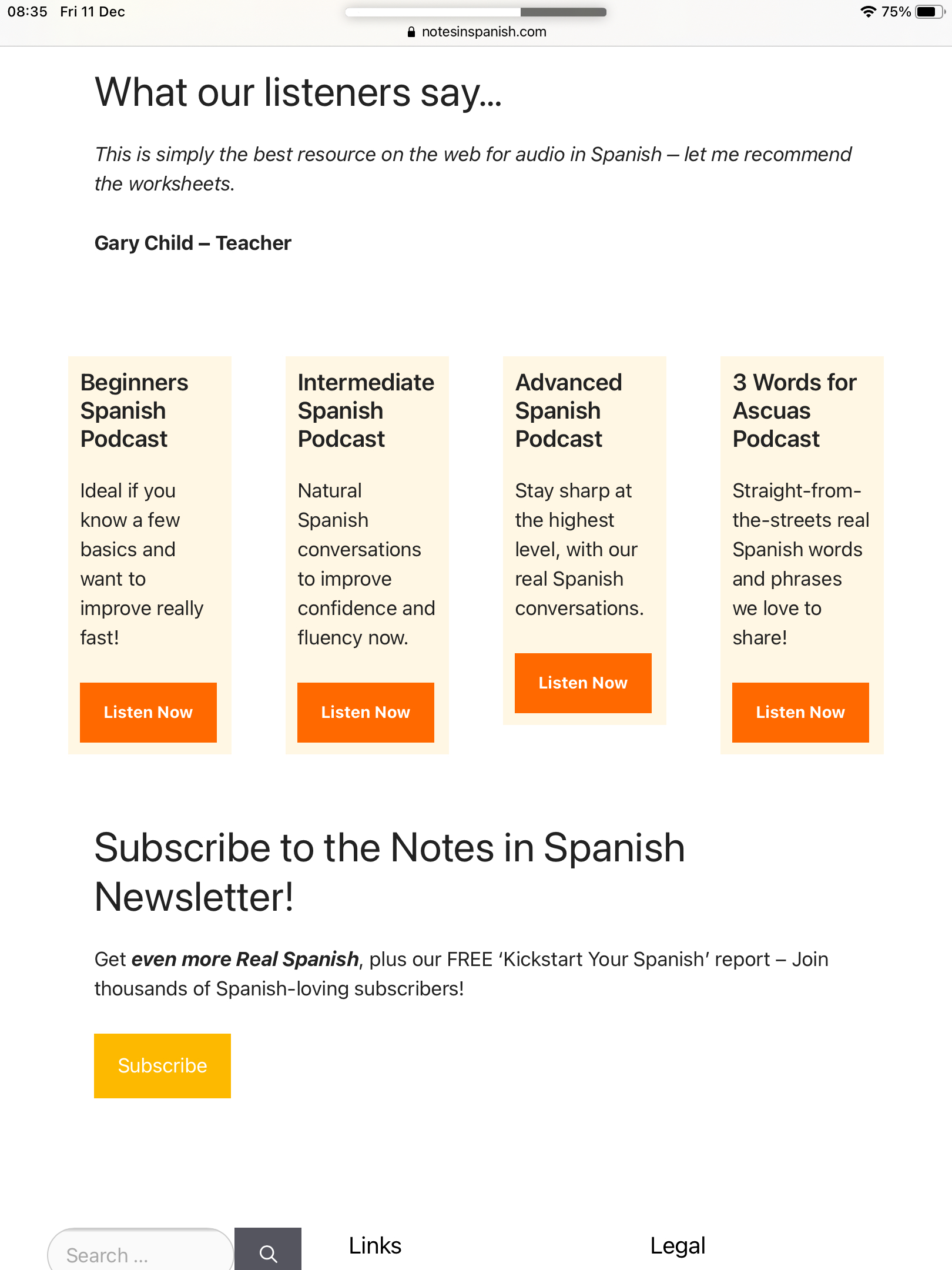
And the original page here: https://www.notesinspanish.com/ – scroll down a little to see the boxes.
Is there a best practice for this kind of thing with the iPad, to ensure the columns are the same length? How can I fix this? I’ve played around with padding and margins settings in the containers for tablet but can’t get it right. Many thanks in advance for your help. Ben
December 11, 2020 at 1:09 am #1575507Elvin
StaffCustomer SupportHi,
Have you set the Grid Block’s Vertical Alignment to anything other than “Default”?
If you want the Grid Block’s columns to have the same height, you must set the Grid Block’s Vertical Alignment setting to default.
Else, they will align depending on what you’ve set in it. (Top, Center or Bottom)
December 13, 2020 at 11:23 pm #1579370Hi Elvin, Sorry for the delay in replying. Yes, I have set the Grid Block’s Vertical Alignment setting to default for tablet, but the issue persists. Also I’ve tried setting a minimum height for each container in the grid block, and again, the problem is there. Is there anything else I can try? Thanks.
December 14, 2020 at 1:05 am #1579459StaffCustomer SupportYou can try this:
Add
equal-height-gridclass to your Grid Block’s CSS classes on its advanced setting.You can then add this CSS:
.equal-height-grid .gb-inside-container, .gb-container {
    height: 100%;
}
.equal-height-grid .gb-button-wrapper {
    margin-top: auto;
}
.equal-height-grid .gb-inside-container {
    display: flex;
    flex-direction: column;
}
This ensures the contents occupy 100% of the ancestor’s height and pushes the button down to the bottom.
December 17, 2020 at 12:05 am #1583898Elvin, you are a genius 🙂 That solved it, thank you so much!
December 17, 2020 at 12:46 am #1583921StaffCustomer SupportElvin, you are a genius 🙂 That solved it, thank you so much!
No problem. Glad to be of any help. 😀
-
AuthorPosts
- You must be logged in to reply to this topic.