- This topic has 17 replies, 4 voices, and was last updated 5 years, 4 months ago by
Tom.
-
AuthorPosts
-
December 11, 2020 at 6:33 am #1576016
polina
Hi There,
60% of my visits are made via mobile. So, trying to design mobile first– What I am trying to achieve:
Get mobile menu on desktop, with on the left: hamburger + search. And on the right, Woo basket + login / Account.– What I am getting:
https://snipboard.io/2lFsrR.jpg
* hamburger is on the right, and opens on the left when clicked
* basket on the left
* search is on the left, as wished, but the field opens on the right, what is not logical nor convenientWhat I did
* I followed this tutorial
https://docs.generatepress.com/article/centering-logo-navigation/
* Since I don’t have search or basket in menu, I place the custom link on the bottom of menu. Also tried on top or elsewhere, what did not change anything.
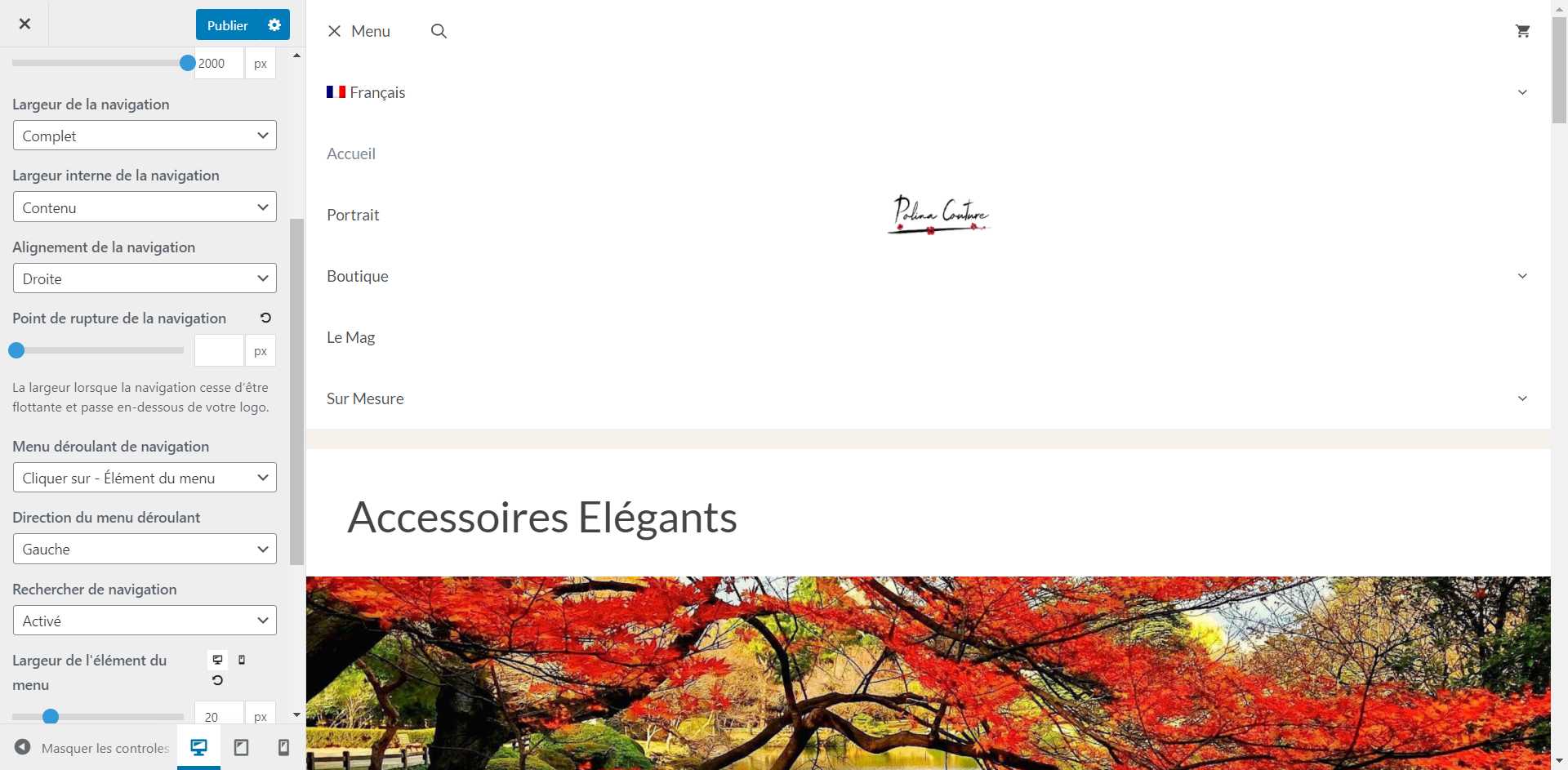
* I set breakpoint at 2000 to get mobile menu on desktop. See settings here:
https://snipboard.io/2lFsrR.jpgThanks in advance for your help
Kind regardsps; just starting with your theme. Honestly lost between header / nav 1 / nav 2, menu +, elements … an introduction introducing those “things” could be of help for new comers
December 11, 2020 at 8:07 am #1576275David
StaffCustomer SupportHi there,
can you share a link to your site so I can see whats required.
December 12, 2020 at 12:35 am #1577079Hi David,
Actually, my website uses another theme. And I am currently using a staging, to learn GP and find the right settings. So, will write the credentials for this staging below.
This is the target:
https://snipboard.io/ZY6k0Q.jpg
My current result is visible on staging
Thank you
Kind regardsDecember 12, 2020 at 11:19 am #1577743Leo
StaffCustomer Support– What I am trying to achieve:
Get mobile menu on desktop, with on the left: hamburger + search. And on the right, Woo basket + login / Account.Give thie CSS a shot:
.main-navigation.has-branding .menu-toggle {
    order: -1;
}
.main-navigation .menu-bar-items {
    flex: 1;
}
.main-navigation .menu-bar-item.wc-menu-item {
    order: 5;
    margin-left: auto;
}
It should give you this layout as you requested:
https://www.screencast.com/t/KaP84BTkThen you can add the login/account link using the generate_menu_bar_items hook.
December 12, 2020 at 8:07 pm #1578090Hello,
Thank you for this, it somehow works, but from UX perspective, it’s not good on several aspects.
1. The search field opens on the left of the icon (which is on the left). This could make sense if RTL, but my site is LTR
2. The hamburger -now on the left- opens on full width, with 3 issues
2a. On desktop, you have to notice that there are tiny arrows on the opposite side … they are usually close to name, to suggest sub menu
2b. On mobile, the name of the menu should rather disappear, for sake of clarity. But this is not enabled by settings
2c. the logo, which is supposed to be on top in the center, is moving on the center of the screen when hamburger is open. See:
https://snipboard.io/FzhfxE.jpg
3. The size of the logo is linked to the size of the menu elements. So, if I want to get a logo which is not super small on desktop, I need to accept a lot of empty spaces within menu.My purpose is to have on desktop a navigation that is similar to mobile. The strategy that I used (I am a dummie) was to set the mobile menu on PC. Apparently, this is creating complexities, because the mobile menu has -logically- been designed to work on mobiles and not on desktops.
=> QUESTION: Would it be more effective to keep a breakpoint between mobile and desktops, and then design the desktop nav like the one for mobiles?
Kind regards
December 13, 2020 at 11:01 am #1578876StaffCustomer SupportAny chance you can open a new topic for each of your follow up questions?
I believe we’ve solved the original topic of “Get Mobile Menu on Desktop as well, with centered logo”.
It’s very difficult for us to track and help with multiple issues in one long topic like this.
I also noticed that the site link you’ve provided above is no longer using GeneratePress.
December 13, 2020 at 10:53 pm #1579344Hi,
1. I understand that you need to separate topics but here, they are all linked. So, not sure that you are right, because if I split, you will have to coordinate the answers within different threads.
2. I consider that it’s not awfully inconvenient, with poor ergonomy and clarity for any Mr and Mrs Smith. If you think differetly, you can close the topic. This will simply mean that we can’t agree on what has to be delivered to visitors (ie ease, simplicity, speed, findability, ….).
3. you know that it’s an invisible staging site, nothing prevents you from changing the settings. I made page speed tests yesterday; you probaly came during this time. You know -or can know- that I just bought GP and I have 30 days to make it happen. And I do also tests with GB (generateblocks), which I reported to your team.
Waiting for your feedback on the fist 2 points
Kind regards
December 14, 2020 at 4:35 am #1579713StaffCustomer SupportI think it would be best to restart the navigation. First remove the Centered logo CSS and any other CSS modifications you have made.
Then:
1. Customizer > Layout > Header – enable the Mobile Header and set the Mobile Header logo.
2. Customizer > Layout > Off Canvas Panel – set this to ON.
2.1 Set you Menu Location to Off Canvas Panel in Customizer > Menus.
3. Customizer > Layout > Primary Navigation – type into the Mobile Menu Breakpoint field a really high value eg. 6000We should now have a mobile header that is being displayed across all device sizes and it should have the Logo, Menu, Search and Cart being displayed.
Once that is ready let me know and ill provide the CSS to make a similar layout to the Hermes site you referenced.
December 14, 2020 at 7:52 am #1580179Hi David,
Thank you very much 🙂
I have been struggling to understand what you meant … I am not familiar with tech jargon, the doc is not up to date, and the French translation -probably Canadian- is actually very special for me… … As an example, took me a while to understand that off-canvas was translated by litt. “lateral panel”, what is confusing with litt. “lateral bars” (refering to your “sidebars”).
Sorry, to the point:
– Yes, Hermès is the target, it’s super simple, super clean, super clear, and adding coherence between all devices
– I think I made it, though, as you will see, there are now 2 hamburgers on desktops and tablets (and 1 on mobile). Did not find how to change it,
Kind regardsDecember 14, 2020 at 3:16 pm #1580707StaffCustomer SupportCan you change the Off Canvas Panel to Mobile only – that should remove one of the hamburgers.
December 14, 2020 at 11:04 pm #1580961OK Done, and it works
December 15, 2020 at 5:05 am #1581329StaffCustomer SupportOK – now add this CSS:
/* Remove extra off canvas hamburger */
#mobile-header .menu-bar-item.slideout-toggle {
    display: none;
}
/* Move Hamburger menu to Left Hand Side */
#mobile-header .menu-toggle {
    order: -1;
}
/* Center logo */
#mobile-header .mobile-header-logo {
    position: absolute;
    top: 0;
    left: 50%;
    transform: translatex(-50%);
}
/* Arrange Menu bar items */
#mobile-header .menu-bar-items {
    flex: 1;
    flex-direction: row-reverse;
}
#mobile-header .menu-bar-item.search-item {
    margin-right: auto;
}

/* Stlye Navigation search */
#mobile-header .navigation-search.nav-search-active {
    left: 160px;
    right: unset;
    pointer-events: auto;
    visibility: visible;
    opacity: 1;
    width: 200px;
    top: 5px;
    height: 50px;
}

#mobile-header .navigation-search input[type="search"] {
    height: 50px;
    box-sizing: border-box;
    border: 1px solid #ccc;
}
December 15, 2020 at 7:17 am #1581615Hi David,
It’s rather OK on desktops / tablet, but on mobile …
This is the result, it’s a bit overlapping
https://snipboard.io/1MXcNx.jpg
When you click on search, it’s even more:
https://snipboard.io/OTho0N.jpg
On the other side, benchmark is this:
https://snipboard.io/iN1p0l.jpg
https://snipboard.io/gYs03D.jpgInitially, I also thought first about using your mobile nav on desktop. I already asked to Leo if it was the right strategy, no answer but all in all, since mobile / desktops have 2 opposite orientations (portrait / landscape), they have to be different.
I am not a Tech, sorry to ask, would it be really more complicated to have hamburger + search bar in your header?Kind regards
December 15, 2020 at 3:21 pm #1582139StaffCustomer SupportOk so instead of the GP Nav Search Icon you would prefer it had a visible search field ?
December 15, 2020 at 10:11 pm #1582395I hope to be clear, concise and exhaustive: if achievable with and within GP, I confirm that my target, from the begining, for the header / nav (bar on top) is like Hermes, on mobile and desktop. No change.
So, concretely; re. search:
– on desktops and tablets: icon + visible / outlined searchfield, on the left. This is what is on Hermes and what you what successfully achieved.
– on mobile: icon on left, without searchfield. But searchfield opening full width when you click on search icon.How Hermes do, it’s super simple, clear, efficient, and extremely well balanced in terms of design.
My former question was just about the best or less worse strategy to make it happen re. header / nav. I spent now several hours on your doc and testing on staging, it’s really hard to understand what is, how to manage, how interact header / primary nav / secondary nav / elements / menu plus / … for mobile / desktops … For the rest, I think that I can manage but for this “top bar” …
-
AuthorPosts
- You must be logged in to reply to this topic.