- This topic has 16 replies, 3 voices, and was last updated 5 years, 6 months ago by
David.
-
AuthorPosts
-
October 9, 2020 at 7:25 am #1480390
Shayne
Hey, I have searched for this and found a page that explained how to do this with the Page Hero elements.
I set it up as shown in the screenshots below, but it is not showing. What am I missing?
I have the default GeneratePress theme. The website is currently “staging”
CURRENT WEBSITE:
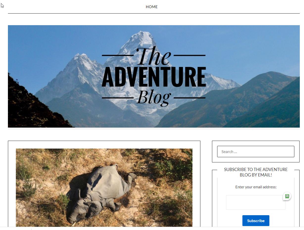
STAGING:

PAGE HERO SETTINGS:


Any help would be greatly appreciated. Thank you
October 9, 2020 at 10:22 am #1480834Leo
StaffCustomer SupportHi there,
Can you try adding some top and bottom padding in the page hero?
Let me know 🙂
October 9, 2020 at 10:28 am #1480850That seemed to have done the trick. I had to add 400px padding at the top.
October 9, 2020 at 10:44 am #1480877Thank you!
October 9, 2020 at 11:19 am #1480921StaffCustomer SupportNo problem 🙂
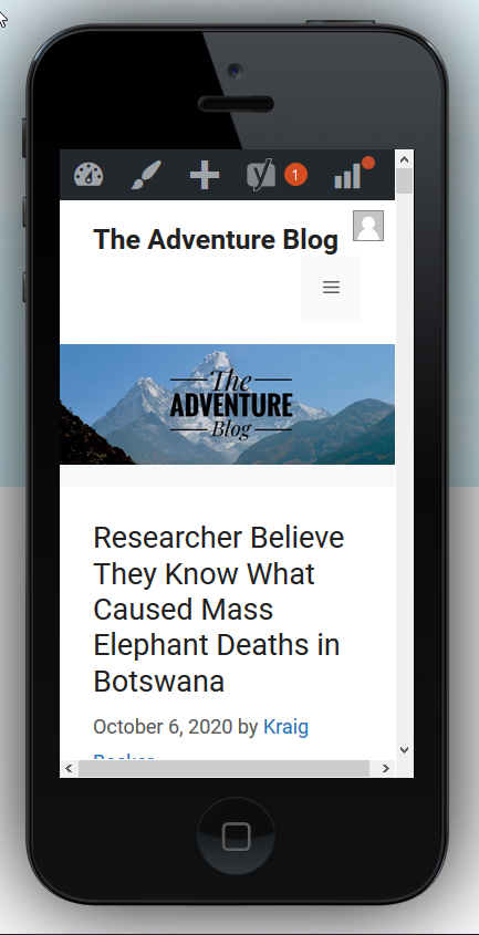
October 9, 2020 at 6:15 pm #1481305Any tips to make it look decent on mobile?
Staging

Old Theme
 October 9, 2020 at 7:54 pm #1481370StaffCustomer Support
I’m guessing your old site is using static image (response) as opposed to the background image (not responsive) in page hero.
If you are not adding any content on top of the image, then you can just use the featured image option:
https://docs.generatepress.com/article/adding-featured-images/If this doesn’t help, can you link me to the page in question?
October 9, 2020 at 9:05 pm #1481421Would this work to only display it on the home page? If so, I am not sure how to do so as the only “pages” I have are contact & privacy policy.
October 10, 2020 at 6:13 am #1481844David
StaffCustomer SupportHi there,
you can use % top and bottom padding.
First calclulate the original image aspect ratio ie.Height(px) / Width(px) * 100 = %
Now add that as you combined top and bottom padding.
Ef. if the aspect ration is 56% then set top and bottom to 28% each.This will keep the header image responsive.
October 10, 2020 at 1:46 pm #1482533Ok, so I tried this and got it to look decent on mobile, but it’s weird on desktop. This is the math I did:
image is 422 x 1200
(422/1200)*100 = 35.17
On mobile I set this:

Looks like this:
on desktop when I choose these settings:

I get this:

Thanks
October 10, 2020 at 7:35 pm #1482706StaffCustomer SupportCan you link us to the page in question?
October 10, 2020 at 10:14 pm #1482785Yes, thank you:
https://staging.adventureblog.net/
You will get an SSL error as this in on staging and I don’t have an SSL cert installed for the staging sub domain.
October 11, 2020 at 5:03 am #1483109StaffCustomer SupportFor Desktop you will need to use Pixel Padding to size the image. As the % method i provided only applies when the Featured Image spans full width.
October 12, 2020 at 7:01 am #1484768Is there a calculation for how much padding (pixels) I should use for desktop too? I can get it to look good on my laptop, but on other resolutions, it cuts off pretty badly.
October 12, 2020 at 7:44 am #1484858StaffCustomer SupportAs there is no content for your image it may be easier to remove the background image and all the padding and add this to the content:
<img class="hero-image" src="full_url_to_your_image/image.jpg" />just update the URL and make sure the original image is the width of the hero element.
This will then display the full image regardless of screen size. -
AuthorPosts
- You must be logged in to reply to this topic.