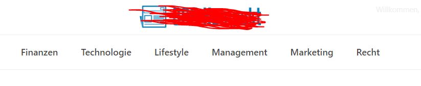
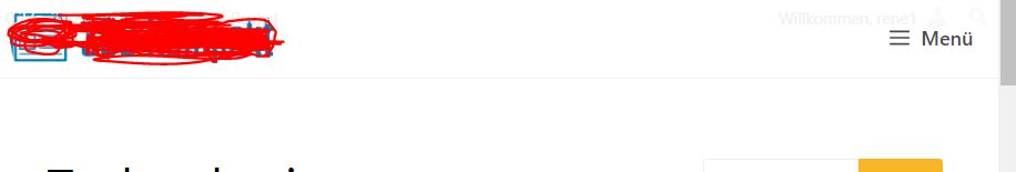
As a result, the desktop version did not look as desired. Have now made the setting you mentioned and adjusted the rest with SCSS.
Desktop
Mobile
Code (SCSS)
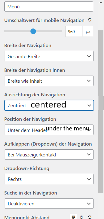
$mobile-menu-breakpoint: 960px;

.main-navigation{

    border-bottom: 1px solid var(--border);

    @media (min-width: $mobile-menu-breakpoint){
        border-bottom: none;
    }

    #primary-menu{
        border-top: 1px solid var(--border);
        border-bottom: 1px solid var(--border);
        @media (min-width: 1px) and (max-width: $mobile-menu-breakpoint){
            border-bottom: none;
        }
    }

    #primary-menu li a{
        text-align: center;
    }

    @media (min-width: $mobile-menu-breakpoint){
        #primary-menu li:hover a{
            font-weight: 700;
            -webkit-box-shadow: inset 0px -2px 0px 0px rgba(0,0,0,1);
            -moz-box-shadow: inset 0px -2px 0px 0px rgba(0,0,0,1);
            box-shadow: inset 0px -2px 0px 0px rgba(0,0,0,1);
        }

    }

}
@media (min-width: $mobile-menu-breakpoint) {
    .navigation-branding, .main-nav{
        width: 100%;
        justify-content: center;

    }
    #menu-hauptmenu{
        justify-content: center;
    }
}
.