
Archived topic
Main menu same as blog.appsumo.com
3 replies · Started by René on February 1, 2023
Viewing posts 1–4 of 4
Hey, how can I make a main menu like AppSumo (https://blog.appsumo.com/)? It currently looks the same on desktop as it does on AppSumo, but in the responsive view the burger menu doesn't slide to the top right, but stays centered under the logo.
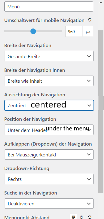
Hi there,
go to Customizer > Layout > Header and enable the Mobile Header.
As a result, the desktop version did not look as desired. Have now made the setting you mentioned and adjusted the rest with SCSS.
Desktop

Mobile

Code (SCSS)
$mobile-menu-breakpoint: 960px;

.main-navigation{

    border-bottom: 1px solid var(--border);

    @media (min-width: $mobile-menu-breakpoint){
        border-bottom: none;
    }

    #primary-menu{
        border-top: 1px solid var(--border);
        border-bottom: 1px solid var(--border);
        @media (min-width: 1px) and (max-width: $mobile-menu-breakpoint){
            border-bottom: none;
        }
    }

    #primary-menu li a{
        text-align: center;
    }

    @media (min-width: $mobile-menu-breakpoint){
        #primary-menu li:hover a{
            font-weight: 700;
            -webkit-box-shadow: inset 0px -2px 0px 0px rgba(0,0,0,1);
            -moz-box-shadow: inset 0px -2px 0px 0px rgba(0,0,0,1);
            box-shadow: inset 0px -2px 0px 0px rgba(0,0,0,1);
        }

    }

}
@media (min-width: $mobile-menu-breakpoint) {
    .navigation-branding, .main-nav{
        width: 100%;
        justify-content: center;

    }
    #menu-hauptmenu{
        justify-content: center;
    }
}
Glad to hear you found a solution
This archived topic is closed to new replies.