
Archived topic
Widgets
10 replies · Started by Anonymous on July 22, 2015
Hi,
Am having a little problem with my sidebar widgets, the widget don't usually have their full width is either they float to the right or left or just looks tiny, so I sometimes use margin-left or right in my CSS to position them but this always affect the responsive layout of the site on different screen sizes. Am using Jetpack facebook widget and twitter timeline widget right now, the facebook widget seems ok but the twitter widget is having the same problem.
Can you link me to your site so I can take a look at what's going on possibly?
Thanks for replying, my site is not online yet, am still working/hosting it offline then use ftp client to upload it online when completed.
No problem - any chance you can take a screenshot of the issue so I can see it?
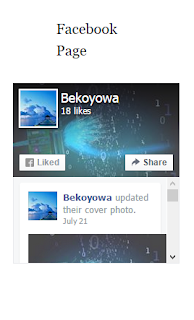
Yes, here  it looks as if it float to the right, I was able to align it perfectly on the desktop with CSS but this affect the responsiveness which I have to start writing different media queries to achieve. the widget area works great for other widgets but the facebook and the twitter widgets for some reason not cooperating have tried different widget plugin for the facebook and twitter but always come out the same. The widget in the image is Facebook Like Box (Jetpack).
Hmm, very difficult for me to know what's going on without being able to look at the code.
What's the CSS you added for desktop?
.fb-page{
width: 230px !important;
margin-left: -60px !important;
margin-right: 60px;
}
What happens when you remove that code completely?
When I removed the code I got that in the picture above. But with the code I got this
You can try to use that CSS only on desktop:
@media (min-width:767px) {
      .fb-page{
            width: 230px !important;
            margin-left: -60px !important;
            margin-right: 60px;
      }
}OK, thanks