Archived topic
Translatepress - switcher tabs mobile & desktop
20 replies · Started by Kumar on September 29, 2020
Hi GP team,
Could you please help me with language switch on desktop & mobile menu
This is where I would like to display the language switch as a drop down
Desktop - https://snipboard.io/8LkHsW.jpg
Mobile - https://snipboard.io/rO6vPX.jpg
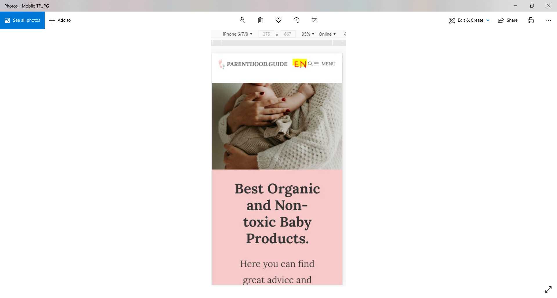
Also, can you please tell me how can I remove the word "menu" on the mobile? (Leaving only serach & hamburger icons/three lines)
I am using the latest version of GP 3.0 & GP premium.
Translation plugin - Translatepress
Their docs on the switch - https://translatepress.com/docs/settings/#language-switcher
You have three options to display language switchers on the site:
Shortcode ( Use the [language-switcher] shortcode on any page or widget. )
Menu item ( Go to Appearance -> Menus to add Language Switcher Languages in any menu. )
Floating language selection ( Have a floating dropdown following the user on every page. )
Thanks
Kumar
Hi there,
which version of GeneratePress Theme are you using? Are you using 3.0 beta ?
Hi David,
GP Theme Version 3.0.0-alpha.5
GP Premium Version 1.12.0-rc.1
Thanks
Kumar
You can use a Hook Element to add the switch short code.
https://docs.generatepress.com/article/hooks-element-overview/
You will want to use the generate_menu_bar_items hook that was added to 3.0.
May need a little CSS to re-order it - happy to help with but we will need to the site once the code is added.
Hi David,
I have added - links below.
Thanks
Kumar
Can you provide the link to your site so we can help with the CSS?
Screenshots don't really help for cases like this.
Thanks!
Looks like I hadn't clicked generate shortcode. Now updated screen print below.
Needs tweaking.. with css for mobile and desktop.
URL below.. sorry
Looks like it's positioned correctly already?
https://www.screencast.com/t/0ntDSp6Y
Unfortunately No.
Desktop - I would like it after search
Mobile - closer to the logo and want to remove the word "menu" (logo -space - Language - space- Serach - hamburger)
Thanks
Kumar
Try this CSS for desktop first:
.main-navigation .menu-bar-items {
    flex-direction: row-reverse;
}
To remove menu text on mobile, this should help:
https://docs.generatepress.com/article/mobile-menu-label/
Can you disable all of your caching plugins so I can take a closer look at the mobile code?
Thats great. Desktop works perfect and as expected.
Mobile looks cluttered at the moment.
When I look in the customiser its doesn't show text "menu" for mobile but on developer tool & mobile browser it shows the text "menu" next to the hamburger. If we remove the text - it will give us additional space so that it doesn't break to the next line.
Just to confirm, this field is empty for you?
https://www.screencast.com/t/hUScXusu
Hi Leo,
I can confirm it is empty. Please see below:
Primary menu
https://snipboard.io/960jSW.jpg
Secondary Menu
https://snipboard.io/lWFG69.jpg
Please see below box.
I added a space to the Menu Label field. Published the changes. Then i removed the space from the Menu Label field and published changes again. This fixed the issue.