
Archived topic
Style Product Categories in left sidebar
10 replies · Started by Mathias on October 5, 2018
Hi GP!
Really love the support in this forum!
I am currently migrating my WooCommerce shop to GP. The default product category widget looks like this:
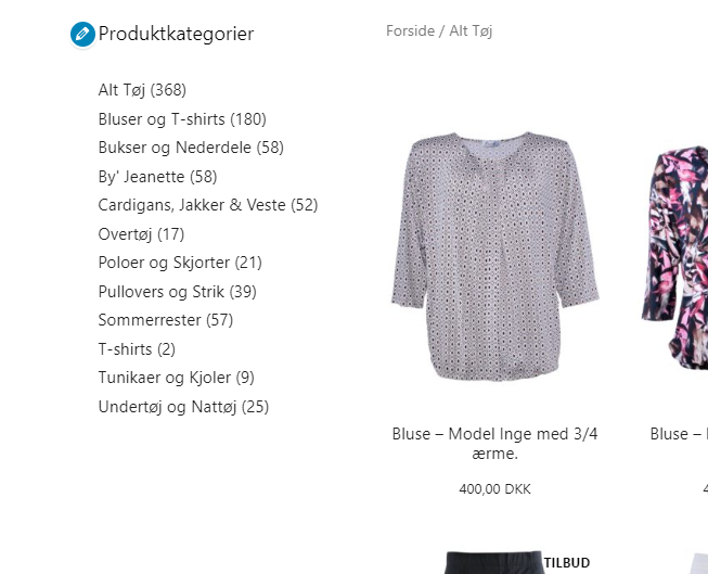
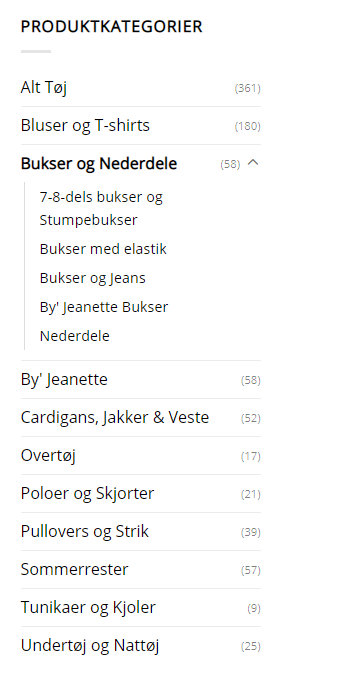
On desktop I am trying to replicate the look on my old site:
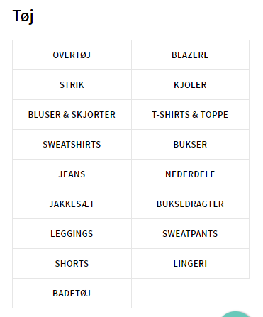
And on mobile/tablet I am looking for something like this table look above the product list:
I am not the strongest CSS person on this planet, to put it mild. Can you guys guide me in the right direction?
Best,
Mathias
Hi there,
this CSS will deal with the desktop:
.woocommerce .widget_product_categories ul li {
    display: flex;
    line-height: 1.7em;
    border-bottom: 1px solid #ddd;
    margin-top: 0.35em;
}

.woocommerce .widget_product_categories span.count {
    color: #ddd;
    margin-left: auto;
    font-size: 0.8em;
}
The tricky part is the tablet columns, doable but some of your category names wrap onto 2 lines.
Seriously. I have to start by telling you how crazy good support you guys do. This is my third support ticket on this forum. Each time you have answered almost instantly - and not just guided my but actually provided the solution. I can't stress enough how impressed I am!
To the solution. Thank you David! It's perfect. There is just one minor bug:
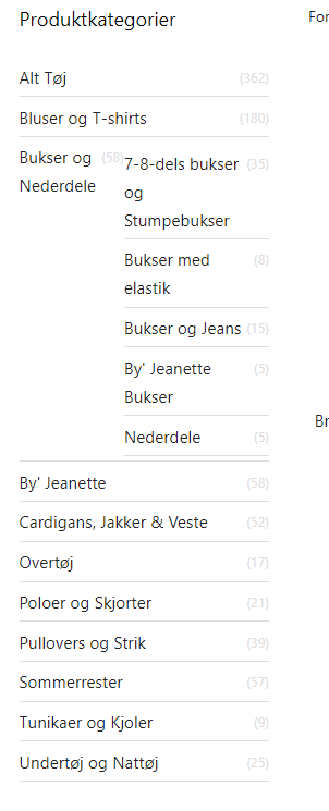
Also, can you help me adding an "Arrow" to the categories with subcategories and give those categories "dropdown behaviour" when the arrow is clicked?
Regarding the mobile solution: I just moved my sidebar to the top of the page instead of the tables - it looks awesome!
Best,
Mathias
Thank you for the feedback. We try out best.
So try this updated CSS - i have added the browser prefixes to the flexbox to cover legacy support:
.woocommerce .widget_product_categories ul:not(.children)>li {
    display: -webkit-box;
    display: -ms-flexbox;
    display: flex;
    line-height: 1.7em;
    border-bottom: 1px solid #ddd;
    margin-top: 0.35em;
    -ms-flex-wrap: wrap;
        flex-wrap: wrap;
}

.woocommerce .widget_product_categories span.count {
    color: #ddd;
    margin-left: auto;
    font-size: 0.8em;
}

.woocommerce .widget_product_categories ul.children {
    padding: 1em;
    border-left: 1px solid #ddd;
    flex: 1 0 100%;
}

.woocommerce .widget_product_categories ul.children span.count {
    display: none;
}

.woocommerce .widget_product_categories ul:not(.children)>li.cat-parent span:after {
    content: '+';
    font-size: 20px;
    font-weight: 900;
    color: #000;
}
.woocommerce .widget_product_categories ul:not(.children)>li.cat-parent span.flipped:after {
    content: '-';
}
I have added plus and minus for the toggle, unicode html caret up / down goes a little bit funky.
Then give this JS a shot:
<script>
jQuery( document ).ready( function($) {
    $(".cat-parent ul").hide();
    $(".cat-parent > span").click(function() {
      $(this).next("ul").toggle();
      $(this).toggleClass('flipped');
    });
});
</script>Thanks David! It solved it for the "Bukser og Nederdele", but it looks like this on desktop:
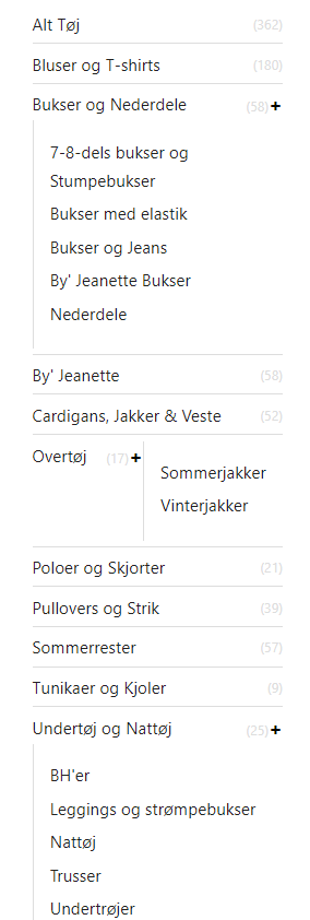
and like this on tablet:
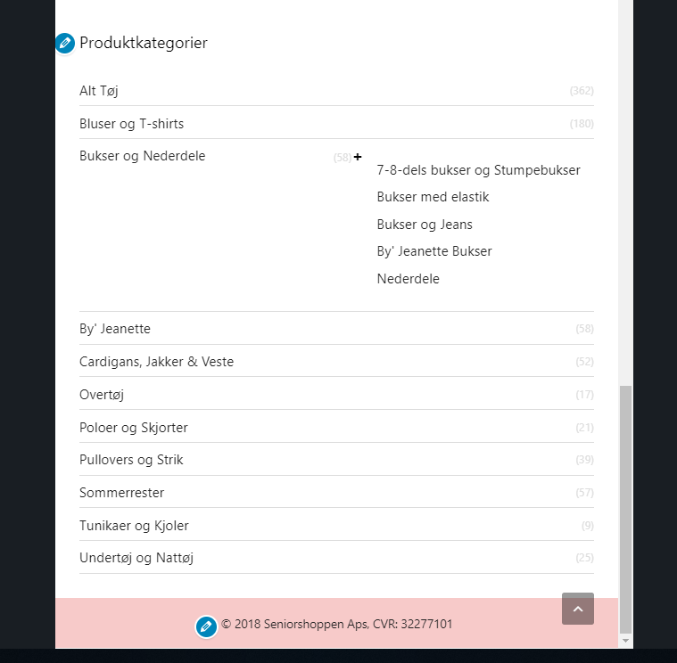
and like this on mobile:
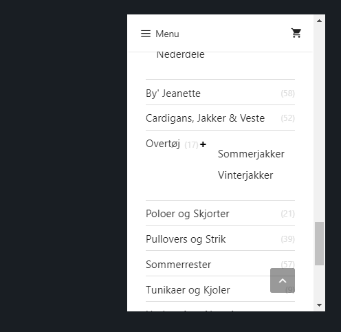
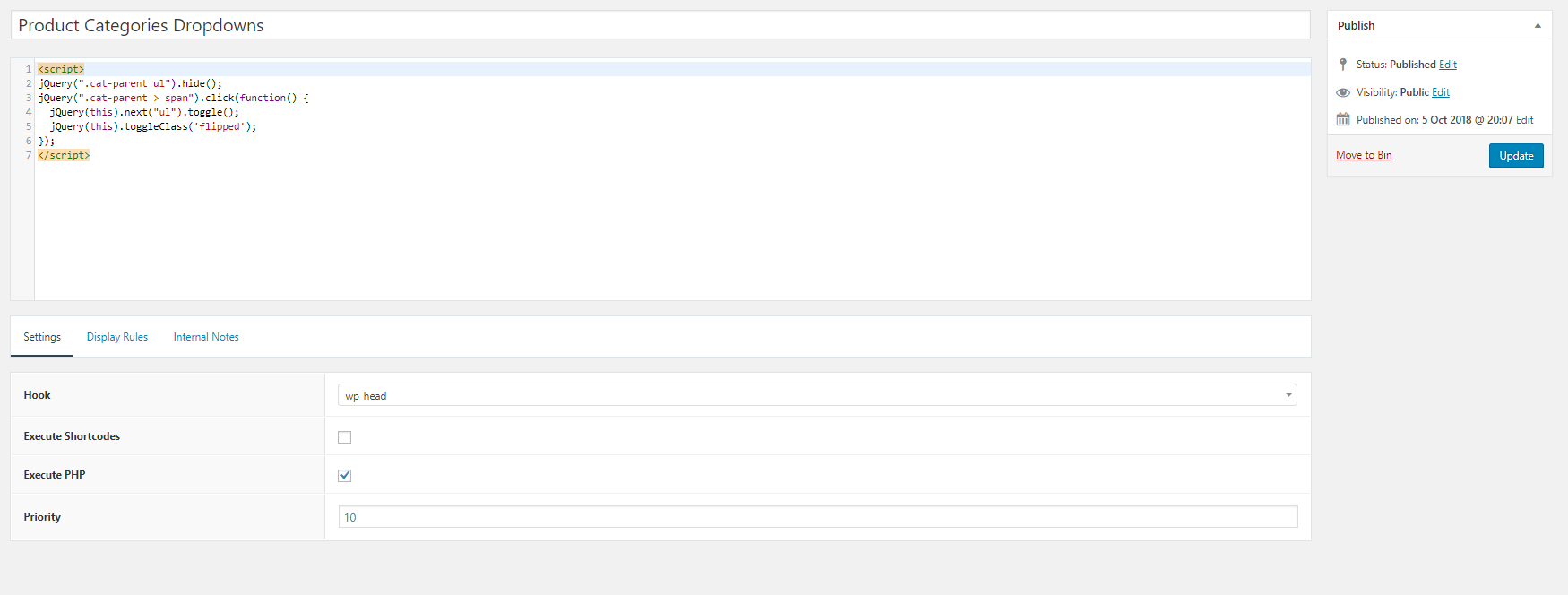
Also, the JS does not work. I added it with elements like this. Is that correct?
Best,
Mathias
I just stumbled on this. I am basically looking for the functionality seen in the right sidebar menus here. If that helps you a bit David.
I updated the CSS and JS here
You are the man David! It works perfect!
Thanks David!
Awesome! Glad i could be of help
Hi David, I was looking to do something very similar and used the code above but it did not work for me.
Am I missing something?
Hi there,
might be best if you raise a new topic - ( add the URL of this topic to it so we can keep track ) - you can then use the Site URL field to then share your site privately so we can have a look.