
Archived topic
Sticky Menu ALWAYS visible, not just on scroll: how?
11 replies · Started by Piccia on June 7, 2017
Hi there, I think I might have posted on this before but cannot find the thread and never received a notification, so if that's the case sorry in advance.
The client wants the menu to be *always* visible, not just appear as you scroll down. How do I achieve that? I just can't work it out.
The website is behind a password so if you want to see, let me know in a private answer if possible.
Many thanks
Piccia
Hi there,
I think this is what you are looking for: https://docs.generatepress.com/article/navigation-logo/#navigation-as-header
Let me know.
That's great, thank you Leo!
However, now the menu goes on two lines even though I have set the width to full:
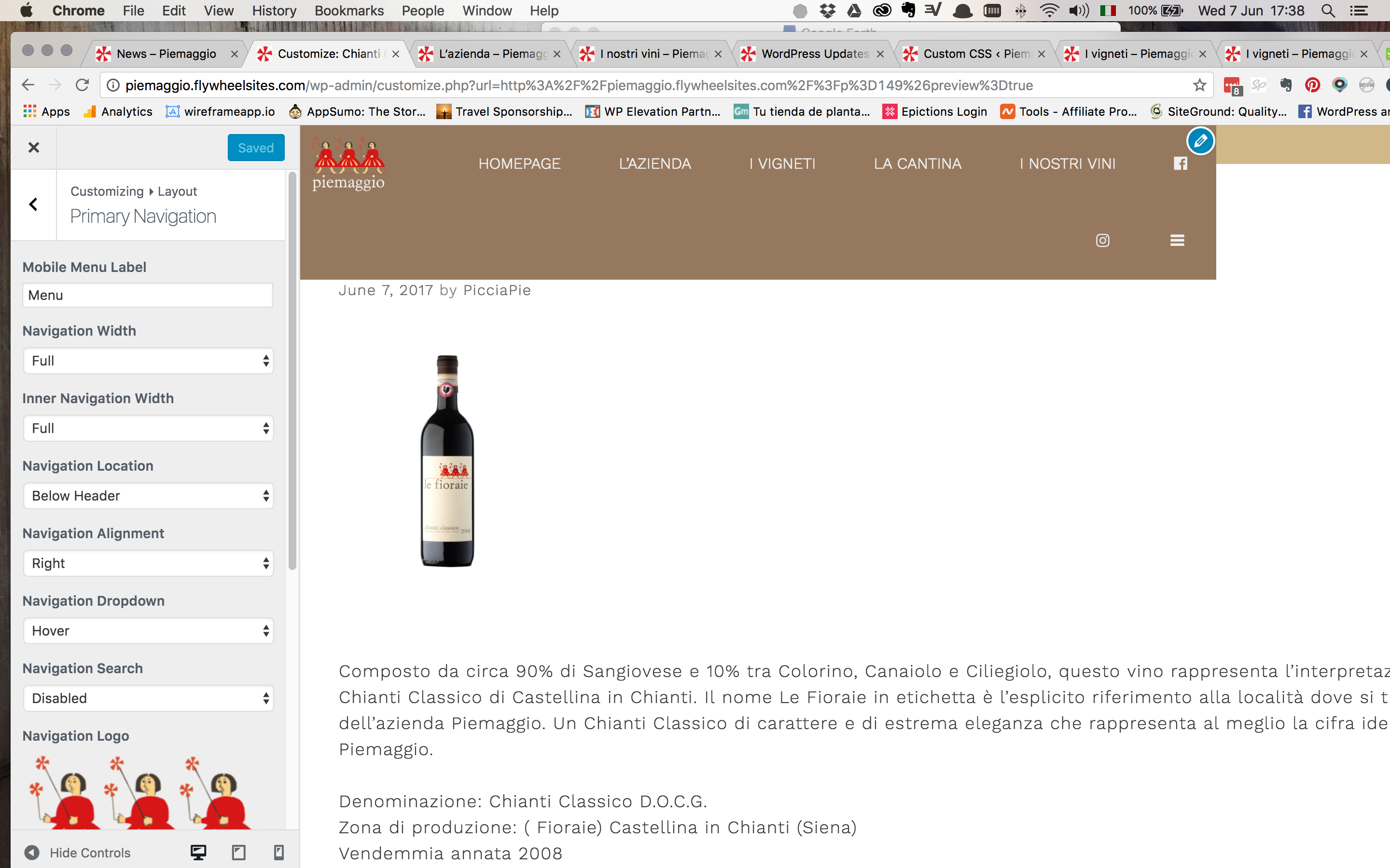
Any idea how to avoid that?
Thank you
Try adjusting the menu item width: https://docs.generatepress.com/article/secondary-menu-item-height-width/
Unfortunately adjusting menu item width has done nothing. Also, that's set as primary nav, so why would secondary help? Also not sure why it's just not full width when I've set it to full width.
Any other ideas? thank you in advance
Oops sorry wrong link: https://docs.generatepress.com/article/menu-item-height-width/
Is the outer set to full width? https://docs.generatepress.com/article/navigation-layout/
Yes it is set to full width, see screenshot posted earlier:
Adjusting the menu item width only makes the menu wider, but still on two lines. So it doesn't help unfortunately.
Looks like something is going on with the container width.
Can you provide a link to your site? You can send it through Account Issue here and just mention the topic:
https://generatepress.com/contact/
In your custom CSS, you have this:
.main-navigation {
    position: absolute;
    width: 100%
    left: 60x;
}
You're missing a semi-colon after the 100%, so it should be this:
.main-navigation {
    position: absolute;
    width: 100%;
    left: 60px;
}I am officially a plonker. Thank you Tom and Leo and sorry.
Resolved.
No worries! Glad I could help :)