Archived topic
Padding problem
13 replies · Started by Leo on April 21, 2021
Hello,
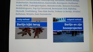
I have set up a new element (type: post navigation) which looks fine, except for one small thing: the padding does not seem to work properly for the smartphone settings (unless I am doing something wrong, of course) .
The element is in two parts: the left part is left-aligned and the right part is right-aligned (as per your YouTube video) and each part includes two headlines. The left-aligned second headline does not seem to obey the padding, whereas its right-aligned counterpart does.
Padding details for both parts are:
Top = 4
Right = 10
Bottom = 4
Left = 10
Please see the private information box, where you will find two screenshots to make things a bit clearer.
It looks as if the left-aligned side of the element ignores the padding number for the right end side, which is set to 10. And even when I put it to 50 or so, nothing happens. As you can see, the (mirrored) right-aligned equivalent looks fine.
Many thanks.
Hi there,
could you share a link to the page where i can see the incorrectly aligned content ?
Dear David,
Thank you so much for your prompt reply. Please go to the end of myberlin.nl/archieven/8870 to see the error (smartphones only, no problem for tablets and desktop). The left-aligned link refers to the previous article, which has a rather long title and this seems to cause it.
If you look at the bottom of this page: myberlin.nl/archieven/8550 you will find a link to the same article. However, this time the link refers to the next article and is therefore right-aligned. The error does not occur.
I hope this helps. Many thanks.
Hi Leo,
It's because you gave the H3 headline a -30px right margin.
https://www.screencast.com/t/cwc0cvfPmvsh
It's not the best way to achieve what you are looking for.
Try to remove the margins of the headlines, set left/right paddings for headlines, remove the left/right padding for the container.
Hope that helps.
Dear Ying,
Thank you so much, that worked. You're the best!
Kind regards,
Leo
Glad to hear that :)
You are welcome!
Dear Ying,
I am terribly sorry having to bother you again, but I just discovered that the tablet view appears to be incorrect. No matter how I try, the second part of the block keeps appearing underneath the first part instead of next to it (although the preview in the elements editor looks fine). In fact, the desktop and the tablet previews look identical in this regard - but not in reality. As an example, could you maybe have a look at:
http://www.myberlin.nl/archieven/8870 (in tablet mode)
to see what I mean.
Undoubtedly, I am doing something wrong, but I believe I have now tried all options - without any luck. Thank you so much for helping me out again!
Best wishes
Leo
Hi Leo,
No worries :)
It looks fine to me:
IPad: https://www.screencast.com/t/X6yinQYrDBh
IPad pro: https://www.screencast.com/t/fNDvFNyG
I don't have an actual device to test, but I assume it should be right.
Could you try to clear your browser cache on your tablet and see if it works?
Let me know :)
Dear Ying,
Thank you for being so patient with me!
Here are three screenshots:
https://i.postimg.cc/R0v1ygQB/desktop.jpg
(desktop view)
Everything looks fine here!
https://i.postimg.cc/nct1qVjr/tablet7-lk.jpg
(this is taken from my old, 7 inch tablet)
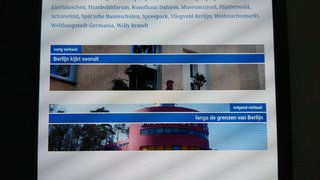
The two containers are now indeed shown next to each other, but they have different heights because of the additional headline in the second container. How can I avoid this? I noticed that this is also the case for the smartphone view, whereas the desktop view does not have this issue.
https://i.postimg.cc/k5kS9wWG/tablet10-lk.jpg
(this is taken from my 10 inch samsung 5e tablet)
As you can see, the second container still appears underneath the first and not next to it, as it should. I emptied the cache and I even installed a different browser for this purpose, but the outcome is the same.
These two issues are like a real puzzle to me, but I simply do not see the solution. I have gone through all sorts of settings, but in vain.
Thank you again for helping me out!
Best regards
Leo
For the two containers are not the same height issue, it might be a browser supporting issue if the browser is too old. The code should make the two containers the same height regardless of how many lines the titles have. Maybe try another device? Too bad I don't have a tablet to test.
For the Samsung 5e tablet, does the sidebar move down like the behavior on mobile? If so, it's been treated as a mobile, make sure its resolution is at least 769px in width.
Sorry, I can't test, hope it'll work out.
Dear Ying,
Thank you once more for your quick reply! I believe that I've found what causes the problem: for tablets and smartphones the second container is shown underneath the first whenever the view is NOT set to "Desktop Site". This is at least true for both Firefox and Chrome. As soon as the view is switched to "Desktop Site" the two containers appear next to each other, as they should. I suppose that there is no option to have the containers next to each other in the non-desktop site view as well?
However, I have noticed that there is still something else that does not seem quite right (for desktop, tablet and smartphone views alike): kindly have a look at this image:
https://i.postimg.cc/7PzNnXjX/different-heights.jpg
and you will see that the height of the containers depends on the number of lines in (one of) the containers. If two or more lines are required because the title is too long for just one line both images are pulled downwards (so to speak). As a result, the aspect ratio between width and height is no longer correct. Is there an option to change this: I would rather like to see that the header showing the title (be it one line or two or three) works like a banner partially hiding the images, so that the height of the images always remains the same. Would this be possible?
Let me take this opportunity to say how impressed I am with both the incredible amount of options GeneratePress Pro offers and your excellent service!
Regards,
Leo
Hi Leo,
Seems it's that setting which treats the site as a mobile site on tablets, unfortunately, we can't really do anything about it, sorry for that.
If you'd like them to show side by side on mobile as well, then change their container width to 50% under the mobile view as well, though it might not look good on a smaller screen, but worth a try :)
For the image height issue, the image height equals to the height of contents plus the padding you set, so yes, it changes when content height changes.
Try this CSS, it gives the container a fixed height.
.gb-grid-wrapper.gb-grid-wrapper-6f53de6e > .gb-grid-column > .gb-container {
    height: 150px;
}Dear Ying,
Thank you so much for your prompt reply. I have followed up your suggestion to change the container width, but you are right: it does not really look good. It is only a small thing, though. I am very pleased about the solution you sent me for the height issue: it is perfect!
I will continue to explore the countless opportunities GeneratePress offers: it is extremely well done and the documentation, the tutorials and the customer service are excellent!
Thank you again!
Regards
Leo
You are very welcome Leo :) Always glad to help.
I think Tom will be proud to read your comment here!