- This topic has 5 replies, 3 voices, and was last updated 4 years, 4 months ago by
Leo.
-
AuthorPosts
-
December 21, 2021 at 10:01 am #2055934
Ben
Hello,
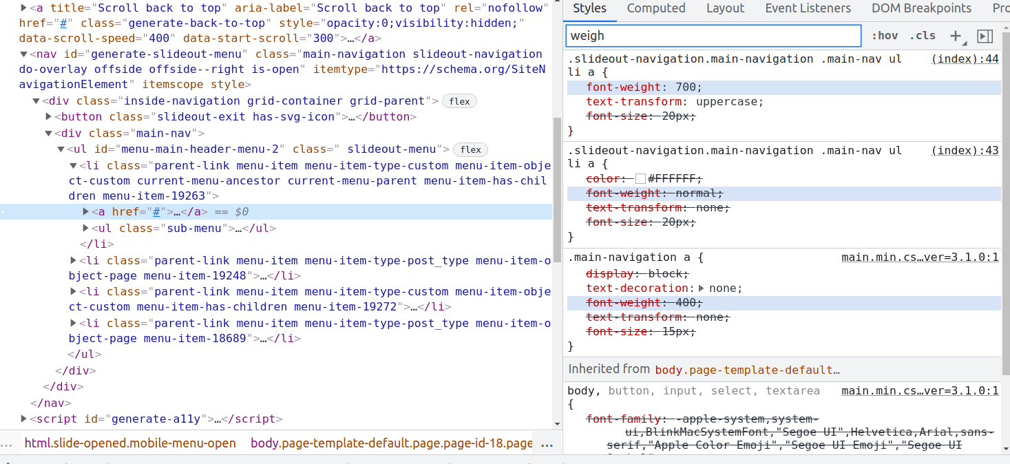
The off canvas panel typography settings (font weight and text transform) are not working on this site: https://staging.drjacquelinehayes.com/
I was able to change the colour settings in the customizer. When I try to change the typography settings I see no change in the frontend and in the dev tools I see the following:Font weight and text-transform declarations are printed twice with the ‘text-transform: uppercase’ and ‘font-weigh: 700’ settings overwriting the desired settings (‘text-transform: none’ and ‘font-weight: normal’)
There was no change when disabling all plugins except for GP premium, or from disabling the child theme.
How can change the off canvas typography settings?
December 21, 2021 at 11:39 am #2056008Ying
StaffCustomer SupportHi Ben,
You are still using the old typography options, would you consider switching to the new typography system?
The new system would be easier to use, for more info: https://docs.generatepress.com/article/switching-to-dynamic-typography/
And I noticed that when I change the setting in customizer, its preview shows the correct result, but not the case in frontend. You might have server level cache enabled, can you check with your host to clear the server cache?
Let me know 🙂
December 23, 2021 at 7:59 am #2057758Hi Ying,
Yes, server side cache was enabled for logged in users. I’ve disabled the server side cache plugin now.
I changed to the dynamic typography system. I can now style the typography of the off canvas panel.
One problem I’ve discovered is how my child theme style.css rem units are interpreted by the browser. I did have the following css in my child theme:/* Set html font size as a reference for rem units used below */ 1 /* Mobile */ 2 @media (max-width: 768px) { 3 html, body { 4 font-size: 18px 5 } 6 } 7 8 /* Tablet */ 9 @media (min-width: 769px) and (max-width: 1024px) { 10 html, body { 11 font-size: 18px 12 } 13 } 14 /* Desktop */ 15 @media (min-width: 1025px) { 16 html, body { 17 font-size: 19px 18 } 19 }Previously, the blockquote font-size of 1.2rem was computed as 22.8px on desktop (19px X 0.2 = 3.8, 19 + 3.8 = 22.8). Now using GP dynamic typography to define dynamic base font sizes the blockquote font size is computed as 19.2px.
Do you know why this is happening?
thanks for your support
December 23, 2021 at 5:40 pm #2058089Leo
StaffCustomer SupportSounds like the original topic has been resolved?
If so can you open a new topic for the separate question?
Thanks 🙂
January 4, 2022 at 7:50 am #2068890Ok thanks Leo. I’ve created a new topic here: https://generatepress.com/forums/topic/unexpected-rendering-of-font-size-using-rem-and-dynamic-typography
January 4, 2022 at 6:55 pm #2069430StaffCustomer SupportThank you!
-
AuthorPosts
- You must be logged in to reply to this topic.