- This topic has 10 replies, 3 voices, and was last updated 3 years, 5 months ago by
Ying.
-
AuthorPosts
-
November 9, 2022 at 8:50 am #2408528
HansRuedi
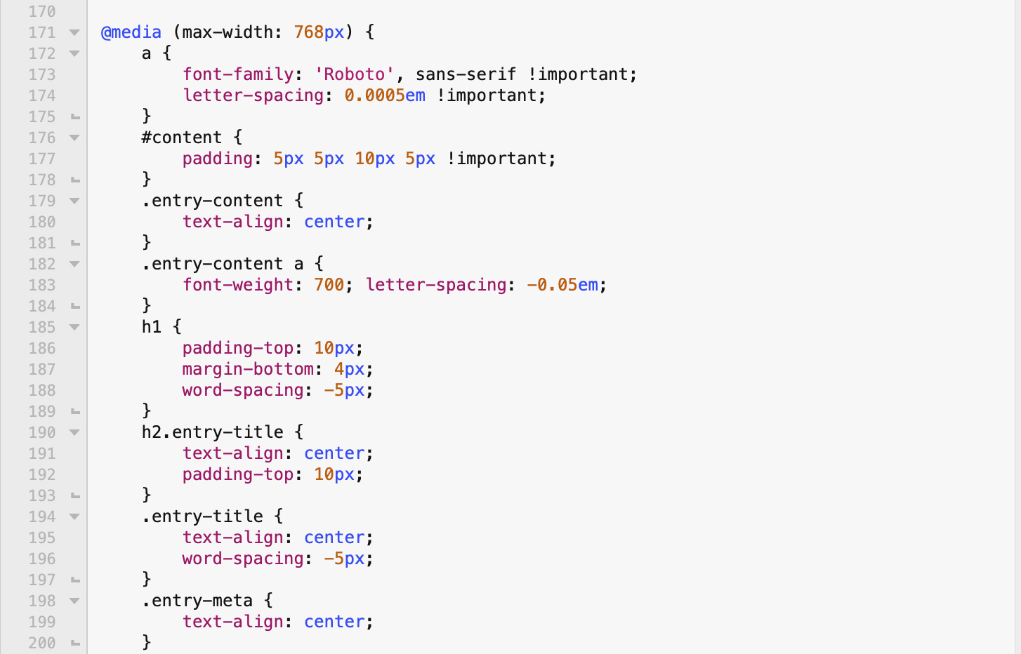
Some elements with special params defined in style.css with *@media (max-width: 768px)* AND some elements without individual params no longer show up correctly since update to GP 3.2.2 and GP Premium 2.2.1 on mobile device (and ONLY on mobile device, other words with Safari on iPhone). Yes, cache on mobile is empty…
e.g. #content { padding: 5px 5px 10px 5px !important; }, all pseudo-elements etc.
I never had this problem before.
November 9, 2022 at 8:52 am #2408531PS:
Sorry for that «r» in title (Devicer), admin pls remove.Thanks!November 9, 2022 at 9:03 am #2408550David
StaffCustomer SupportHi there,
can you share a link to a page on the site where i can see this issue ?
November 9, 2022 at 9:17 am #2408574Hi David,
Sorry to forget… Here it is:
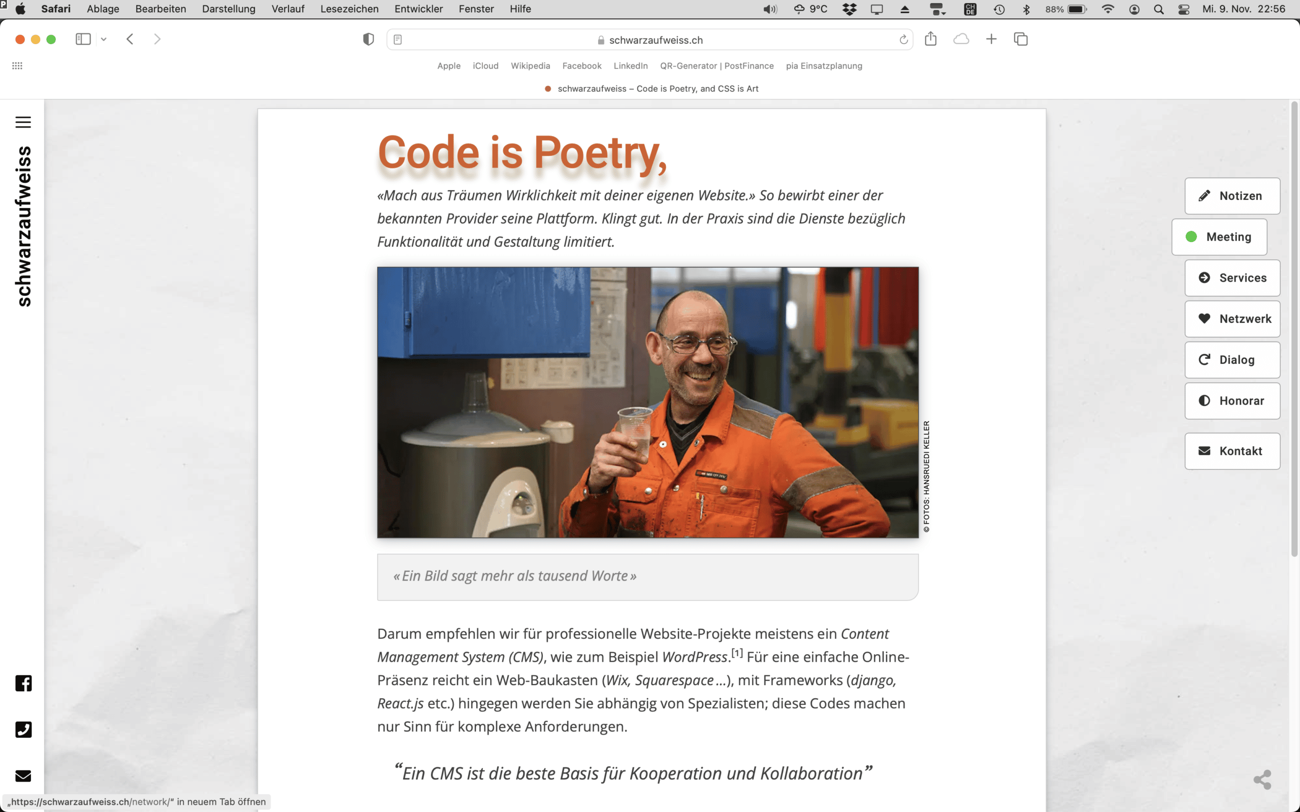
https://schwarzaufweiss.che.g. please compare…
https://schwarzaufweiss.ch/support/
…on desktop and mobile (h1)Also Slideout menu on mobile (font size) is broken
And where is now that breakpoint setting in the Customizer?
PPS: I have to leave now, will reply later if needed. Thanks!
November 9, 2022 at 10:40 am #2408693Ying
StaffCustomer SupportHi Hans,
I really can’t find the differences between the 2 h1 titles on the 2 pages, can you point out that’s different?
And this CSS for mobile
#content { padding: 5px 5px 10px 5px !important; }is there.Also Slideout menu on mobile (font size) is broken
It’s set to 20px, what does it supposed to be?
November 9, 2022 at 2:30 pm #2408935Hi Ying,
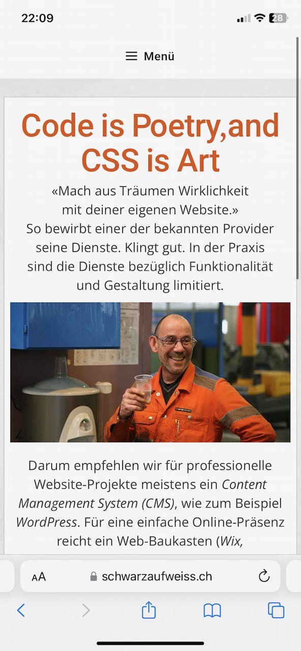
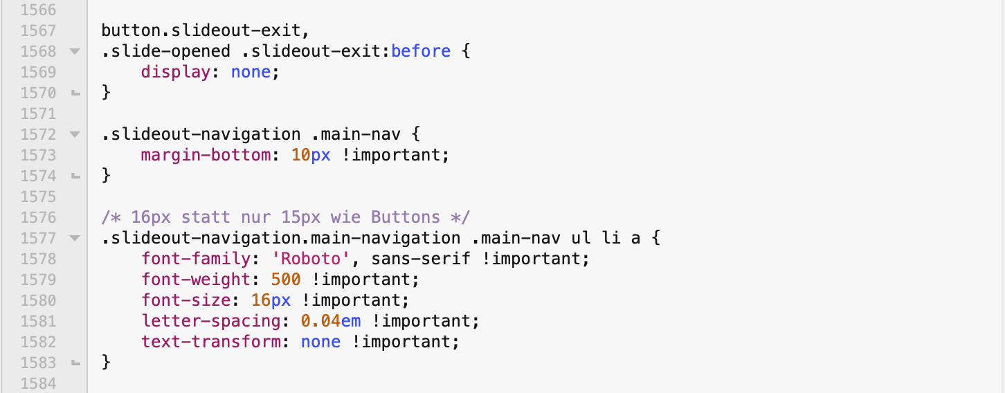
Here is a screenshot, taken on my iphone – please compare h1 to desktop (desktop is correct, pls hover h1 on desktop). And padding-top is more than 5px on mobile. All my pseudo-elements are also broken. And font-size in menu should be 16px, what’s also correct on desktop (style.css:1577) but not on mobile!
I now checked css for different elements on mobile. Since 3.2.2 and 2.2.1 mobile devices no longer load style.css of my child theme! Before everything, every element was ok.
btw: I only updated the theme and GP Premium, no other part, not WP and no other plugin.
 November 9, 2022 at 3:02 pm #2408962
…and here a screenshot of that support page with correct h1 (hover effect) on desktop:
https://schwarzaufweiss.ch/wp-content/uploads/2022/11/support-page-desktop.png
November 9, 2022 at 4:11 pm #2409019StaffCustomer SupportI can see the title on mobile is missing the text shadow and hover effect, but your CSS seems only adding text shadow and the hover effect on screens wider than 769px:
text-shadow: https://www.screencast.com/t/h5W3S0ApE3Y
hover:https://www.screencast.com/t/bOJ2M2b5Can you show me a screenshot of the CSS specifically added for mobile? And where did you add it?
For the padding, top padding added to element
#contentis 5px:
https://www.screencast.com/t/fOIwgu8mFkugBut there’s other element also has spacing, eg.
site-mainhas 20px top margin: https://www.screencast.com/t/ffOez3TMAll my pseudo-elements broke
Can you show me an example?
And font-size in menu should be 16px,
I can see you’ve set the general menu item font size to 16px on mobile, but this will be overridden by the font size setting for the off canvas menu, it’s been set to 20px, and I don’t see a setting for mobile.
November 10, 2022 at 2:19 am #2409468Hi Ying,
«I can see the title on mobile is missing the text shadow…», there was never a shadow for h1 on mobile! What you wrote, it’s only applied to h1 for screens wider than 769px (shadow doesn’t make sense for small mobile screens).
Did you see (my screenshot): On mobile both parts of h1 (support page) are now always visible, no more hover two switch between «Code is Poetry,» and «CSS is Art» (please check on desktop).
«Can you show me a screenshot of the CSS specifically added for mobile?». That hover effect isn’t available specifically for mobile or desktop…
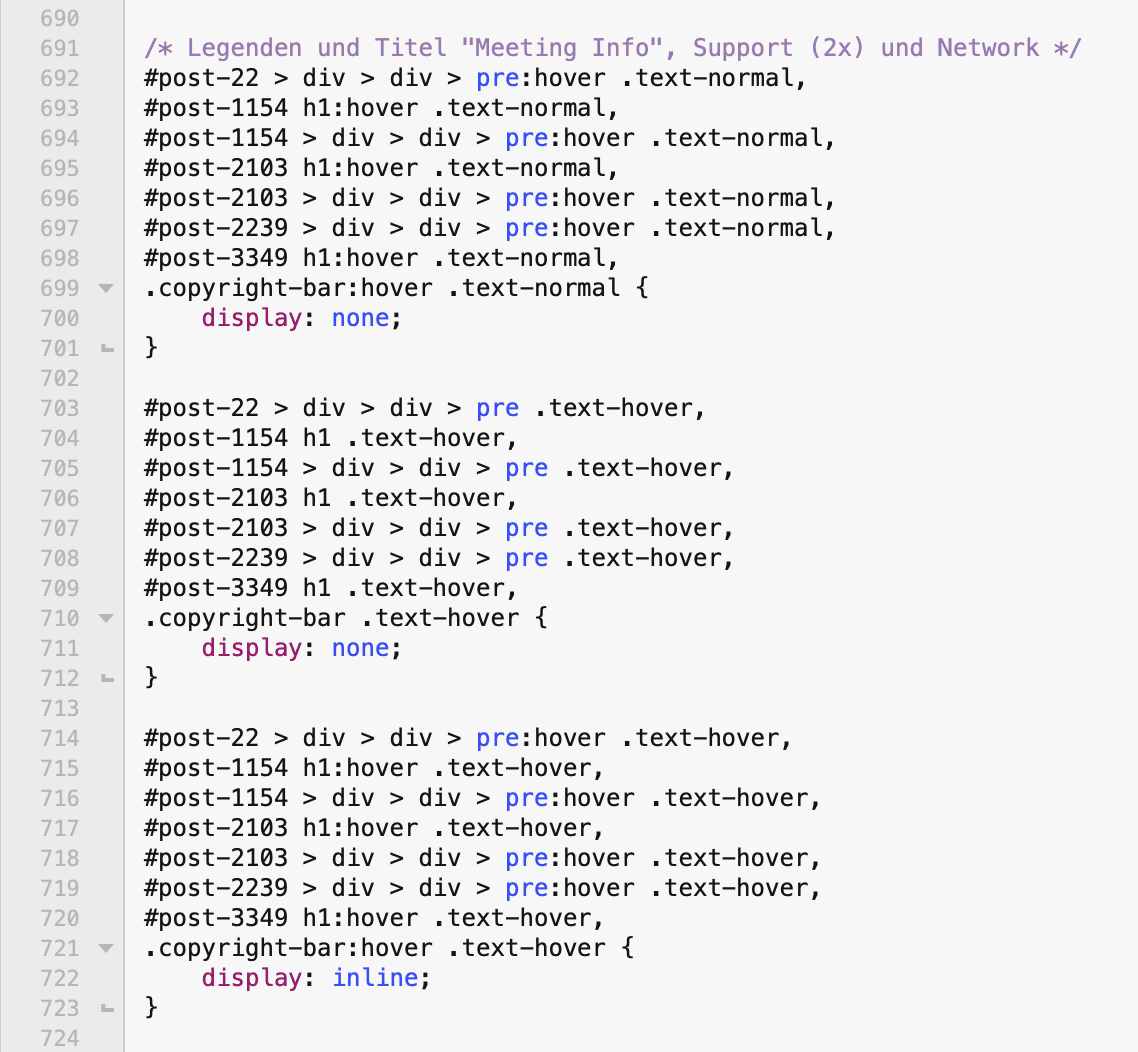
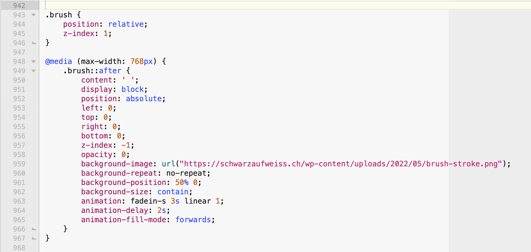
(CSS for h1 on post 1154)«Can you show me an example?» (pseudo element), here it is…
(does no longer show up)«I can see you’ve set the general menu item font size to 16px on mobile». Not only mobile, all sizes…
…«this will be overridden by the font size setting for the off canvas menu, it’s been set to 20px, and I don’t see a setting for mobile». No, on desktop it’s correct (16px), what should also be the case on mobile based on my custom css.«And where did you add it?» (Custom CSS). I was always using a child theme of GP with style.css (nothing added with > Appearance > Customize > Additional CSS but in that separate file, edited by BBEdit…).
Again: It’s not only about shadows, not about one or the other margin or padding – for me fact is that ALL custom CSS isn’t loaded for mobile screens. E.g. I have different font params for mobile in my custom CSS (word-spacing: -5px for all h1), nothing is applied…
Something changed between 3.2.1 and 3.2.2, between 2.2.0 and 2.2.1 while handling mobile screens…
November 10, 2022 at 4:22 am #2409635ok, got it. In the meantime I did a rollback… The problem seems to be in my style.css!
Searching now…
Thanks for all your support.
November 10, 2022 at 10:03 am #2410262StaffCustomer SupportGlad you’ve figured it out 🙂
-
AuthorPosts
- You must be logged in to reply to this topic.