Hi…
I just started using GP Premium yesterday and am not a sophisticated user of stylesheets or PHP, so if you are able to help me, please don’t assume I know a lot.
On a desktop, my header looks like the top picture below, but when I narrow the screen (left to right) in my browser to simulate how it will look on a cellphone or tablet, it looks like the bottom picture.
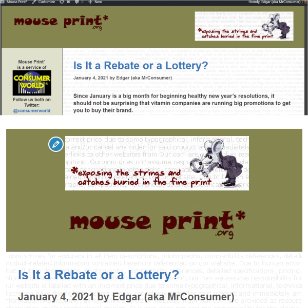
On narrow screens, I want the “MousePrint.org” logo to be the TOP graphic and the mouse and slogan to be right under it. What I get now is just the opposite.
I am NOT using the mobile header option because it substitutes a tiny logo, and I want to use the above two images.
So you know, MousePrint.org is a .jpg that I selected as the site logo in the header section. But, the mouse and slogan is a header image widget (with seemingly no options of where you want it placed). I tried using the background image option for the mouse and slogan but it aligns (too) far to the right.
Is there a simple way to implement changes so the header on small screens looks like the bottom picture above?
Thanks in advance,
Edgar
.