- This topic has 5 replies, 3 voices, and was last updated 3 years, 5 months ago by
David.
-
AuthorPosts
-
November 8, 2022 at 9:14 am #2406706
Sascha
Hi
please, allow me to handle this request here, since I use both GPP & GBP and would like to keep all my support tickets here.
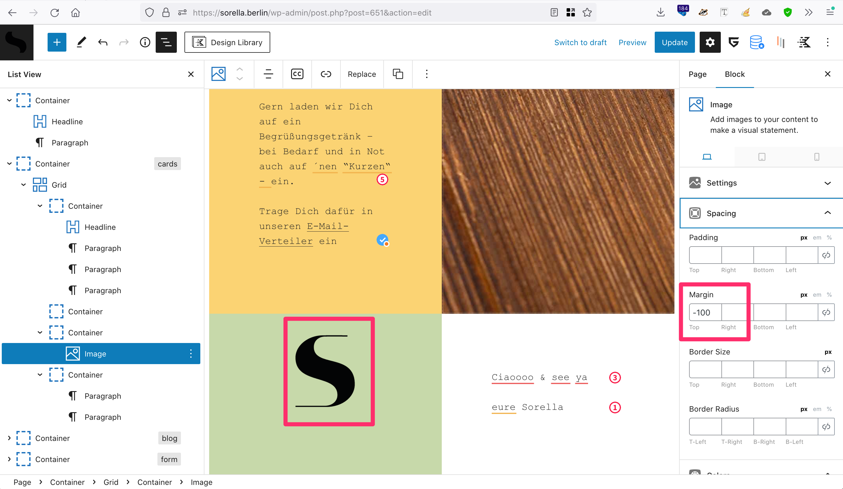
On this site, I have placed an image (“S”-Symbol) vertically between 2 cards using negative margins (screenshot). When decreasing the screen-width, the symbol starts overlapping the content of the top-card. Also, the image is not really getting smaller.
Any idea about how to position the symbol more elegantly? I’d like the symbol to “halven” the two cards on desktop & tablet (won’t display on mobile) without overlapping the content.
Thank you in advance and kind regards,
SaschaNovember 8, 2022 at 9:27 am #2406723David
StaffCustomer SupportHi there,
can you share a screenshot of how you want it appear ?
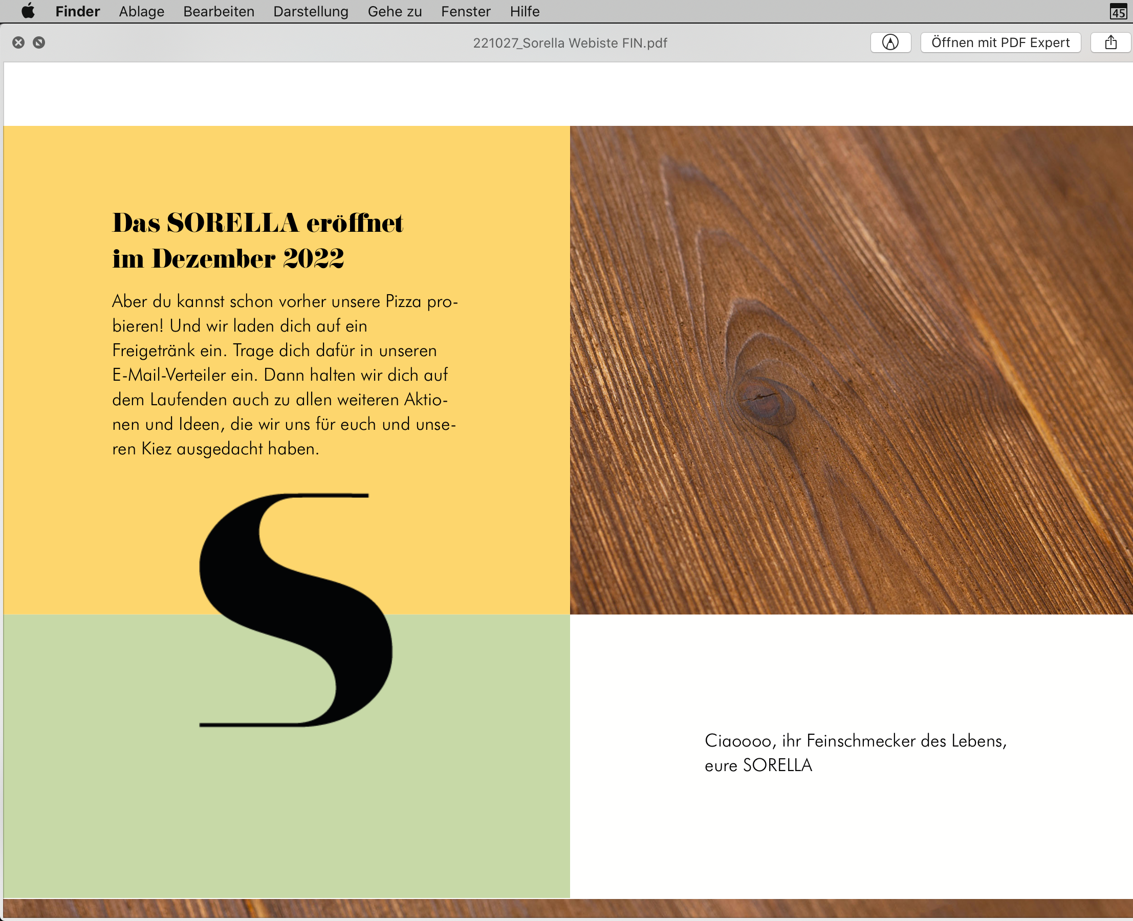
November 8, 2022 at 12:50 pm #2406949Jup, here’s a screenshot from the mockup
November 8, 2022 at 1:43 pm #2407011Ying
StaffCustomer SupportI would recommend adding the image into the yellow container, after all texts.
Then remove the negative top margin from the image block, add negative bottom margin to it instead.
Set the yellow container
z-indexto 2.November 16, 2022 at 2:11 am #2417678SOLVED: I have adjusted the tablet & mobile settings of the blocks 🙈
ORIG:
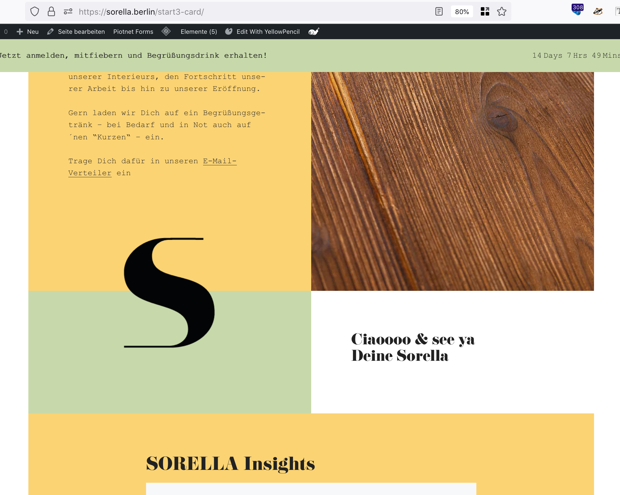
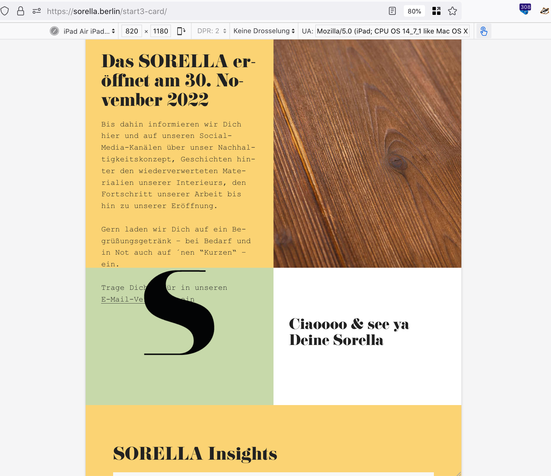
Hello, thanks.I have duuplicated the page (dev-page-url), moved the image-block below the text in yellow-container, removed top-margin, added bottom-margin, set yellow-container Inner z-index to 2, and now it looks good on desktop, but not on tablet.
Any idea about how to solve this?
November 16, 2022 at 6:44 am #2417985StaffCustomer SupportHi there,
i would approach the whole thing like so:
1. The Container block that has the
Simage block inside. Give it a CSS Class of:has-overlay-image
2. Select the Image Block and give it a CSS Class ofis-overlay-image
3. Remove any negative margins that position the image for all device sizes.4. Then you can use some CSS to position the image absolutely, relative to its container:
.has-overlay-image {
    position: relative;
}
.is-overlay-image {
    position: absolute;
    left: 50%;
    bottom: 0;
    transform: translate3d(-50%,50%,0);
}
5. Now you just need to make sure that your Container Blocks have adequate padding to provide the space for the overlay image to site in.
-
AuthorPosts
- You must be logged in to reply to this topic.