
Archived topic
How to fix mobile menu displaying issue Service Site Library
5 replies · Started by bitinum on May 22, 2022
Viewing posts 1–6 of 6
Dear GP Team,
I have uploaded a 250x48px logo to my web site and modified the width to 250px following your guide.
As a result, The menu on desktop displays correctly.
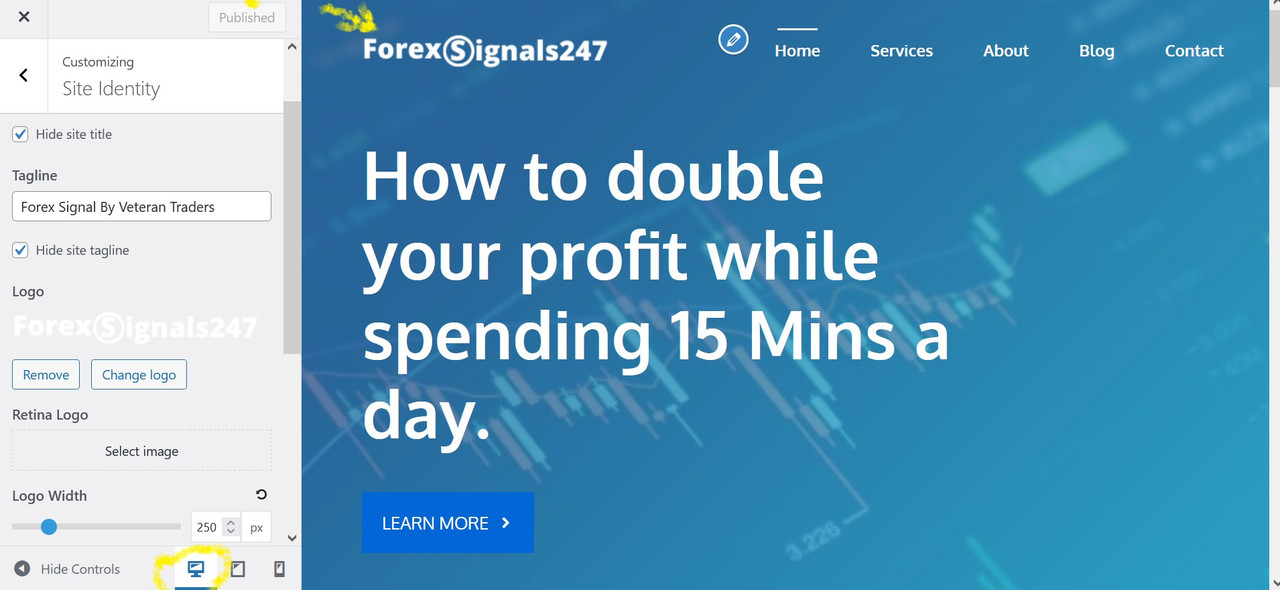
But the menu on mobile does not
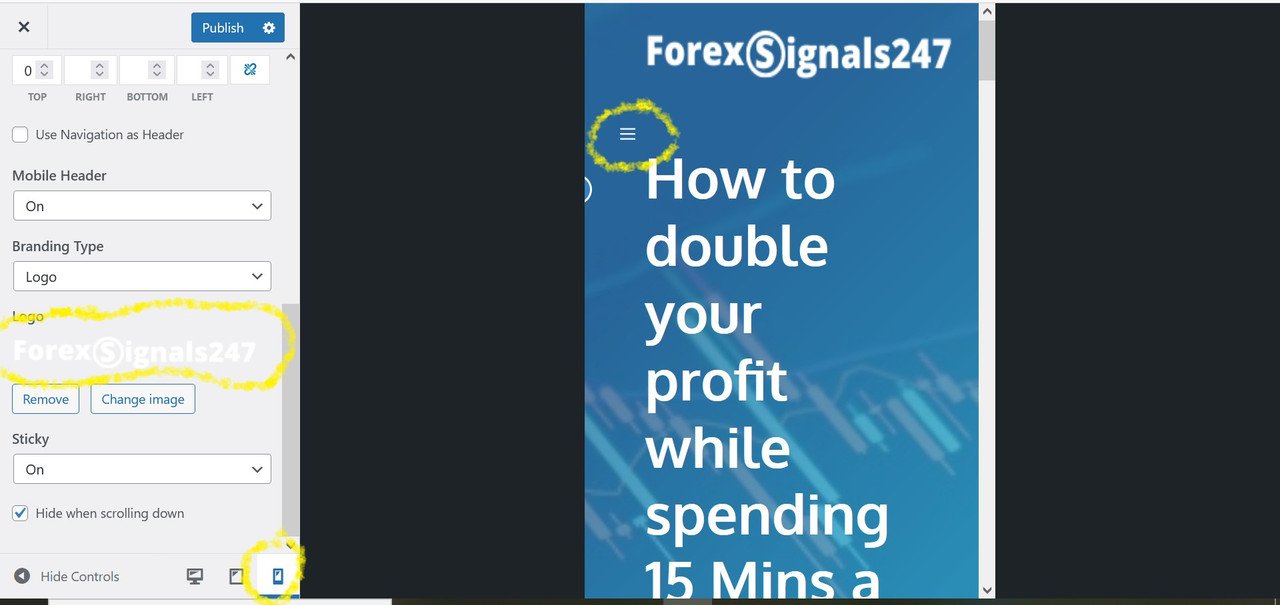
You can go to my web site here for more details
I wonder how to fix the menu displaying issue on table
Thanks
I have modified the width in the layout setting and it works, thanks
Hi there,
We would have to shrink the logo some more on tablet with this CSS:
@media (min-width: 769px) and (max-width: 1024px) {
    .site-header .header-image {
        width: 200px;
    }
}
Adding CSS: https://docs.generatepress.com/article/adding-css/
Can you try if this works first?
Glad to hear :)
thanks for your support
No problem :)
This archived topic is closed to new replies.
