Archived topic
How to display button at the bottom?
7 replies · Started by Sascha on October 16, 2022
Hi
please, allow me to handle this request here, since I use both GPP & GBP and would like to keep all my support tickets here.
On this site I have a container with a bg-image, a headline & button.
On mobile, the container is set to vh = 100, and the button should be displayed at the bottom of the container, the headline at the top.
To achieve this, I have wrapped the button in another container and applied the class "even-buttons" to both containers.
Then I added the CSS via SImple CSS:
.even-buttons .gb-inside-container, .even-buttons {
  display: flex;
  height: 100%;
  flex-direction: column;
}

.even-buttons .gb-inside-container >*:last-child {
  margin-top: auto;
}
but the button is still displayed directly below the headline on mobile.
Can you help me with this?
Thank you in advance and kind regards,
Sascha
Hi there,
where can i see this ?
Oh, I thought I had added the link, so here it is
The parent container isn't 100vh yet. You'll also need to set the height of the gb-inside-container of the parent container to 100%. Try adding this:
@media (max-width: 768px) {
    .gb-container.gb-container-5e0aabfa > .gb-inside-container {
        height: 100%;
    }

    .gb-container.gb-container-5e0aabfa {
        height: 100vh;
    }
}Hi, you said "parent container" once 100vh and once 100%, so which one to chose? Maybe just a typo?
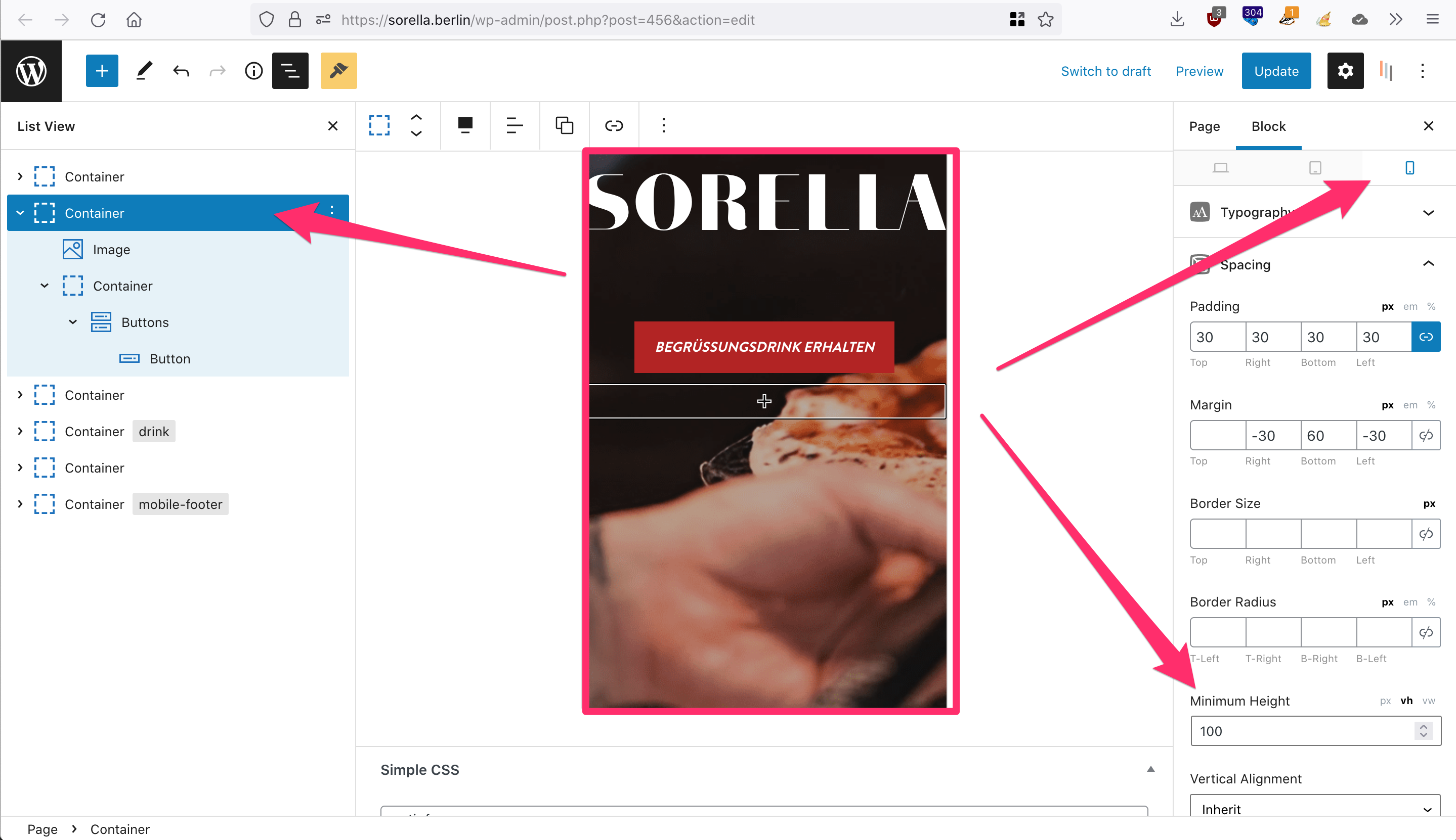
And as you can see on this screenshot, the vh of the parent container is set to 100vh already.
Can you please help me further and try to explain a bit easier?
The inner container has no settings applied, I have only used this as a wrapper for the button-block. I have only applied the CSS-Class "even-buttons" to this inner container.
The parent container also has the same CSS-class applied, plus individual spacing-settings for desktop/tablet and mobile, where only the mobile-version has 100vh applied.
Now this CSS is in Simple CSS field:
.even-buttons .gb-inside-container, .even-buttons {
  display: flex;
  height: 100%;
  flex-direction: column;
}

.even-buttons .gb-inside-container >*:last-child {
  margin-top: auto;
}

@media (max-width: 768px) {
    .gb-container.gb-container-5e0aabfa > .gb-inside-container {
        height: 100%;
    }

    .gb-container.gb-container-5e0aabfa {
        height: 100vh;
    }
}
Can you please tell me the CSS for this scenario? Or provide a hint for a better practice or method?
Thank you in advance and kind regards,
Sascha
Hi there,
remove that CSS and try this instead:
.even-buttons,
.even-buttons > .gb-inside-container {
    display: flex;
    flex-direction: column;
}
.even-buttons > .gb-inside-container {
    flex: 1 0 100%;
}
.even-buttons > .gb-inside-container > :last-child {
    margin-top: auto;
}Thanks, awesome!
This code is only working for this layout Container > Container? or can I use this in Grid-Layout as well?
In theory yes it will work on any Container Block, but it all depends on whats inside the containers and its styles.
So the CSS may need adjusting.
As general go to i use the CSS here:
https://generatepress.com/forums/topic/buttons-in-generateblocks/#post-1313986