- This topic has 7 replies, 2 voices, and was last updated 8 years, 4 months ago by
Tom.
-
AuthorPosts
-
December 12, 2015 at 8:05 pm #159712
Josep
Mytributejournal.com
First – I know this is not a theme problem – it is a coding problem on my part.
The goal: How it looks now – where the header stays fixed and the content rolls up over it – and the sidebar sticks.
Problem 1: The smaller the screen resolution – the bigger the space between the header and the nav bar.
Problem 2: on Mobile I would like to put a different image as the header.How it is currently set up:
– Site Logo is currently a transparent bar that is 160 px high.
– Header background image is a full width header image that contains all the text you see as well as the swirls.The logo is a transparent tall image to keep the nav bar below the header – If I put the Image I want as the logo – it squeezes it into thee 960 container and makes it look odd against the background – as you can see the swirls fall outside AND inside of the 960px container so I get wierd crop lines. If there is a way to make the logo full width instead of just the container size – this may solve problem 1. If that cannot be done – I will need a way to change the Logo image AND the background header images for smaller screen sizes.
For problem 2 – I tried this code:
<div class="show-on-desktop">
    <img src="URL TO DESKTOP HEADER" alt="" />
</div>

<div class="show-on-tablet show-on-mobile">
    <img src="URL TO TABLET/MOBILE HEADER" alt="" />
</div>
But it just put 2 header images on my site.
December 12, 2015 at 10:48 pm #159722Tom
Lead DeveloperLead DeveloperUsing a background image won’t work with those mobile classes.
Instead, upload your header as a regular image in “Customize > Site Identity”.
To get around squishing it inside the container, add this CSS:
.site-header .inside-header.grid-container {
    max-width: 100%;
}
That should be all that is needed.
December 13, 2015 at 11:59 am #159824GREAT!!! Thank you! That works for using the logo instead of the background image! Perfect.
Now I also tried this to make it fixed: https://generatepress.com/forums/topic/how-can-i-create-a-fixed-header-and-top-menu-in-the-generate-press-theme/#post-31579
But it keeps sawing the PAGE header (yellow background black and white photos) in half only displaying the bottom half of the PAGE header coming out under the nav bar.
And lastly – I have found several ways to change the header image for mobile – can you point me to the one that works best with this theme?
Joseph
December 14, 2015 at 12:07 am #159909Lead DeveloperLead DeveloperDid you follow the instructions you linked to here?: https://generatepress.com/forums/topic/how-can-i-create-a-fixed-header-and-top-menu-in-the-generate-press-theme/#post-31579
I’m not seeing the additional markup anywhere on your site.
As for displaying a different header for desktop vs mobile, what you mentioned in the first post in this thread is the best way.
December 17, 2015 at 8:32 am #160621Was just about to mark this topic as resolved. Then the website owner sent me this screenshot.
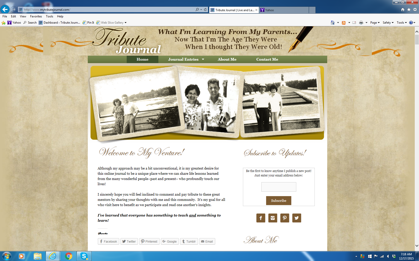
Both the background and the header image are the same width – so I’m not sure what is going on here. It appears her resolution is larger than the width of the image but that the background will stretch but the header will not?
December 17, 2015 at 10:22 am #160652Lead DeveloperLead DeveloperWhy keep the background image in there at all if the header image is showing the same thing?
December 17, 2015 at 10:26 am #160655The background image extends through the entire page – not just the header. I’m open to any solutions!
December 17, 2015 at 10:30 am #160656Lead DeveloperLead DeveloperI suggest taking out the ribbons and text from the background image and just have it be that old paper pattern.
The leave the ribbons and text to the header image.
-
AuthorPosts
- You must be logged in to reply to this topic.