
Archived topic
Full width HERO image on mobile... and collapsing of the sidebar on small tablet
17 replies · Started by Mathieu on November 16, 2020
Give this a shot instead:
@media (max-width: 1024px) {
    .slideout-toggle {
        display: none;
    }
}Oh yeah! It works.
There's one last thing that used to work and that still works with Flexbox but the option doesn't seem to be available anymore.
On one site, I can still change the navigation logo in "Primary navigation" instead of "Sticky navigation".
The result is the Menu Hamburger in the middle and the magnifying glass on the right.
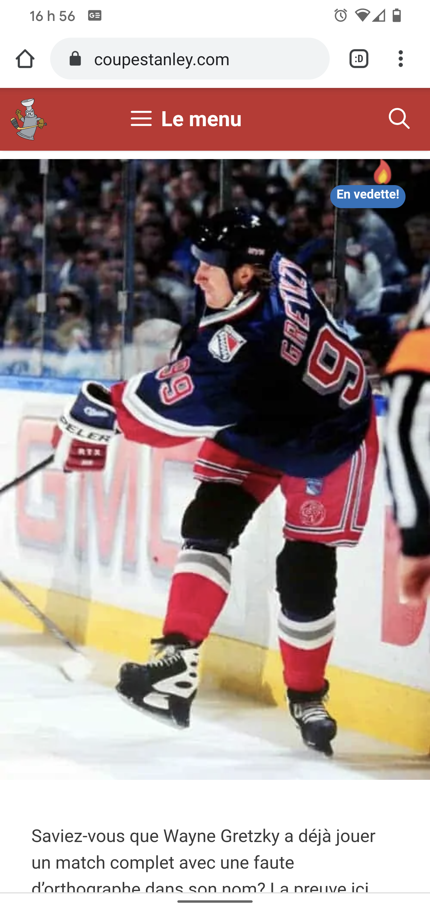
This is on flexbox but I can't reproduce it.
Is there a trick? Either by triggering the right code with the right hook in PHP or purely CSS.
BTW, this theme is a perfect score in Cumulative Layout Shift. Wow.
Congrats.
Any chance you can open a new topic for the separate question as it doesn't seem to be related to the original topic.
I'll mark this topic as resolved.
Thanks :)
