
Archived topic
Fonts boldness seems too bold?
9 replies · Started by William on March 16, 2021
Hi there,
I am migrating changes from the experimenting theme of mine to the staged site so I can push it live.
On the experiment theme here, you can see the settings below:
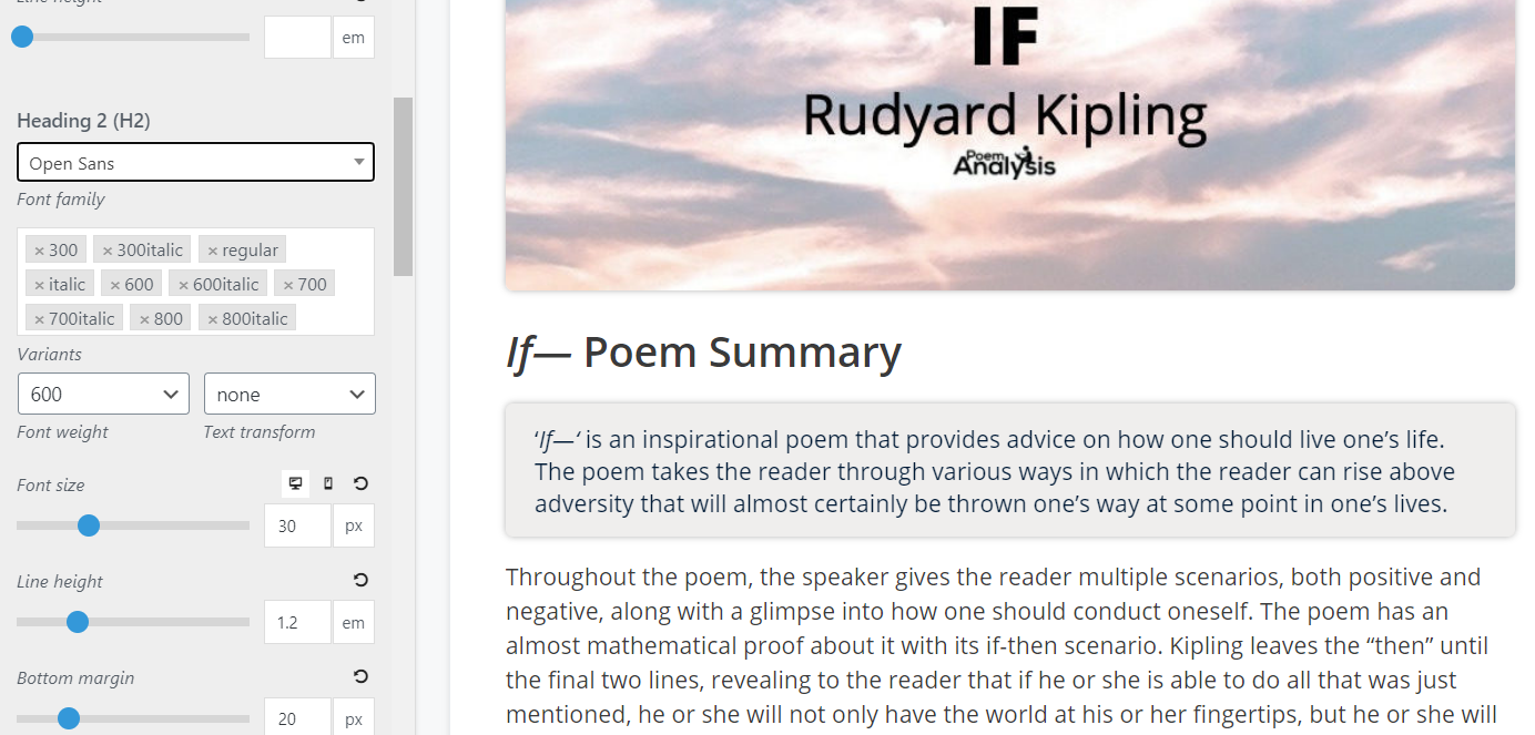
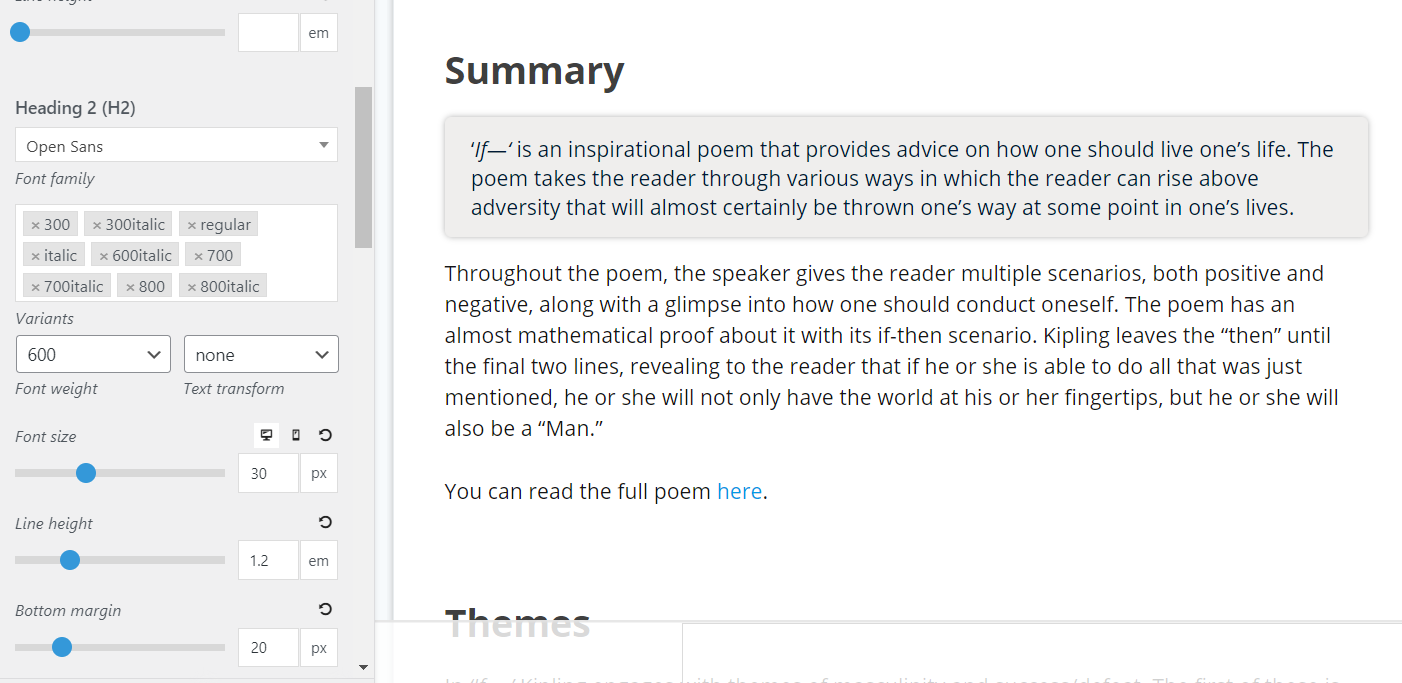
On the staged site(view here, with Username: qwggdqrdxf, Password: NY559Ds5nJ), it has the same settings. However, it looks a lot bolder - why is this the case?
Hi William,
The settings for the two pages aren't exactly the same from what I can tell:
https://www.screencast.com/t/7uhUXG5J0r
https://www.screencast.com/t/CVijSXLymk
I've changed that so it is live now, so you can see the difference in bold.
Hmm that's strange.
Can you disable all plugins except GP Premium on the site with the issue?
I've just disbaled everything except GP Premium and the issue still appears.
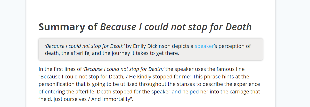
Weird thing is that if in italics, it seems to be the right font weight looking (less bold):
Hi William,
I think it's because these two H2 are using different fonts which inherited from the body's font family.
I don't know why the font you choose for H2 in customizer didn't apply to them.
Try to keep only one font family for body see if it works.
Let me know.
They are both inheriting Open Sans font. Even if I don't inherit and ask for Open Sans issue still persists - I'm not really sure the solution you are suggesting?
Can you make sure 600 is loading in the variants?
I see the difference in the screenshots you've provided:
https://www.screencast.com/t/d055fa8kBNwN
Aha you're a genius, the 600 was not enabled in the font family under body - thanks lots! I appreciate it so much.
No problem :)
