- This topic has 10 replies, 4 voices, and was last updated 3 years, 9 months ago by
Fernando.
-
AuthorPosts
-
August 30, 2022 at 2:27 pm #2328820
Sascha
Hey there,
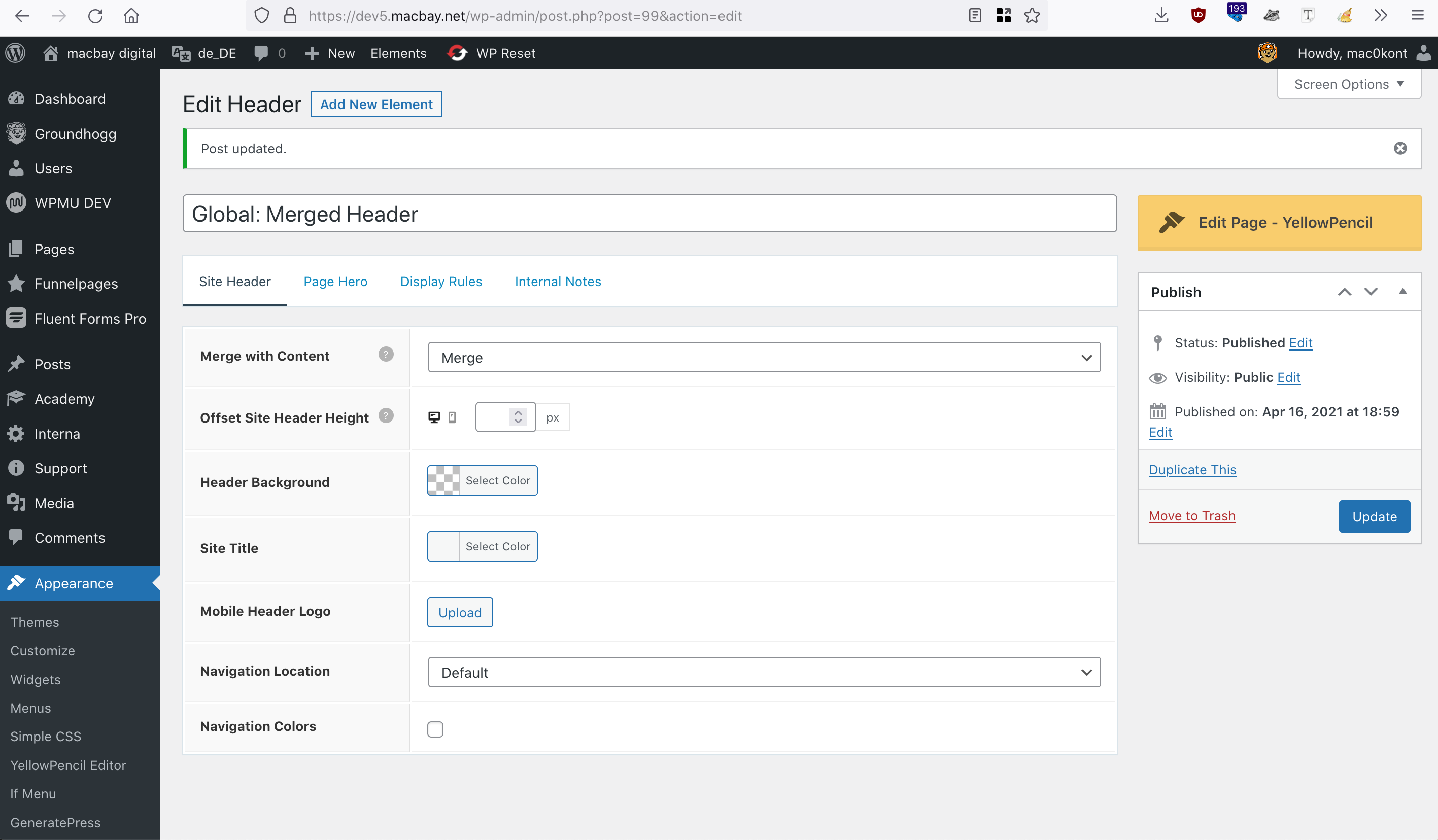
I have paused working on my new site for a while and today I’ve realized, that the header/nav is not merged anymore, although the appropriate Element is still active and settings look ok, as you can see on this screenshot.
Last time I had worked on this site, the hero-container was merged with the header/nav correctly, but now it looks as moved below the header.
Can you please help me troubleshoot and fix this?
Please find temp-admin-login in the private info field below.
Please note, that I have coloured the header blue, so that it’s easier to recognize the logo & nav. I remove the colour again after this issue is fixed 🙂
Thank you in advance and kind regards,
SaschaAugust 30, 2022 at 5:23 pm #2328866Fernando Customer Support
Hi Sascha,
Can you try temporarily setting Elements Hook: Site Wrapper (Open) and (Close) to draft?
August 30, 2022 at 11:26 pm #2329006Hi Fernando,
thank you for your reply. Obviously, the Site-Wrapper corrupted the Merge, so I appreciate your hint.
Actually, this site-wrapper was not working properly anyway. I wanted to prevent any full-width containers to go beyond 1920px (as defined per the child-theme), to prevent bg-images inside the full-width-containers become too large on big screens (like 4K+).
Is there any alternative for this approach that you can recommend?
Thank you in advance and kind regards,
SaschaAugust 30, 2022 at 11:50 pm #2329031You can try adding a custom class set-max-width to all Container Blocks with images, and then add this CSS in Additional CSS:
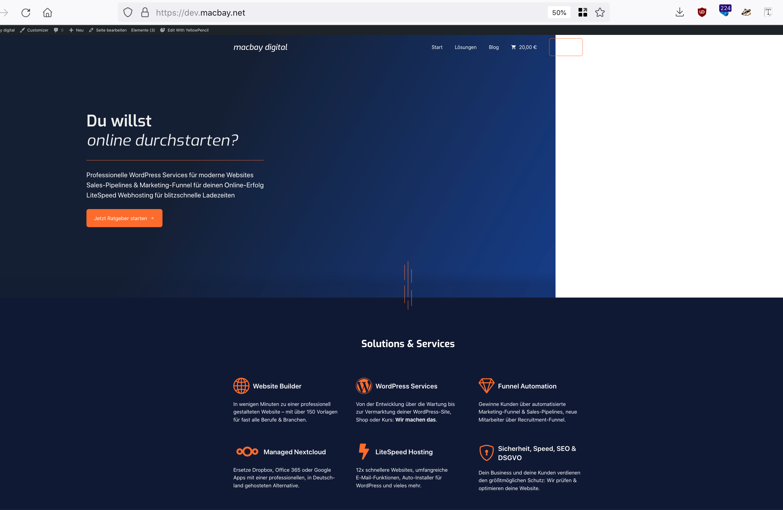
.gb-container.set-max-width {
    max-width: 1920px;
}
August 31, 2022 at 2:48 am #2329170Thanks, just applied the class to the hero-container on the frontpage and added the CSS via Customizer. Then, I have tested by decreasing the zoom of my browser and now it looks like this.
So the image will not scale too much, but the container and content is moved to the left and a large white space appears right to the container.
I have also tried to set the container to full-width, but then the image scales up again.
Any better idea?
Thank you in advance and kind regards,
SaschaAugust 31, 2022 at 9:59 am #2329746Ying
StaffCustomer SupportHi Sascha,
Can you try to set the background image’s selector to
pseudo elementinstead ofelement?In that case, we should be able to target both the background image & background gradient and move them together to the center.
Let me know!
September 1, 2022 at 2:58 am #2330294Thanks Ying, but now the bg-image is not showing at all, as you can see here.
Any other idea?
September 1, 2022 at 2:59 am #2330296Without the
pseudo elementdeclaration, it also looks badSeptember 1, 2022 at 10:54 am #2330751Leo
StaffCustomer SupportThanks Ying, but now the bg-image is not showing at all
Have you resolved this? I’m seeing the background image:
https://www.screencast.com/t/o4Xi7Ou1RSeptember 11, 2022 at 1:22 am #2339393Hello all,
now I’ve tried again on another test-site https://dev5macbay.us2.instawp.xyz/, imported the “Cloud” site-template and applied the code to Customizer CSS as recommended above:
.gb-container.set-max-width {
    max-width: 1920px;
}
Also, I’ve added the class
set-max-widthto the hero-container.Now, this hero-container does not expand the 1920px indeed, but on 4k retina screens, it will “stick” to the left, as you can see here
Here’s a 5sec clip to show you, how I have applied the CSS-declaration & -class:
https://clips.macbay.net/conversations/551a2d74-865f-55bf-994a-ed3d24012fcaThen I have reverted the changes again by removing the CSS-declaration & -class.
I would like to configure a site-wide solution, so that I don’t need to add classes to all the hero-containers, so I re-enabled the Site-Wrapper by adding the following:
Customizer CSS:
.site-wrapper {
	width: 100%;
	max-width: 1920px;
}
Customizer Global Colors (for better visibility of the body-background)
Body > Background: #5ce6e6Elements (2x):
1. Hook: Site Wrapper (Open):
<div class="site-wrapper grid-container grid-parent">
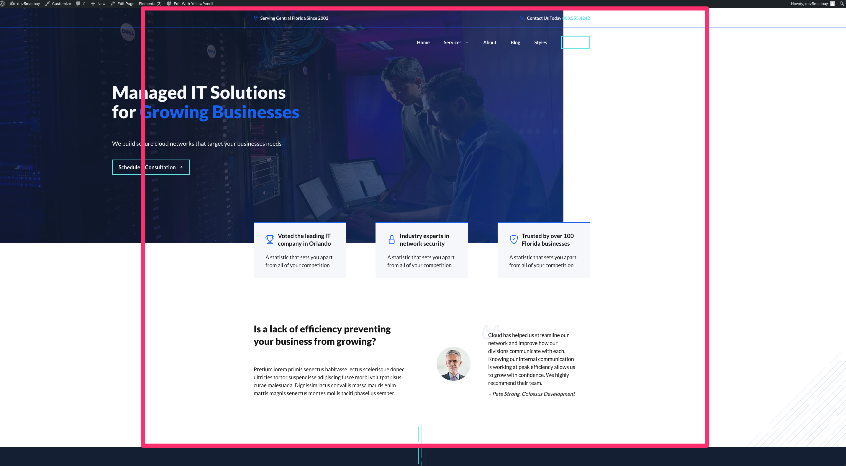
2. Hook: Site Wrapper (Close):</div><!-- .site-wrapper -->It does not work again, and also, the hero-container is not merged with the header & top-bar any more, as you can see on this screenshot.
But this time I have found out, what may “corrupt” this solution: It’s the “Merged Header” Element!
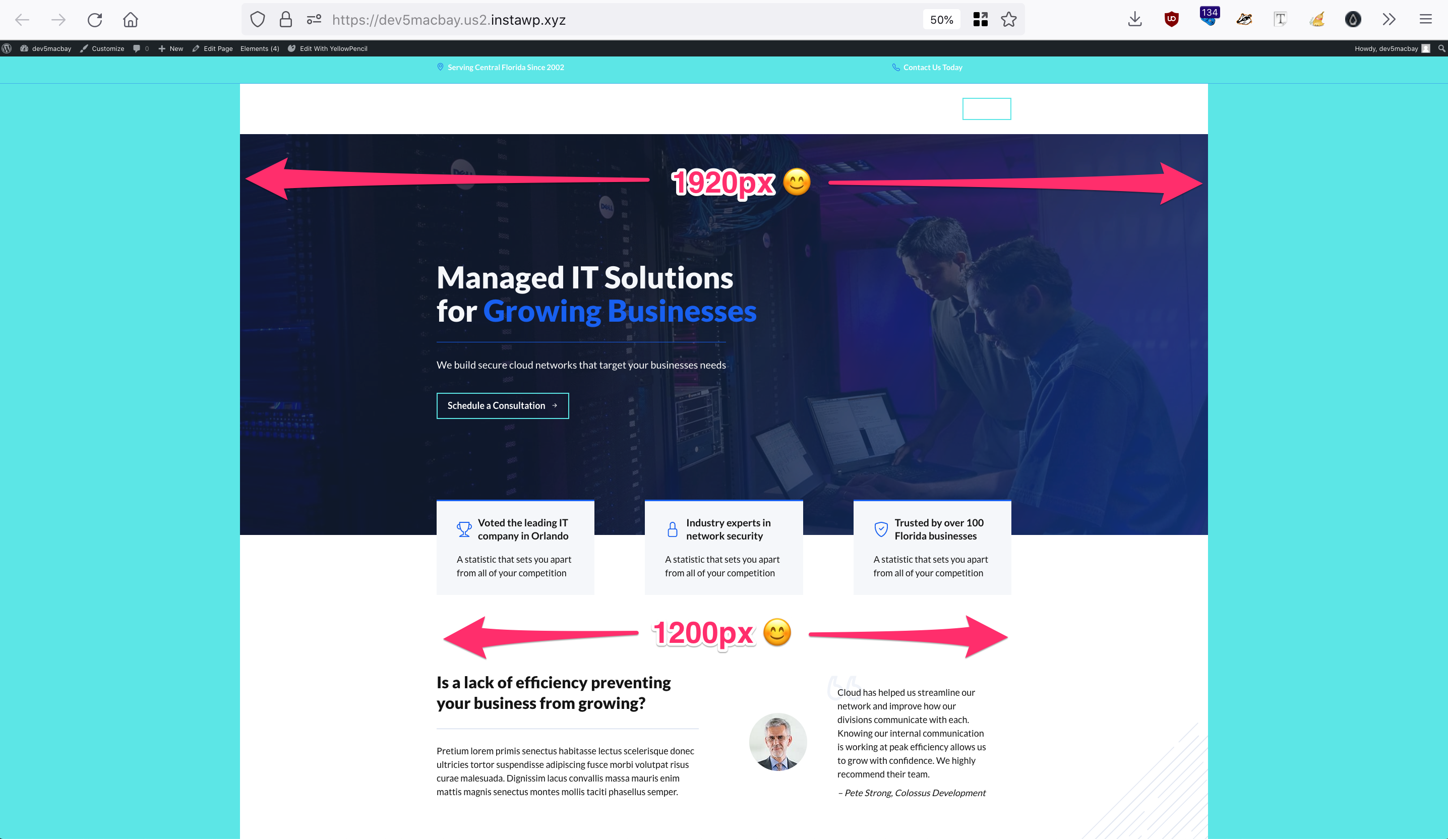
After I have set this Element to draft the magic happened: The full-width hero-container remains inside the 1920px and the content inside the 1200px (as defined via Customizer > Layout > Container > Container Width), as you can see on this screenshot.
Hence, we need to find out, how to merge the content with the header AND the top-bar alternatively. I have tried to solve via CSS by adding
#masthead{margin-bottom: -170px;}via Customizer CSS (not knowing if this is considered a good practice 🙈). But then, the hero-container overlaps the top-bar, even after increasing the priority of the Top-Bar Element from 10 to 11 or 20, still remained “hidden”.I have tried to elaborate a good solution, but it seems, I need to refrain from using the Top Bar Element in order to make this layout work.
So my question is:
1. Why is the Merge Header-Element preventing the Site-Wrapper from working properly, how to solve this?
If this can only be solved via the negative-top-margin of the hero-container:
2. How to show the Top Bar Element?Looking forward to hearing your good advice again 😊
Thank you in advance and kind regards,
SaschaSeptember 11, 2022 at 9:30 pm #2340082Hi Sascha,
As an alternative, can you try first setting the content width through a Layout Element and re-enable the merge Header Element?
-
AuthorPosts
- You must be logged in to reply to this topic.