- This topic has 13 replies, 3 voices, and was last updated 3 years, 3 months ago by
David.
-
AuthorPosts
-
December 22, 2022 at 7:16 am #2470460
Daniel Moreno Cuerda
I am trying to show a different menu only in the store part, i.e. products, categories, etc. In the rest of the website the main menu should be shown,
For this I have created a new menu and a location of its own.
Then I added that code to my navigation.php which is as follows:do_action( 'generate_after_mobile_menu_button' ); if (is_post_type_archive('product') || get_post_type() == 'product'){ wp_nav_menu( array( 'theme_location' => 'menuTienda', 'container' => 'div', 'container_class' => 'main-nav', 'container_id' => 'primary-menu', 'menu_class' => '', 'fallback_cb' => 'generate_menu_fallback', 'items_wrap' => '<ul id="%1$s" class="%2$s ' . join( ' ', generate_get_element_classes( 'menu' ) ) . '">%3$s</ul>', ) ); } else{ wp_nav_menu( array( 'theme_location' => 'primary', 'container' => 'div', 'container_class' => 'main-nav', 'container_id' => 'primary-menu', 'menu_class' => '', 'fallback_cb' => 'generate_menu_fallback', 'items_wrap' => '<ul id="%1$s" class="%2$s ' . join( ' ', generate_get_element_classes( 'menu' ) ) . '">%3$s</ul>', ) ); }The problem is that for mobile devices it still loads the main menu instead of the other one.
If you view the store from a computer it appears fine, but on mobile it disappears and shows the main menu.
I hope you can help me, thank you very much
December 22, 2022 at 8:28 am #2470657David
StaffCustomer SupportHi there,
where can i see the issue ? Can you share a link
December 23, 2022 at 1:16 am #2471258Sure! thks
December 23, 2022 at 1:23 am #2471259Fernando Customer Support
For reference, can you also share a screenshot of this menu on desktop view?
Uploading Screenshots: https://docs.generatepress.com/article/using-the-premium-support-forum/#uploading-screenshots
December 23, 2022 at 2:41 am #2471314Hi!
Screenshot of normal web:

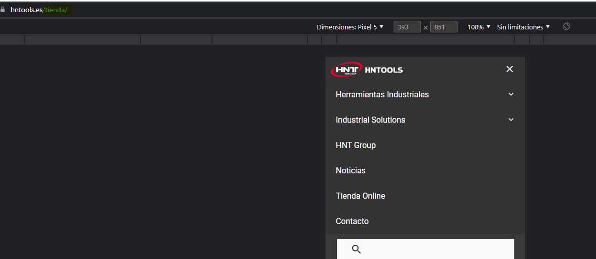
Screenshot of shop:

Screenshot of mobile nav in shop:
 December 23, 2022 at 4:02 am #2471393StaffCustomer Support
So your code is hooking in a new navigation. But its not swapping out the actual menu for the default theme navigation which is what is being displayed in the mobile menu dropdow.
To fix that you can filter in your new menu into primary navigation like so:
add_filter( 'wp_nav_menu_args', function ( $args ) {
    if ( 'primary' === $args['theme_location'] && ( is_post_type_archive('product') || get_post_type() == 'product' ) ) {
        $args['menu'] = 'Your menu name';
    }
    return $args;
} );
Set the name of your menu here
Your menu nameDecember 23, 2022 at 4:26 am #2471423It does not work, no changes can be seen. I have cleared all cache
I still see the primary menu in the store part of the web.
December 23, 2022 at 9:05 am #2471757StaffCustomer SupportI made an edit to the code above, can you try that ?
January 3, 2023 at 12:35 am #2481527Hello good morning and happy new year.
I got back to the problem. I added the modified code but it still doesn’t work.January 3, 2023 at 3:27 am #2481732StaffCustomer SupportCan you remove the code i provided, and disable the Mobile Header in Customizer > Layout > Header.
What menu do you see now on mobile ?January 3, 2023 at 4:34 am #2481848Now I have managed to get it to show. But the bad thing is that the main menu and the custom menu are visible.
 January 4, 2023 at 3:13 am #2483146StaffCustomer Support
Ok, so if you’re good with the custom menu, then you can unhook the themes menu toggle
add_action('wp',functiom(){
    remove_action( 'generate_before_navigation', 'generate_do_header_mobile_menu_toggle' );
});
January 4, 2023 at 4:10 am #2483199Thanks!
January 4, 2023 at 4:36 am #2483234StaffCustomer SupportGlad to be of help 🙂
-
AuthorPosts
- You must be logged in to reply to this topic.