
A well-crafted landing page can make or break your marketing efforts. Whether you’re promoting a product, collecting leads, or driving signups, your landing page needs to grab attention, deliver value, and inspire action in seconds.
If your landing page is slow to load, or if you don’t clearly show that your product or service solves a site visitor’s problem, the lack of connection will show up in your analytics as a low conversion rate.
The good news? You don’t need to be a web developer or design expert to create landing pages that convert. With the right strategy and the performance-optimized GeneratePress Pattern Library, anyone can build high-performing pages quickly and easily.
Types of Landing Pages
There are different types of landing pages.
- Homepage. Your catch-all for all visitors that provides an overall picture of your business, products, and services. Your homepage should stand out from other pages to allow users to easily recognize their starting point, whether arriving at your site for the first time or navigating back from another page.
- Persona landing page. A page tailored to a specific persona (audience) with a distinct and clear call to action (CTA).
- Product or service page. A page that explores how your product or service solves a particular problem or helps your audience reach an aspirational goal.
- Squeeze page. A minimalistic page with a strong headline, a brief pitch, and a very specific CTA. No distractions, no extra links—just a laser focus on getting that lead or the sale
- Lead capture page. A simple page with a short form to capture an email address in return for some outcome, like a free download or webinar signup.
Determine the type of landing page you’re designing, then begin a strategic analysis of what must be on the page to guide your audience through a buyer’s journey to conversion.
Typical Landing Page Structure
Structure your landing page in a way that guides your audience to action. A typical structure might look like:
- Navbar. The top of the page is where your logo and navigation links are. You might omit navigation on a squeeze page where you want to drive action to one simple step and remove any user exploration.
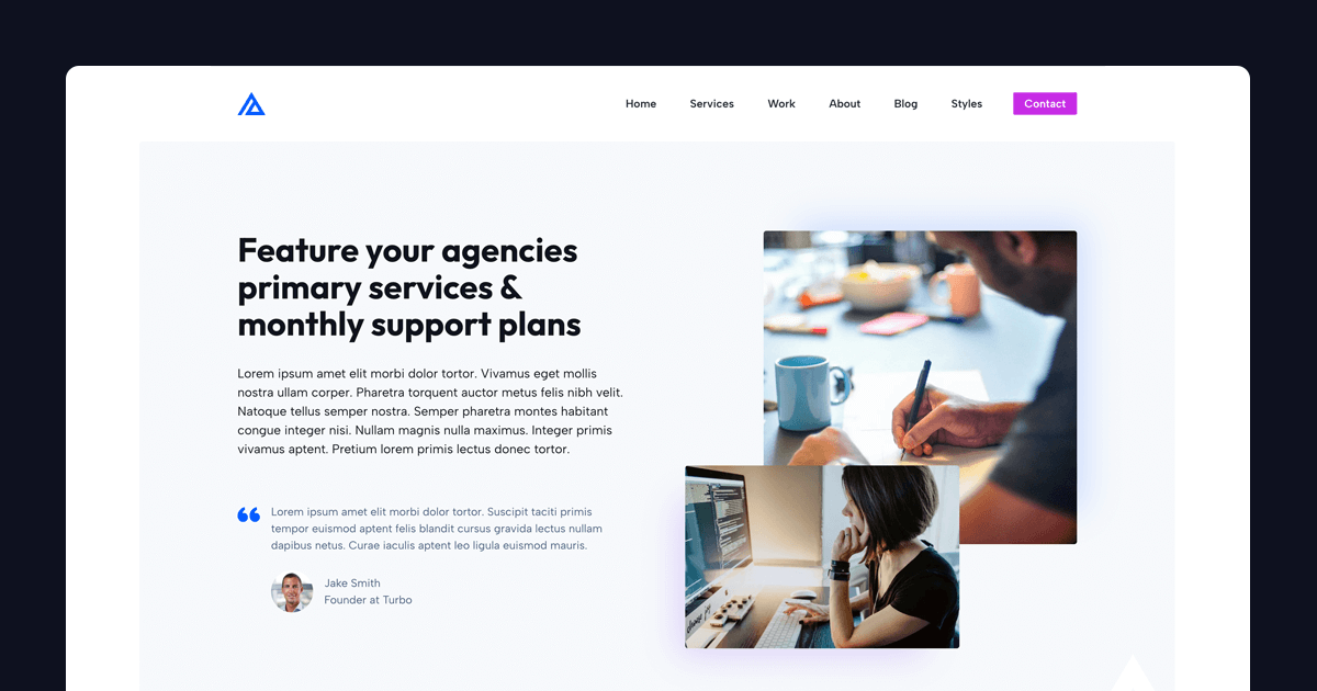
- Hero. The main section at the top of the page includes your headline text, subheadline, and captivating imagery with a clear CTA.
- Social proof. Testimonials or logos of press coverage or your well-known customers.
- Features and objections. Your key value propositions and answers to any objections.
- Repeat your call to action. Make it easy to take action at the end of your page.
- Footer. An area with overall navigation, contact and social media links, and any disclaimers, privacy policy, and terms of service.
This structure might deviate depending on the type of landing page, but it’s a good overall framework from which to start.
Start with a Clear Goal
Every landing page should have one specific purpose. Are you trying to sell a product, grow your email list, or get people to register for a webinar?
Define your goal upfront because it will shape everything else—your copy, design, and call-to-action (CTA). Avoid the temptation to squeeze multiple objectives into one page. A focused landing page always outperforms a cluttered one.
For example, if your goal is lead generation, your page should prioritize a form and a compelling offer.
Remember, most site visitors do not read everything on your landing page. They scan text and imagery for signs that you’re solving their problem or meeting their aspiration.
Craft a Compelling Hero Section
Your hero section is the first thing visitors see, and it’s your best shot at keeping them on the page. Make your hero area clear, concise, and benefit-driven. Instead of something generic like “Welcome to Our Website,” try “Boost Your Sales with This Simple Trick” or “Get Your Free Guide to Doubling Your Income.”
The key? Highlight the value your visitor will gain and spark curiosity or urgency. Pair your headline with a short subheading that adds context or reinforces the promise. Here are some examples of succinct headlines that work for well-known brands.
- Slack
- Headline: Where work happens.
- Subheadline: Slack is free to try for as long as you’d like.
- Dropbox
- Headline: Find anything. Protect everything.
- Subheadline: Meet Dash for Business. Find, organize, and protect company content with AI-powered universal search for work.
- DoorDash
- Headline: Discover restaurants and more near you.
- Venmo
- Headline: Fast, safe, social payments
- Subheadline: Pay, get paid, grow a business, and more. Join the tens of millions of people on Venmo.
Simplify Your Design
A clean, uncluttered design keeps the focus on your message. Stick to these basics, and use white space to make your landing page feel approachable and easy to consume.
Ensure that your color palette supports your brand and that you use contrasting colors for accessibility. For example, your CTA buttons should stand out, be bright, and intuitively feel active. If you’re using hover colors, ensure they respond actively when a user hovers their cursor over them.
Optimize for mobile. In the last quarter of 2024, mobile devices accounted for 62.54% of global website traffic. Test your landing page on smaller screens.
You don’t need fancy animations or complex layouts. Too much motion or animation can make your website feel like an advertisement. Use effects like animation on scroll minimally, and avoid auto-playing videos. An automatically starting video can be so intrusive that it affects engagement with other page content.
Simple designs often convert better because they eliminate distractions, making it easier for site visitors to take action.
Write Persuasive Copy
Your words need to do the heavy lifting, but be aware that 80% of your site visitors will skim your landing page and not dive into your deepest contemplations about your product and service.
Keep your copy short, scannable, and action-oriented. Use bullet points to list benefits and outcomes, not just features.
Create a Compelling, Active Call-to-Action
Your CTA is the tipping point between a bounce and a conversion. Make it impossible to miss and irresistible to click. Use action verbs like “Get,” “Start,” or “Download,” and add a sense of urgency or value. Examples of compelling calls to action:
- Claim Your Free Trial Now
- Join 5,000+ Happy Customers
Place your CTA button in your hero section and repeat it down the page for skimmers.
Avoid generic text such as “learn more” and keep the text succinct. Don’t make your site visitors work to understand the action you’re offering; instead, lead them to the solution they’re looking for.
Strategy Prompts When Creating a New Landing Page
Ask yourself the following questions when creating a new landing page.
What is this landing page selling?
Clarify the product, service, or offer. Keep the focus tight. This might be different than the action they’re taking on this page, but it should be clarified as you strategize. Every landing page should eventually turn into revenue for your business.
What singular action do we want users to take on this page?
Define the call-to-action, such as buying a product, downloading a resource, or signing up for a newsletter. Ensure the page drives one clear goal.
What benefit do they receive if they take that action?
Highlight the value proposition, making it compelling for users to act. Tie the benefit to a specific solution to a site visitor’s problem or aspiration.
Who is your target audience?
Be specific about your audience demographics and their interests and pain points.
What might stop someone from taking the desired action?
What objections might a user have when they’re considering your offer? Handle the objections clearly and succinctly. These objections might be cost, trust, or confusion.
What tone or personality should the page convey?
Tie the tone or personality to your overall brand identity, and make sure it communicates to your target audience.
Are there any specific colors, fonts, or visual styles you want to include?
Refer to your brand styles or specific imagery that must be included.
What proof or credibility can you showcase?
Social proof might include brand logos for businesses using your product or service, testimonials, number of positive reviews, and number of users.
How will users arrive at this page?
A user might come to your page from a specific ad, social media post, or email campaign. How will you tie to their referring post in a way that provides continuity of their experience?
What’s one key message you want users to remember?
While a landing page is driving action, also consider how this landing page supports your overall brand message.
If displaying pricing for multiple options, which option should be highlighted?
Which is best for this customer segment if there are multiple pricing tiers? How will you drive attention to the tier best for this target audience?
Are there frequent questions that pre-sales support receives?
Help your customers find answers quickly to help them quickly take action. This is a great place to handle objections, reiterate your refund policy, and establish trust.
Do you have examples of landing pages you like or dislike? Why?
What are your competitors doing well, or what are they missing? Are there landing pages in other markets that can provide inspiration?
Is there a deadline or urgency to this offer?
Urgency can often inspire fast action. If it is a Black Friday sale landing page, for example, how will you clearly highlight the end of the sale?
What happens after they take the action?
Think of every landing page action as the start of a customer relationship. How do you continue the conversation and deepen the relationship so that the prospect feels positive toward your business and brand?
Landing Pages are Easy with GeneratePress
GeneratePress offers pre-built landing pages within the GeneratePress Pattern Library, and if you’re starting with a new site, the starter sites in the Site Library. These options get you started building quickly with performance-focused designs ready for your content that you can modify easily.

The GeneratePress Pattern Library allows you to start with a full page or build a landing page from various sections for the ultimate flexibility. Sections include:
- Author
- CTA
- FAQ
- Feature Sections
- Gallery
- Hero
- Logo
- Pricing
- Query Loop to dynamically create a section
- Team
- Testimonial
Test, Iterate, and Optimize
Even the best landing pages can improve, and as online marketers, it’s our job to continuously look for optimizations and improvements to understand our audiences better.
Use tools like Google Analytics or Hotjar to track how visitors interact with your page. Are they dropping off early? Is your CTA getting clicks? Run simple A/B tests — try a different headline, button color, or image — to see what boosts your conversion rate.
Try different testimonials or test their placement. Does conversion change with testimonials higher up on the page?
Small changes can lead to big results. Even if your landing page has been succeeding, strive to gather data to inform improvements.
Get feedback from valued customers. You want to gather both qualitative information and quantitative data. If your customers provide feedback that tells you something isn’t right, see if the data you collect from analytics supports that.
Sample Landing Page
Developing an effective landing page is much more about strategy than tactics. To help your team think through your audience and overall strategy, we’ve created a free strategy infographic. Download it here. This infographic highlights the following sections:
- The service you provide and who it’s for
- Showcase some social proof
- Describe the users pain point
- Describe your solution
- Explain your process
- Add powerful testimonials
- Answer frequently asked questions
- Display pricing options
- Call to action to initiate contact

I love how clear and concise this guide is! The tips on crafting a compelling hero section and simplifying design are especially helpful. Great job on breaking down landing page strategies!