
The GenerateBlocks Site Header Block is one of the most performant implementations of site headers available to WordPress users. Coupled with the Navigation Block, building out site headers is easier than ever.
If you’re looking for even more performance for device-specific display, Conditions adds another performance capability beyond CSS responsiveness. Because GenerateBlocks Conditions are executed on the server before they reach the browser, you can set Conditions based on a user’s device and fully customize the header and navigation for mobile, tablet, or desktop without additional CSS to add responsive display.
With the Site Header Block and Site Navigation Block introduced in GenerateBlocks Pro version 2.2, you can build a single, unified navigation structure and use device conditions to control what renders.
Reasons You Might Want Different Navigation
There are a variety of reasons you might want to use specific headers and navigation for different devices. These include:
Prioritize High-Conversion or Context-Specific Items per Device
Mobile users often browse with more intent or urgency. Quick lookups and on-the-go searches require focused intent. You can create a simplified mobile menu that prominently features top-conversion items such as “Shop Now,” “Book Appointment,” “Contact,” or “Add to Cart,” while hiding or de-emphasizing lower-priority links.
Desktop users, with more screen real estate and mouse precision, can handle a fuller, multi-level menu with categories, submenus, and supporting pages. This reduces cognitive load on small screens and improves conversion rates without duplicating markup.
Optimize Menu Order and Hierarchy for Different User Behaviors
Desktop navigation often works well with left-to-right or hierarchical dropdowns, but mobile benefits from a vertical, touch-friendly list where the most important items appear first. With Conditions, you can reorder menu items or use entirely different WordPress menus so that mobile shows a “quick access” sequence while desktop maintains a broader, exploratory structure. This is especially useful for sites with complex information architecture.
Tailor Interaction Styles to Input Methods
Desktop menus commonly use hover effects for submenus, which feel natural with a mouse. On mobile and tablets, hover doesn’t work reliably, so you need tap-friendly toggles, accordions, or full/partial overlays. Using separate conditioned Navigation Blocks lets you design the ideal interaction for each device. For example, a rich hover dropdown on desktop and a clean slide-out or fullscreen menu on mobile, all provided without CSS hacks or hidden elements loading for everyone.
Simplify for Smaller Screens and Improve Readability/Touch Targets
Mobile screens have limited space, so a dense desktop menu with many links can become cramped, with tiny touch targets that frustrate users and increase bounce rates. Device conditions let you show a streamlined version on mobile while keeping the comprehensive version for desktop and larger tablets. This leads to better usability, higher engagement, and fewer accidental taps.
Support Different Content or Feature Focus by Device
Certain sites serve distinct needs per device. A restaurant might prioritize “Reservations” and “Menu” on mobile, but “Full Menu,” “Events,” and “Private Dining” on desktop.
Conditions make it easy to deliver the right menu without loading irrelevant options for the wrong device and user experience.
Create Compact or Specialized Layouts
Desktop often supports wide mega-menus, multi-column layouts, or extensive CTAs. Mobile headers need to stay compact to avoid pushing content down. You can condition a full mega-menu-style navigation for desktop and a minimal icon-based or search-heavy menu for mobile. This also pairs well with other elements like sticky behavior, search bars, or account/cart icons that behave differently across breakpoints.
Improve SEO and Crawl Efficiency with Cleaner, Intentional Markup
While the primary benefit is performance bypassing the need for CSS responsiveness, device-specific menus also help search engines see a more logical, device-appropriate structure. Mobile-first indexing means Google prioritizes the mobile experience; a clean, purpose-built mobile nav can reinforce important internal links without the noise of desktop-only items. It also reduces overall page weight, supporting better Core Web Vitals.
A/B Testing or Personalization Opportunities
With GenerateBlocks Conditions, you can experiment with variations on specific devices and measure engagement or conversions. This is far cleaner than CSS-only hiding or multiple overlapping menus.
Using GenerateBlocks Conditions makes device-specific navigation and content easier than ever. By wrapping everything in a GeneratePress Block Element, you gain full control with device-based conditions. Here’s how to implement this strategy.
Step-by-Step: Build One Navigation Structure with Device Conditions
Create a New Block Element
- Go to Appearance > Elements > Add New.
- Set the Element Type to Site Header.
- Choose Location rules (e.g., Entire Site, or specific pages/posts).
- Disable the default GeneratePress header in Customize > Layout > Header if you’re fully replacing it.
Add the Site Header Block
Inside your Block Element, insert the Site Header Block. This becomes your flexible header container. Style it with GenerateBlocks controls for layout, spacing, colors, etc. For fast implementation, consider building with one of the GenerateBlocks Pro Patterns from the Pattern Library. These Pro Patterns will create the structure of your overall navigation with the Site Header Block and the Navigation Block already populated.
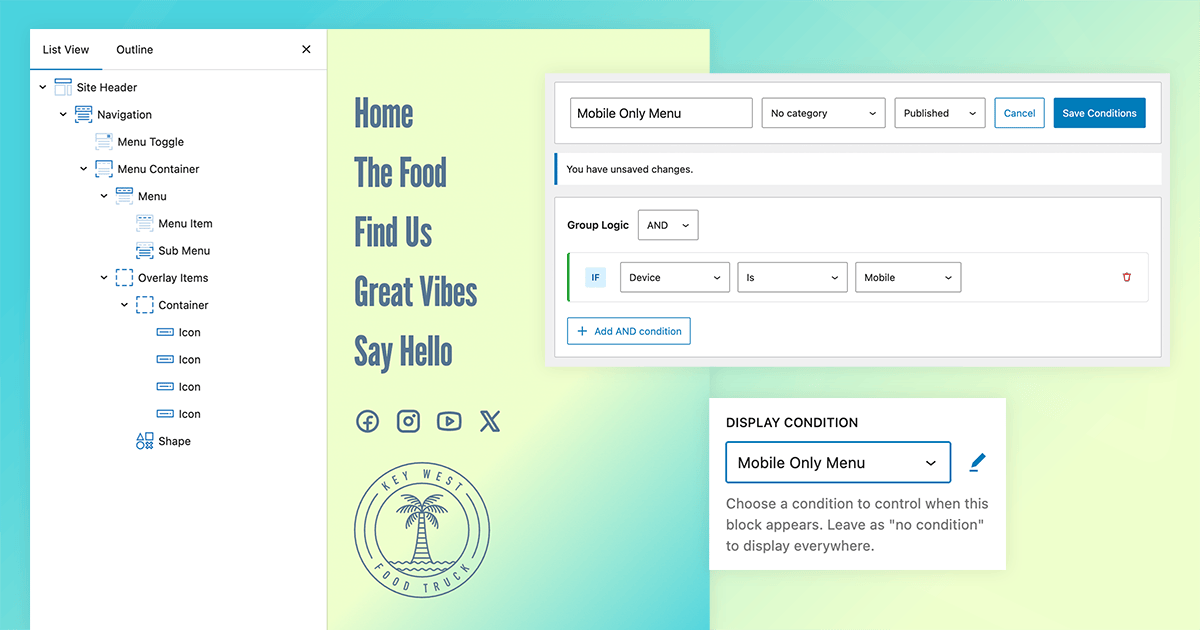
Apply Device Conditions
Select the parent Container Block above the Site Header Block.
In the block settings sidebar, go to the Advanced > Display Conditions section.
Add a Device Type condition. Click the plus button to add a new Condition, and name it intuitively.

- Example 1: Show the full desktop-optimized navigation only on Desktop.
- Example 2: Show the mobile-optimized version (or the same nav with different toggle styles) only on Mobile/Tablet.
Conditions evaluate server-side, so non-matching blocks don’t output any HTML on the frontend.
Style Responsively
Use GenerateBlocks’ built-in responsive controls for padding, font sizes, alignment, and visibility. For the mobile toggle, style the hamburger icon, menu panel (slide, dropdown, fullscreen), and close behavior directly in the Navigation Block.
Test across breakpoints in the editor and on the live site.
Publish and Test
- Save the Element.
- Clear any caches.
- View source on desktop and mobile. You’ll see only the relevant navigation markup—no hidden duplicates.
Benefits of This Approach
- Leaner HTML. No unnecessary hidden menus, the logic for device display is all executed server-side.
- Better Performance. Less markup means faster parsing and rendering.
- Easier Maintenance. Update one menu instead of syncing changes across desktop/mobile versions.
- Full Design Freedom. All the power of GenerateBlocks styling with the ultimate flexibility for device-specific design.
- SEO-Friendly. Cleaner code helps with crawl budget and page experience signals.
This setup is especially powerful if you’re building custom headers with logos, CTAs, search, or other elements that also need device-specific behavior.
Conditions Make Responsive Design Even Easier
The new Site Header and Site Navigation blocks in GenerateBlocks Pro, combined with device-specific Conditions, solve the “multiple navigation structures” problem elegantly. You get modern, flexible headers without the bloat.
If you’re already using GenerateBlocks Pro, try rebuilding your header this way and see what it does to your already exceptional page speed scores.
Have you tried this approach yet? Drop your experiences, or questions, in the comments. And if you’re optimizing for speed and SEO, pairing this with GeneratePress’ lightweight foundation makes for an unbeatable combination
Thanks Kathy, really useful!
I usually used the CSS setting display: none, but I think I’ll start using this method to improve performance!
Let us know how it works out for you with page speed scores!
Hi there,
Thanks for the article.
I have a question about this first section:
—
“The GenerateBlocks Site Header Block is one of the most performant implementations of site headers available to WordPress users. Coupled with the Navigation Block, building out site headers is easier than ever. ”
—
I wouldn’t agree with that. I find the Site Header Block, including the Navigation Block, extremely complicated and very cumbersome to use.
That’s why I still regularly use the “old system” (as long as I don’t need a mega menu).
Is the new Site Header Block really that much more efficient than the old system? Does it really make a difference in terms of speed? I’d be interested to know.
Sorry to hear you find the Site Header and Navigation Blocks difficult. The Pattern Library is always a great place to start, with numerous header patterns available to shortcut the process. And yes, the Site Header Block is more performant than the classic WordPress header and navigation. The core wp_nav_menu() function outputs a lot of generic markup, classes, and fallback behaviors. These have accumulated bloat over 10+ years of backward compatibility. GenerateBlocks’ new blocks were built from scratch as native block editor components, allowing developers to use a clean, modern architecture without legacy overhead. If there’s anything we can do to make the Site Header Block and Navigation Block easier for you, please let us know.
>> These have accumulated bloat over 10+ years of backward compatibility.
Thanks for the info, that’s good to know!
>> If there’s anything we can do to make the Site Header Block and Navigation Block easier for you, please let us know.
It would be great if there were an explanatory tutorial (ideally a video) on this. With the sheer number of settings you can adjust in the Navigation Block, it would be helpful to know exactly what each one does and how to use them to achieve the desired effects.
For example, I once spent several hours trying to replicate the behavior of the “old system” (but unfortunately failed): I wanted the Off-Canvas menu to slide in from the right on mobile devices, but only take up 70% of the page width. The rest of the page was supposed to be covered with a dark overlay. This is something that works perfectly fine with the old system; it’s basically the default setting there. But with the new Navigation Block, this behavior no longer exists. How can I restore this behavior? This question is an example of how cumbersome the new nav block is to use.
That can be done with the new Navigation Block. You can set the mobile menu to slide in; it’s in the main navigation settings. It’s basically the exact same thing as the old off-canvas menu sliding in, you would just need to adjust the width. If you need specific support to get that done, please contact support which can help! https://generate.support/