
The hero section on a web page is the first thing visitors see. Whether on your home page or a landing page, the hero area is your chance to make a strong first impression, convey your main message, and encourage a user to take action.
According to user experience researchers Nielsen Norman Group, users typically spend 10-20 seconds on a web page, and the majority of that time is spent at the top of the page. As such, your hero is the most impactful area of a web page. By far, it will be the area that your site visitors most view.
Designing a hero who converts involves more than just aesthetics. You must be strategic, understand your audience’s psychology and motivations, meet them where they are, and guide them to your solution.
Understand Your Audience
Before you start designing, know who you’re speaking to. What are their interests, pain points, and aspirations? What pain does your product or service solve, and what is unique about your solution?
Create detailed user personas to tailor your message effectively, and it will guide your content, imagery, and call to action.
Compelling Messaging
Your hero section should have one primary message, and that message must communicate your solution to a site visitor’s problem or aspiration and solve it. Users typically read about 28% of the text on a page. By far, most of their reading activity is scanning text rather than reading. The messages you choose for your hero area must support user behavior of scanning text and communicate your solution to a problem effectively.
A Clear and Bold Headline
Make it bold, clear, and benefit-focused. For example, use “Transform Your Business with AI-Driven Insights” instead of just “AI Software.”
Avoid simple “Welcome” messages that don’t meet your prospective customer’s pain points with a solution.
Subheadline
Provide a little more detail, but again, keep it concise. Explain what you offer or how you solve a problem.
Call to Action
Use contrasting colors on your Call to Action (CTA) and clear, action-oriented text like “Start Free Trial” or “Download Now,” and make them the focal point. Choose active words that tell the user exactly what they get when they click on the button or link.
Choose Impactful Imagery
Images or videos can convey emotions, context, and professionalism. Any photos or graphics you choose should paint an aspirational picture of a problem solved or a goal achieved.
Ensure the imagery relates directly to your message or service. Choose high-resolution, professional images or an engaging video. Beware of videos that have too much movement or are distracting. Whatever you choose should support your call to action and not detract from it.
Design for Conversion
Your design should lead the visitor to one specific action. Keep it clean and navigable, and use space effectively so that your CTA stands out.
With mobile traffic being significant, ensure your hero looks and functions well on smaller screens. Consider using smaller images for mobile presentation using the capability in GeneratePress to set different images for different viewports.
Clear Hierarchy and Navigation
While the hero section is visually captivating, it should also provide clarity in terms of hierarchy and navigation. Visitors should have a clear understanding of the page’s purpose and be able to scan content to understand the problem your product or service solves.
Use Psychology
Leverage psychological triggers to encourage action. Three proven triggers motivate visitors to take action. These triggers should be used in conjunction with your solution; on their own they do not provide impact.
- Scarcity: “Only 5 spots left for our webinar!” can push users to act now. A study cited by OptinMonster notes that scarcity-driven FOMO affects approximately 69% of millennials, with 60% making impulsive purchases due to the fear of missing out.
- Urgency: Time-bound offers can increase conversion rates. “Offer closes in 5 hours.” Urgency amplifies loss aversion, and research shows that the pain of losing something feels twice as powerful as the pleasure of gaining the same thing.
- Social Proof: Testimonials or ratings in the hero can build trust instantly. BrightLocal’s research reveals that 98% of consumers read online reviews before buying, and Spiegel Research Center found that products with five or more reviews increase purchase likelihood by 270%
Test and Iterate
What works for one website might not work for another. As such, use A/B testing to determine if different headlines, images, or placements of your CTA convert better. According to a 2023 report cited by 99firms, better UX design resulting from A/B testing can increase conversion rates by up to 400%.
Ensure that you get enough data to make a decision. Convert.com’s study of 28,000+ users found that 80% of A/B tests are concluded before reaching statistical significance.
Examples of Effective Hero Sections
Portland Coffee Company
Portland Coffee Company’s hero area showcases the feeling of a warm coffee on a cold winter morning. With clear appeals for limited-time product, this hero area entices through both urgent psychological appeal and aspirational imagery.

Tesla
In this hero section, imagery of the product backdropped by wind turbines reminds site visitors of their desire to reduce fossil fuel impacts. Concise text and clear buttons drive visitors to consider leasing at an affordable price.

Stripe
Stripe’s homepage hero section showcases a colorful backdrop behind visuals of clear analytics and simple interface design, tying Stripe’s service to revenue growth. The CTA asks for an email address so the prospect can use Stripe immediately.

Taylor Swift
Photography from Taylor’s latest album encourages fans to start listening immediately.

Lyft Business
For organizations with traveling employees, creating an account is the first step. Aspirationally, Lyft reminds businesses of its reliability in making rideshare easy for employees who travel for work.

Lyft Drivers
Lyft’s business model requires reliable drivers to meet customer needs. As such, their driver recruiting page appeals to everyone’s favorite day, payday, and a simple form to get started with their application.

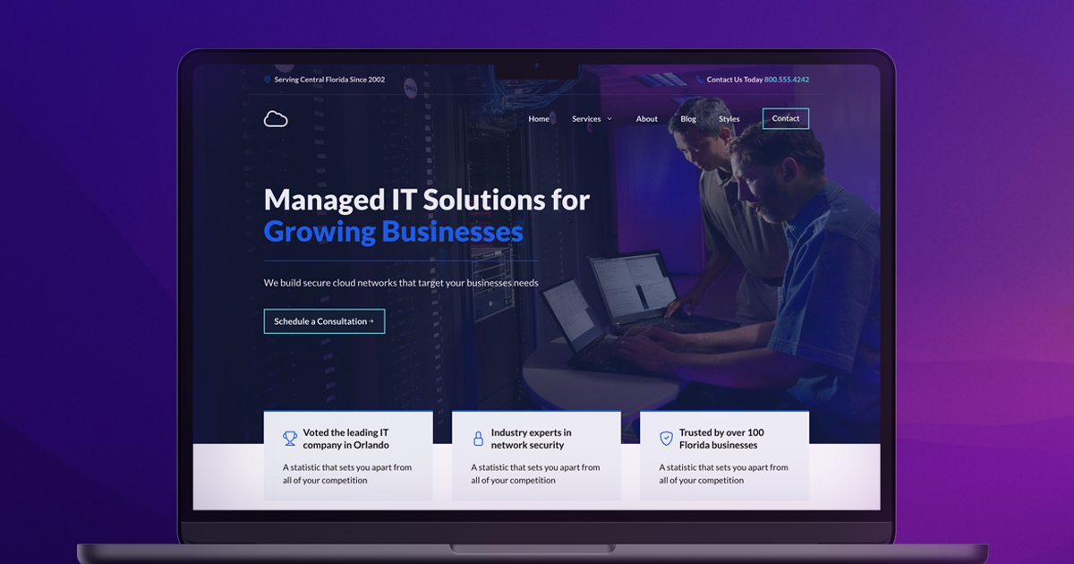
How to Create a Hero Section on WordPress
Our starter sites come with pre-made hero sections that provide all the elements you need to create an effective website. Choose from the new Affinity starter site or one of the Service 2.0 sites, swap images, and enter appropriate text.

If you want to create a hero section from scratch, the new features in GenerateBlocks 2.0 make hero sections simple. For our starter sites with more granular control, we use nested Container Blocks to simplify setting up a hero section.
Here is an overview of the bookkeeping starter site homepage hero area.

While our professionally designed starter templates apply these granular controls, you can create a hero section with a few simple steps.
The GenerateBlocks Patterns Library has everything you need to create hero sections with just a few clicks. Pro users have more options, but even GenerateBlocks Free users have options that you can easily customize.
Start a new page in your WordPress admin, and click the GenerateBlocks icon in the upper right corner.

Next, click on the button to “Open Pattern Library.”
Navigate to the Hero options and choose one of the options that most aligns with your site’s needs.

Change the headline text, imagery, and button text to drive your next conversion.
Your Hero is a Gateway
A well-crafted hero section is an effective gateway to your website, captivating visitors and enticing them to explore further. A great hero can evoke emotions and establish a lasting impression on visitors. Your hero section establishes brand identity and creates connections between your business and prospective customers.
As you design your hero section, consider the balance between stunning visuals, concise messaging, and clear calls to action. Tailor your hero section to your unique brand identity and user motivations. Doing so will ensure an engaging user experience that leaves a lasting impact.