- This topic has 23 replies, 6 voices, and was last updated 3 years, 2 months ago by
David.
-
AuthorPosts
-
September 19, 2020 at 11:19 am #1450229
James
Hey guys,
I am using the latest GP premium and the the Read theme, I am wanting the next post and previous post text links to be buttons. Please can somebody assist me?
Thanks
September 19, 2020 at 2:18 pm #1450339Augustine
Hi, To turn next and previous post links to buttons go to your Theme Customizer >> Layout >> Blog.

Should incase you’re still having issues do let me know and i’ll be happy to assist.
September 19, 2020 at 3:33 pm #1450374Hey,
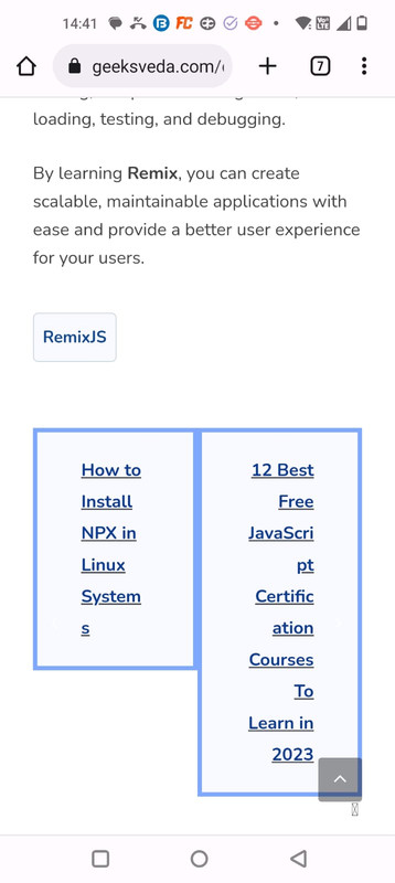
Thanks for the fast reply, however that just changes the read more option to a button. I’m looking to change the post navigation text links seen in this screenshot below.
Thanks
September 19, 2020 at 4:55 pm #1450401David
StaffCustomer SupportHi there,
do you have an example of the style you want to achieve ?
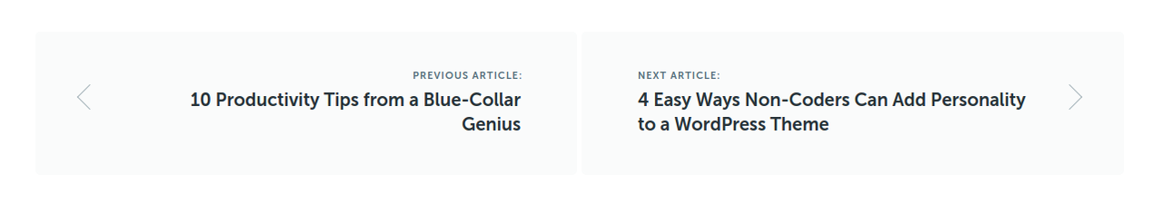
September 20, 2020 at 3:19 am #1450714I was thinking something that just stands out more like in the screen below.
Not overly fussy on the end result, just think the current text links are very blended in. I’d be happy to use the theme buttons style, but I dont know how to convert the text link to a button link, so appreciate any help provided! 🙂
Thank you!
September 20, 2020 at 6:29 am #1450894StaffCustomer SupportTry this CSS:
#nav-below {
    margin-top: 10px;
}

.nav-previous,
.nav-next {
    position: relative;
    margin-top: 10px;
}
#nav-below .nav-previous a,
#nav-below .nav-next a {
    display: block;
    padding: 20px 40px;
    background-color: #ff0000;
    color: #fff;
}
#nav-below .nav-previous a:hover,
#nav-below .nav-next a:hover {
    background-color: #565656;
}
.nav-previous .gp-icon,
.nav-next .gp-icon {
    position: absolute;
    top: calc(50% - 15px);
    left: 10px;
    font-size: 20px;
    color: #fff;
}
.nav-next .gp-icon {
    left: unset;
    right: 0;
}
@media(min-width: 600px) {
    #nav-below {
        display: flex;
        justify-content: space-between;
    }
    .nav-previous,
    .nav-next {
        max-width: calc(50% - 10px);
    }
}
Let us know. May want to change its behaviour for mobiles.
September 20, 2020 at 6:55 am #1450922That is perfect! Thank you very much! 🙂
Just one final thing, you are correct it needs its behavior changing on mobile. At the moment, they are side by side on mobile and the text looks like a long vertical list of words haha. Can we stack them vertically on mobile at all?
Thank you
September 20, 2020 at 7:02 am #1450936StaffCustomer SupportUpdated the CSS above.
September 20, 2020 at 7:07 am #1450939Perfect!
Thank you very much David! Top support as always! <3
September 20, 2020 at 2:22 pm #1451429StaffCustomer SupportYou’re very welcome – glad to be of help.
March 22, 2023 at 2:15 am #2576507Ravi Saive
I have added the provided CSS, which is working fine on desktop, but on mobile it not rendering properly see – https://i.postimg.cc/rsjH7cPD/Whats-App-Image-2023-03-22-at-14-42-01.jpg
March 22, 2023 at 5:31 am #2576714StaffCustomer SupportHi Ravi
do you want to raise a new topic where you can share a link to your site, and i can take a look ?
March 22, 2023 at 8:58 am #2577122Here is the link to site
March 22, 2023 at 10:31 am #2577313Ying
StaffCustomer SupportDo you want the nav links stacked on mobile?
If so, try adding this CSS:
@media(max-width:767px) {
.single-post nav#nav-below {
    flex-direction: column;
}

.single-post nav#nav-below > * {
    width: 100%;
}
}
March 22, 2023 at 9:36 pm #2578012@David and @Ying
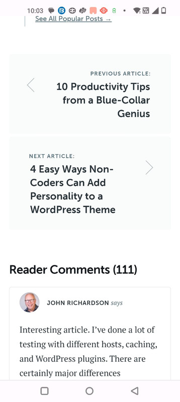
All I want is the prev and next nav should look like this on:
Desktop – https://i.postimg.cc/5NhSPQnX/prev-next-buttons-copyblogger-desktop.png
Mobile – https://i.postimg.cc/kgWFLMpf/prev-next-buttons-copyblogger-mobile.jpg -
AuthorPosts
- You must be logged in to reply to this topic.