
Archived topic
Two mobile menus appearing after update to GP Premium 1.5
5 replies · Started by Paul on November 11, 2017
Viewing posts 1–6 of 6
Since updating to GP Premium 1.5 I've noticed I'm getting two mobile menus appearing when the browser window is between 768-1024px wide.
I believe I did make some changes to the CSS a while back because I wanted the mobile menu to appear sooner - I suspect that might be related to this issue.
The menu on the right is the one I want to hide/remove:
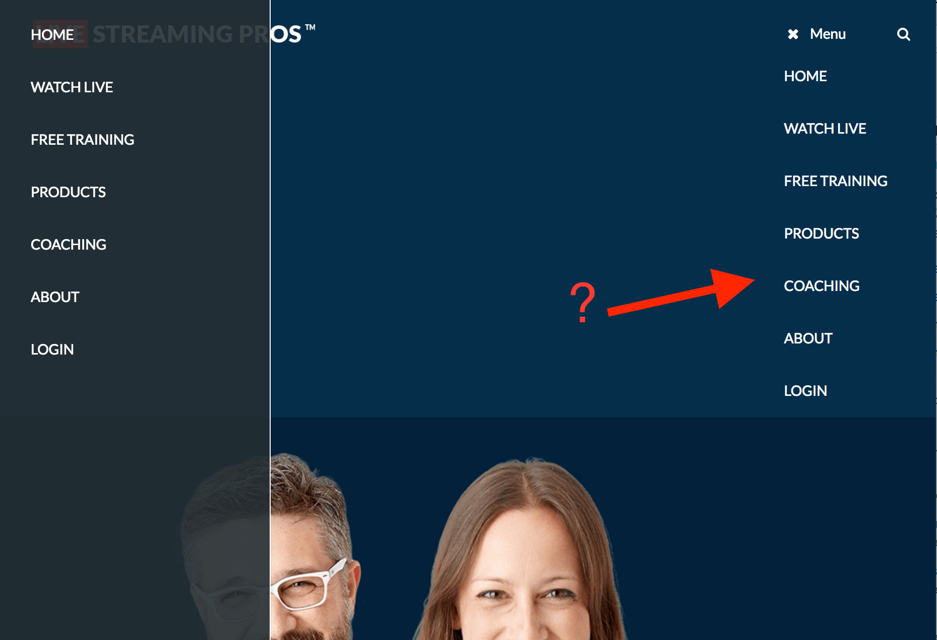
Any ideas?
Hi there,
Are you using some custom CSS to display the mobile toggle at a greater width than 768px?
Hi Tom, yes I have it displaying at 1024. Followed the instructions here:
Try adding this CSS:
@media (max-width: 1024px) {
    .slide-opened #site-navigation.toggled ul {
        display: none;
    }
}Thanks Tom, that appears to have fixed it :)
You're welcome :)
This archived topic is closed to new replies.
