
Archived topic
Stretch Image or BG-Image to right border without Full-Width Container? orbilan
13 replies · Started by Sascha on December 21, 2021
Hey there,
I have created a Main-Container > Grid >
Container-A with Headlines & Text
Container-B with BG-Image
The Main-Container should not be full-width in order to keep the border-spacing consistent for headlines etc.
But the image in Container-B should stretch to the right-border, as you can see on this screenshot.
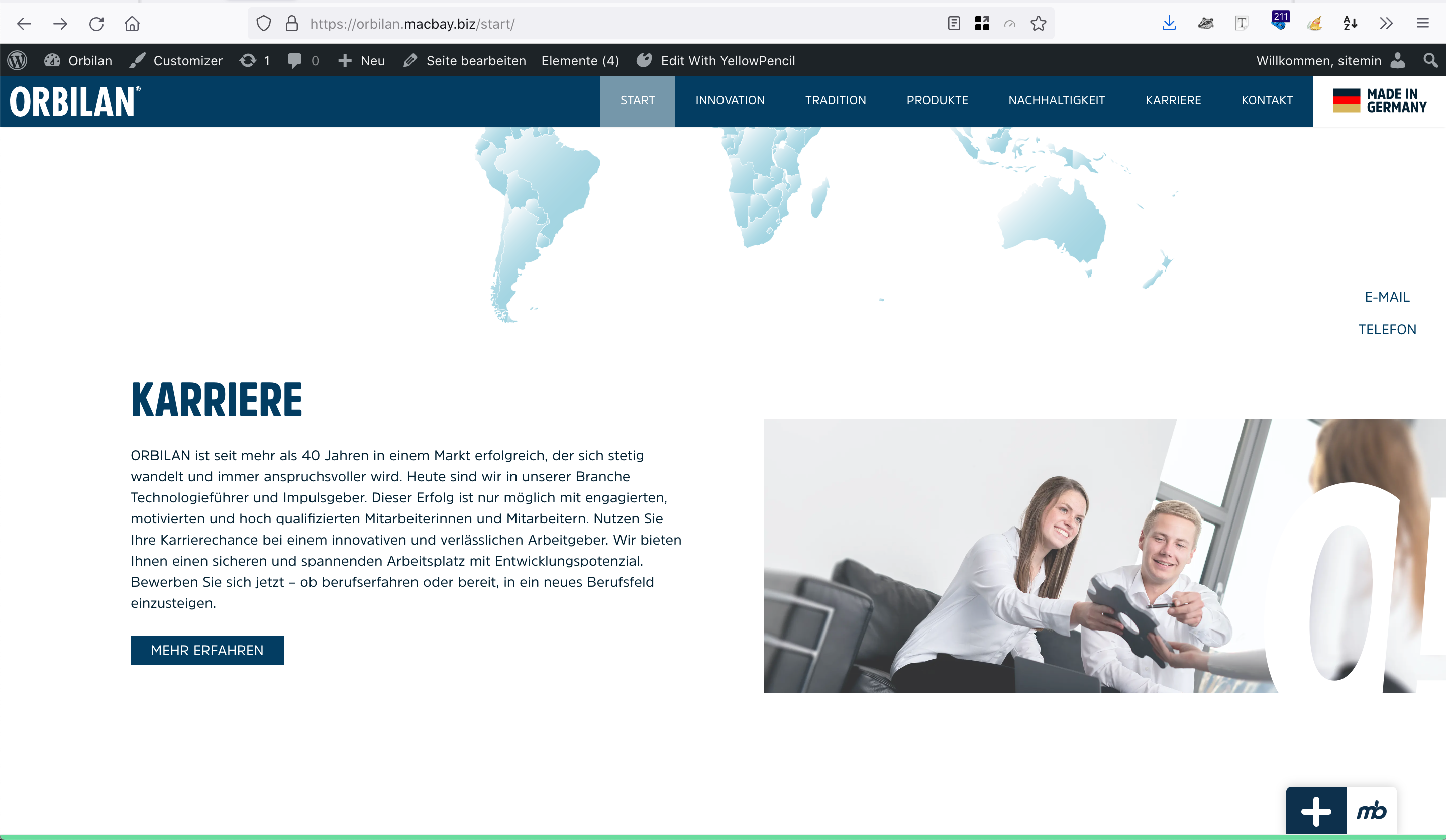
This above mentioned section is placed on this page, but as "Full-Width, so I have added padding-left = 120px to the Container-A in order to keep the headline position consistent with the other sections. But this is problematic as soon as the screen-width changes. The headlines will not remain consistant!
How can I solve this?
Sorry my bad english …
Thank you in advance and kind regards,
Sascha
Hi there,
thats a tricky design to do. There are a few ways to go.
Before that just a note - Don't use the Full Width options in the Block Toolbar. You already have the Content Container set to Full Width - so those options are redundant.
For the breakout image i would do this.
1. first change your container layout so it is like the other sections on your page, so the two grid columns (container-A and container-b) are contained.
2. Select that Container Block and give it an Advanced > Additional CSS Class of: breakout-container
3. Select Container-B with the background image and give that a CSS Class of: breakout-right
4. Add this CSS:
@media(min-width: 769px) {
    .breakout-container {
        position: relative;
    }
    .breakout-right {
        position: absolute;
        top: 0;
        right: 0;
        bottom: 0;
        left: 50%;
    }
}
This will absolutely position the right hand container to sit flush with the edge of the screen.
Hi,
thanks, but it's not working, or maybe I have misunderstood.
Can you please check this page again? The "Karriere" section now looks even worse. The Container-A (the one with Headline "Karriere" included) is streched to the left border, but the headline "KARRIERE" MUST aligne with headline below "NACHHALTIGKEIT".
Thank you in advance and kind regards,
Sascha
Before that just a note – Don’t use the Full Width options in the Block Toolbar
So set the Inner Container of the main container tocontained width, set 1200pxas the width:
https://www.screencast.com/t/GO08OIlviry
Thanks, but now it does not look on tablet …
Thanks, but now it does not look on tablet …
Can you take a screenshot of the look on tablet so we can understand what issue you are pointing to?
Hey there,
thanks for your help!
I have applied the CSS-classes (via Advanced > Additionall CSS Class) & -code (via Simple CSS) to these 2 pages (DE & EN):
https://orbilan.de#karriere (DE)
https://orbilan.de/start-en#karriere (EN)
and it's working well on tablet (768).
But on DE-Version an unwanted border occurs between the image and the right border. Check these screenshots to illustrate the issue:
EN -> http://media.macbay.net/_support/Orbilan-no-border-correct_277338C6.png
DE -> http://media.macbay.net/_support/Orbilan-Start-DE-with-border-right_27733891.png
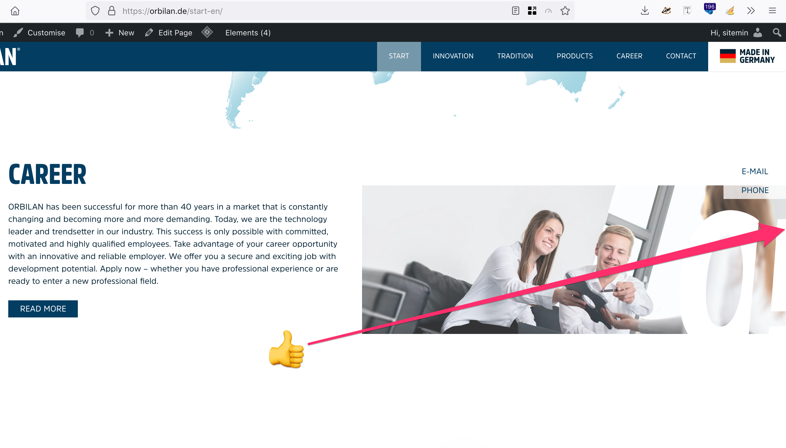
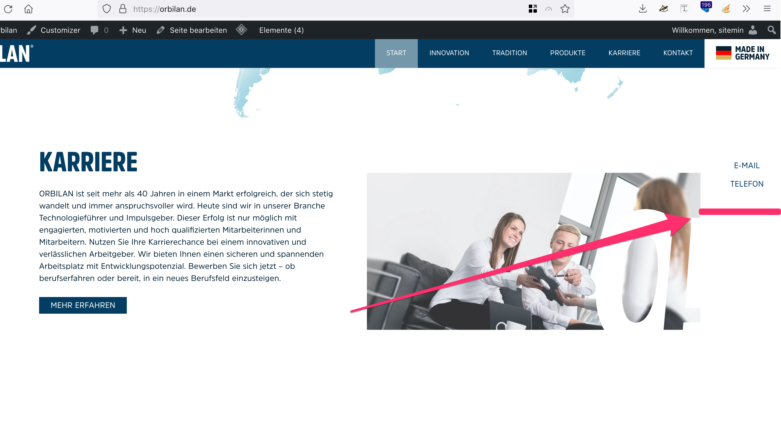
Can you help me fixing this, please?
Thank you in advance and kind regards,
Sascha
Check the Content Container:
https://docs.generatepress.com/article/content-container/
On English it is Full Width.
On German it is NOT - change it to Full Width.
Ah, I also had applied a Global Layout Element with different options 🙈 my bad …
Thank you for your awesome support
Glad to be of help!
Hello,
I wonder if you can help me to apply the same layout to other sections on this site?
There's this page "Produkte New", with their sections "Halbzeuge" and "Fertigteile".
Both these sections content-containers Inner Container should be set to "Contained Width" instead of "Full Width", which I have already done. The challenge now is to expand the images in each section to their respective borders.
I have tried to apply the code which you have previously provided to the content container and the inner container which contain the images, but they are not working properly:
For "Halbzeuge" section, I have replaced the "breakout-right" with "breakout-right" class and replaced the "left" with a "right" declaration:
.breakout-left {
        position: absolute;
        top: 0;
        right: 0;
        bottom: 0;
        right: 50%;
}
Now I can't see the image at all.
On "Fertigteile" section, the left inner-container, or rather the headline & paragraph inside this container, cannot be set to vertically align "centred" any more, instead they "stick" to the top-border.
Also, the section below is now overlapping with the above "Fertigteile" section.
I have provided admin access below.
The CSS Code is applied via Simple CSS meta box below the content.
Any chance that you help me out with this again?
Thank you in advance and kind regards,
Sascha
Update your CSS to this:
@media(min-width: 769px) {
    .breakout-container {
        position: relative;
        overflow: hidden;
    }
    .breakout-right {
        position: absolute;
        top: 0;
        right: 0;
        bottom: 0;
        left: 50%;
    }
    .breakout-left {
        position: absolute;
        top: 0;
        right: 50%;
        bottom: 0;
        left: 0;
    }
}
Note i also added the overflow: hidden; property to the first rule to stop the image from overlapping other containers.
And you need to add some top and bottom padding to the columns containing the text.
Hi, thanks, looks perfekt on desktop now!
Only mobile is not looking good, check here
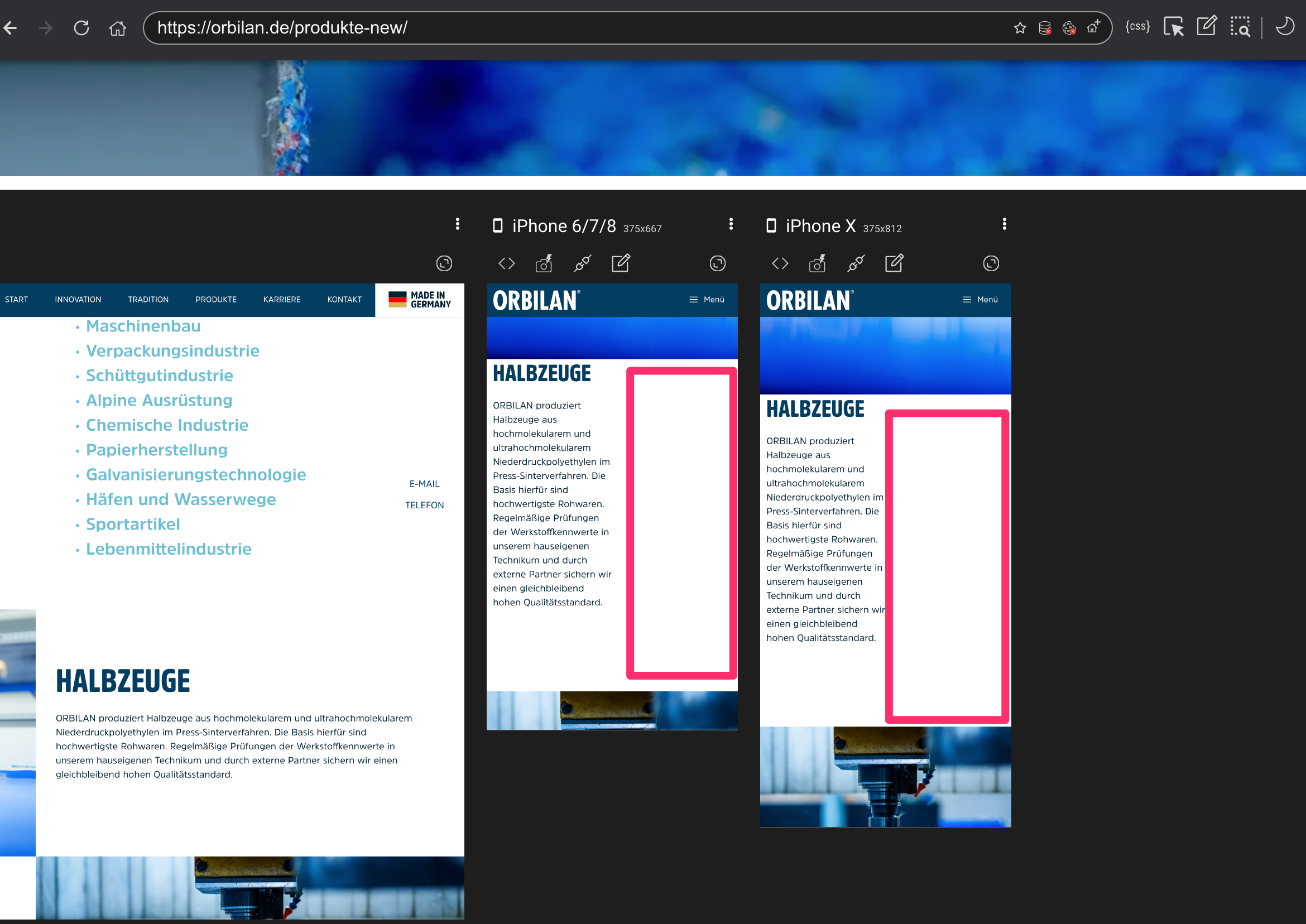
How to remowe this huge white space?
Thank you in advance and kind regards,
Sascha
Couple of things:
1. When you select a column Container and you switch to Mobile views you can change the % it occupies for that screen size - you currently have it at 50% and it needs to be 100%
https://www.screencast.com/t/F4Pa9fSdoa
2. That same Container has -80% right margin on mobile view - that needs setting to 0: