- This topic has 10 replies, 3 voices, and was last updated 6 years, 9 months ago by
Tom.
-
AuthorPosts
-
June 30, 2017 at 2:39 pm #342218
Jamal
Hi
The sticky navigation menu item height doesn’t seem to be applied on the mobile sticky navigation. What am i missing? Thanks !
P.s While creating this support topic this appeared and i thought you might be interested in case it was unintended.
June 30, 2017 at 2:54 pm #342229Leo
StaffCustomer SupportHi Jamal,
Just making sure…so basically you want the mobile header height to be different than sticky mobile header height?
June 30, 2017 at 3:22 pm #342236Hi Leo
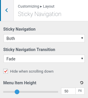
I have not enabled mobile header, i just wanted options in Layout > Primary Navigation > Menu item height to be different than Layout > Sticky navigation > Menu item Height.
On desktop everything works as it should but on mobile i can’t seem to make it work.
June 30, 2017 at 8:02 pm #342282StaffCustomer SupportSo currently you have a mobile Menu Item Height set by clicking the mobile toggle in Customizer > Layout > Primary Navigation, and you want that height to be different when the user scrolls down?
July 1, 2017 at 2:39 am #342367I think i got it to work with this custom css, please let me know if there is a better way to do. Thanks
@media( max-width: 768px ) {
    .main-navigation .main-nav ul li a,
    .menu-toggle,
    .main-navigation .mobile-bar-items a {
        line-height: 50px;
    }
}
July 1, 2017 at 6:12 am #342421Tom
Lead DeveloperLead DeveloperLooks great, although you should be able to do that by clicking the mobile icon in Customize > Layout > Primary Navigation next to the menu item height option.
July 1, 2017 at 6:30 am #342429The sticky navigation part is what i was having problems with, Tom. I want the normal navigation at 80px and sticky at 50px but it’s not happening. I will send you a link so you see what i mean.
Edit: Not sure if email was sent, it shows processing. Anyway here is the link
July 2, 2017 at 2:24 pm #343050Tested this on another install and its still not working. Same value is being set for both the desktop and mobile sticky navigation.
July 2, 2017 at 9:23 pm #343167Lead DeveloperLead DeveloperSo you’re only having the issue on mobile, correct? Right now the sticky + static menu will use the same height on mobile (whatever you have set in Customize > Layout > Primary Navigation > Menu item height (mobile).
A sticky height on mobile will likely come at some point, but I feel like the transition etc.. is overkill for mobile browsers. Settings a more narrow, static height on mobile seems to be best for UX.
July 3, 2017 at 2:50 am #343288I will use a narrower mobile menu item height, thanks for the clarification.
July 3, 2017 at 10:27 am #343511Lead DeveloperLead DeveloperNo problem – I’ll see what I can do about the sticky height on mobile 🙂
-
AuthorPosts
- You must be logged in to reply to this topic.