- This topic has 9 replies, 4 voices, and was last updated 1 year, 11 months ago by
Ying.
-
AuthorPosts
-
May 15, 2022 at 6:29 pm #2220669
Jim
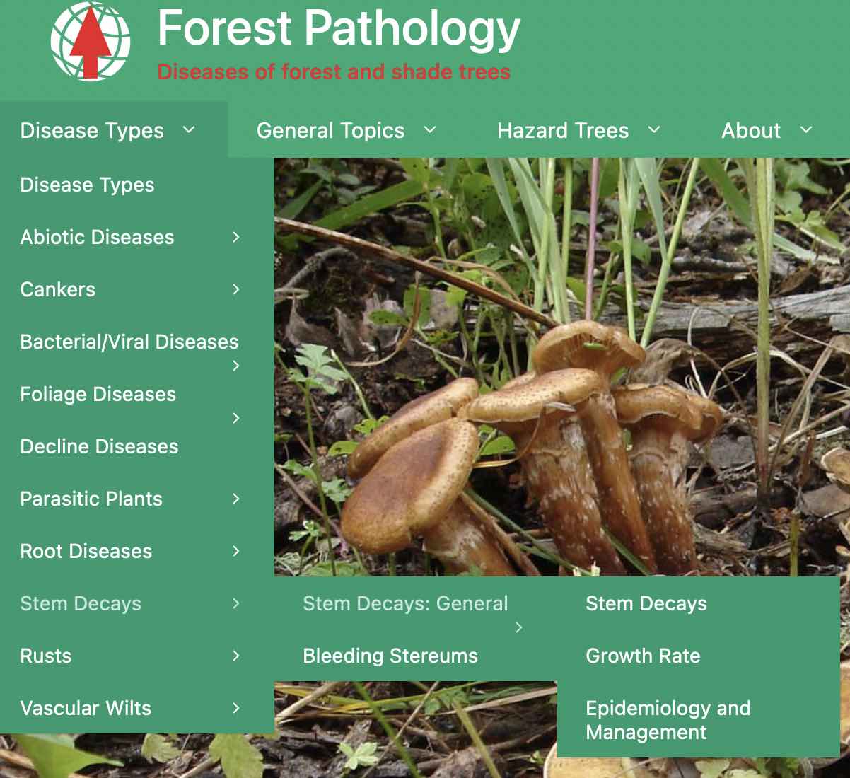
See the longer menu items, causing the > to wrap. Is there a length limit on text, or should it be making more space?
 May 15, 2022 at 7:23 pm #2220686
Leo
StaffCustomer SupportHi there,
Try one of the solutions here:
https://docs.generatepress.com/article/menu-item-height-width/#sub-menu-item-widthIf this doesn’t work then please link us to the page in question 🙂
May 16, 2022 at 6:36 am #2221052Jim
Thank you. Using
.main-navigation ul ul {
    width: auto;
    white-space: nowrap;
}
actually makes it look a bit worse. I actually prefer the text itself to wrap as before. Now it doesn’t, and the right edge of the menu background box is right at the edge of the last letter, and the arrow is still wrapping on longer items. I’d like to just prevent the arrow from dangling on a new line by itself, like a non-breaking space between it and the text.
May 16, 2022 at 8:43 am #2221375David
StaffCustomer SupportHi there,
keep what CSS you have so far and add this:
.main-navigation .main-nav ul li.menu-item-has-children > a {
    display: flex;
    justify-content: space-between;
}
nav ul ul .menu-item-has-children {
    float: none;
}
It should force the submenu to the width of the menu item and keep the toggle icon inline
May 16, 2022 at 11:20 am #2221545Jim
Wow David, you are a CSS-fu master! I’ll spend half the day figuring out how that works.
It no longer allows the text to wrap, but I’m okay with that. It’s a small price to pay to fix the rest of it. I should probably try for shorter menu text anyway.
I notice that the spacing after a menu item now depends on whether it has a submenu. For example, the space after “Decline diseases” is less than space after the rest that have submenus. Is that to be expected?
May 16, 2022 at 11:34 am #2221554Ying
StaffCustomer SupportHi Jim,
You have this CSS which causes the uneven padding.
.menu-item-has-children ul .dropdown-menu-toggle {
    padding-top: 10px;
    padding-bottom: 10px;
    margin-top: -10px;
}
As you have cache plugin on, I can’t tell where the CSS is from.
Maybe check your custom CSS first?
Let me know!
May 16, 2022 at 12:31 pm #2221618Jim
Funny, according to my dev tools, Ying, the CSS you quoted is coming from:
wp-content/themes/generatepress/assets/css/main.min.css?ver=3.1.3I temporarily disabled page caching for the site, although the front page wasn’t cached anyway. I also disabled CSS concatenation/minification, which was probably preventing you seeing what was going on.
May 16, 2022 at 12:39 pm #2221629Ying
StaffCustomer SupportThe CSS does come from GP 🙂
After adding David’s CSS, the structure changed, so the CSS adds extra bottom padding to menu item which has the arrow.
Try add this CSS to remove the extra bottom padding:
.menu-item-has-children ul .dropdown-menu-toggle {
    margin-bottom: -10px;
}
May 16, 2022 at 1:45 pm #2221674Jim
That did the trick all right!
I wonder if you guys would want this to be the stock styling of the menus. It seems to be an improvement (with my limited understanding).
Thanks for all your help! You guys are brilliant at this stuff.
May 16, 2022 at 1:59 pm #2221697Ying
StaffCustomer SupportThanks Jim 🙂
-
AuthorPosts
- You must be logged in to reply to this topic.