
Archived topic
Primary Navigation Problem
12 replies · Started by Dan on September 6, 2019
Hi,
My Primary Navigation menu is wonky, set at a lower level than the logo. Have played around with all the settings, nothing seems to fix it.
You can see what it looks like here: https://barcelonanavigator.com/wp-content/uploads/2019/09/2019-09-06_10-57-19.jpg
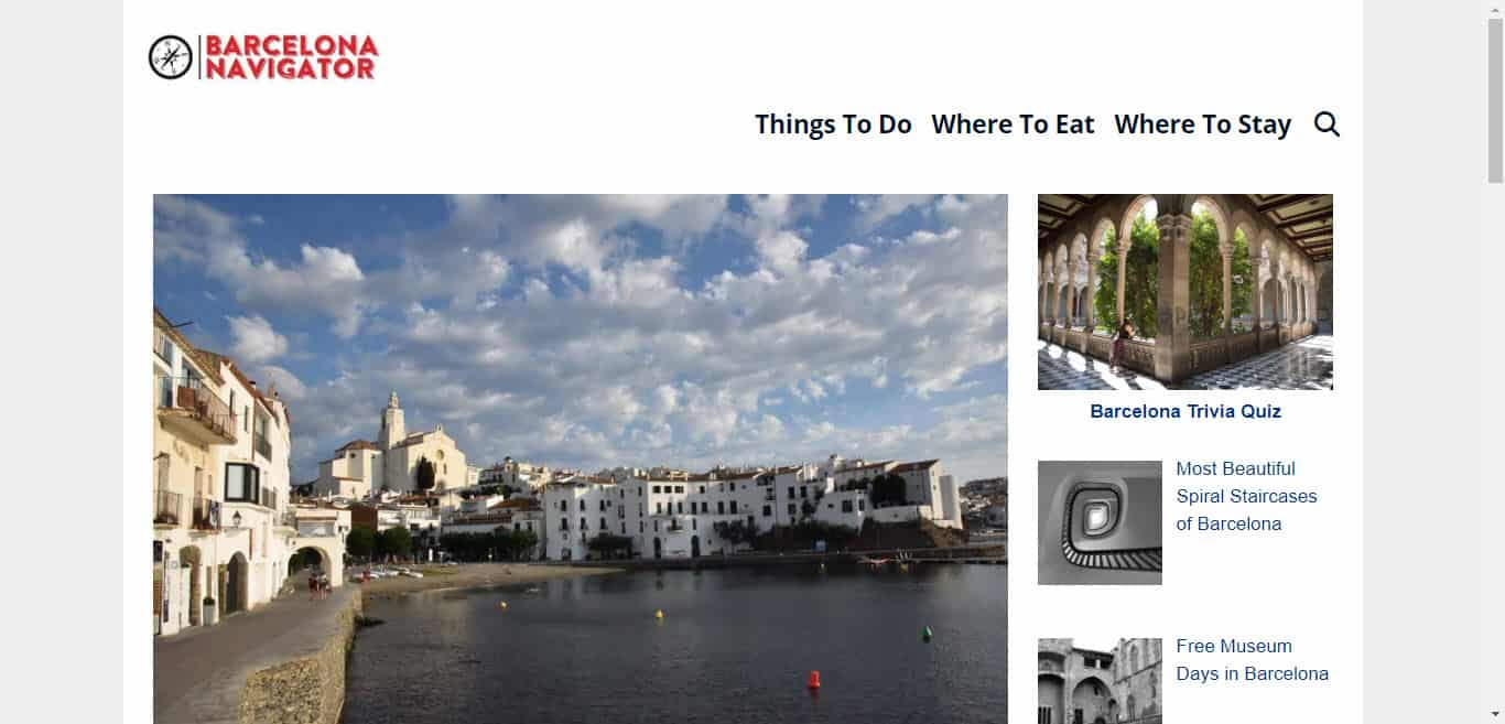
Hi there,
if you want it inline with your navigation then add the logo to Site Identity > Logo then in Layout > Header check the Navigation as Header checkbox. The height of you logo will be defined by the Menu Item height of your primary nav.
Thanks, I did that and it worked, but it shrank the size of the logo so it looks weird. Don't see where I can manage the size of the logo.
sorry, ignore, you asnwered my question! thank you
Glad to hear you got it resolved.
Is there any way to control the size of the logo in mobile vs. desktop? In my case the logo is too small on desktop and too big in mobile.
Maybe this would be easier:
/* Remove default padding on desktop logo */
@media (min-width: 769px) {
    .navigation-branding img {
        padding: 0;
    }
}

/* Set height of mobile header logo */
.site-logo.mobile-header-logo img {
    height: 60px;
}you are awesome, thanks
Glad to be of help
one last question - any way to get more padding above the logo and navigation?
Without effecting the menu item height / logo then we can add some padding like so:
/* Desktop */
.main-navigation {
    padding-top: 15px;
}

/* Mobile */
#mobile-header {
    padding-top: 10px;
}brilliant, thanks :)
You're welcome