
Archived topic
Mobile theme goes slightly beyond the width of the screen
7 replies · Started by Francesco on October 19, 2020
Hi, I've just installed READ theme on a development website.
My problem is : when displayed from mobile, website goes slightly beyond the width of the screen. It is not properly centered and you can even move the screen horizontally. I would like the site to be precisely in the center with no possibility of moving it this way.
I'm sending you the link of the development website into private information. Every unnecessary plugin has been shutted down, but the problem persist. How can i fix thix ?
thanks
Francesco
Hi there,
That's strange.
Do you see the same issue in the default site here?
https://gpsites.co/read/
Hi there,
i tried to find the problem removing every plugin one by one and force browser refresh.
I found that Wordpress Classic Editor Plugin was creating the issue.
Maybe you could be interested in investigating through it, since it is a very popular plugin ?
Anyway i removed it..I'll keep going with the hateful Gutenberg :'(
The home page of Read is using Gutenberg with GenerateBlocks so I wouldn't assume the Classic editor to work well there - you would definitely lose all formatting.
Gutenberg takes a bit of a learning curve but should be a lot more flexible once you get a hang of it - especially with the help of GenerateBlocks :)
Hi Leo, since this post is so recent and I'm facing the same problem (but I don't have the WordPress Classic Editor plugin) I was curious as to how to correct it. Here is how it displays on my phone: 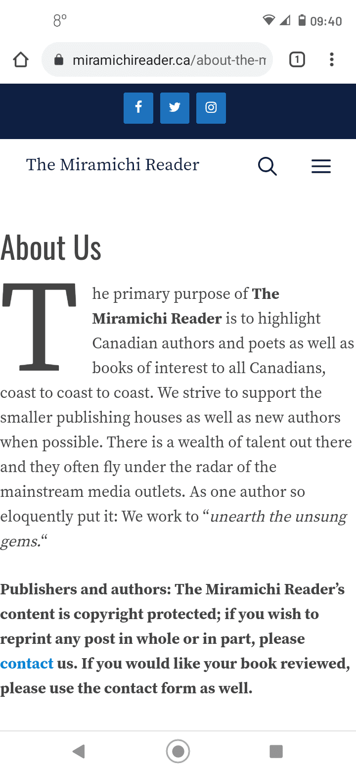 The screenshot doesn't really represent the issue; the text is right to both edges, closer on the left than the right edge.
My website is: The Miramichi Reader This issue occurs on the About Us and Contact pages, but not on single post pages.
Hi there,
can you check the Page Builder Container option for those problem pages:
https://docs.generatepress.com/article/content-container/
Make sure it is set to Default.
Success! Thanks, David!
Glad to hear that!
