
Archived topic
Merch: Homepage mob-carousel
7 replies · Started by Sebastian on July 25, 2019
I guess this question is for David
I really like the Merch design, but one problem is driving me nuts. I have a clean installation, latest WP version and GP version. But there is a gap on the woocommerce carousel compared to the library version on generatepress.com. Although the Gutenberg preview looks good, but not the live version.
Any ideas where the differences come from? Is this a Gutenberg issue?

Hi there,
Give this CSS a shot:
.wc-block-grid .wc-block-grid__products .wc-block-grid__product .wc-block-grid__product-image {
    text-align: left;
}
Adding CSS: https://docs.generatepress.com/article/adding-css/
WooCommerce blocks recently released an update which broke some of the layouts.
Hi Leo
It's left, but not what I hoped for. Also mobile looks different.
Should be
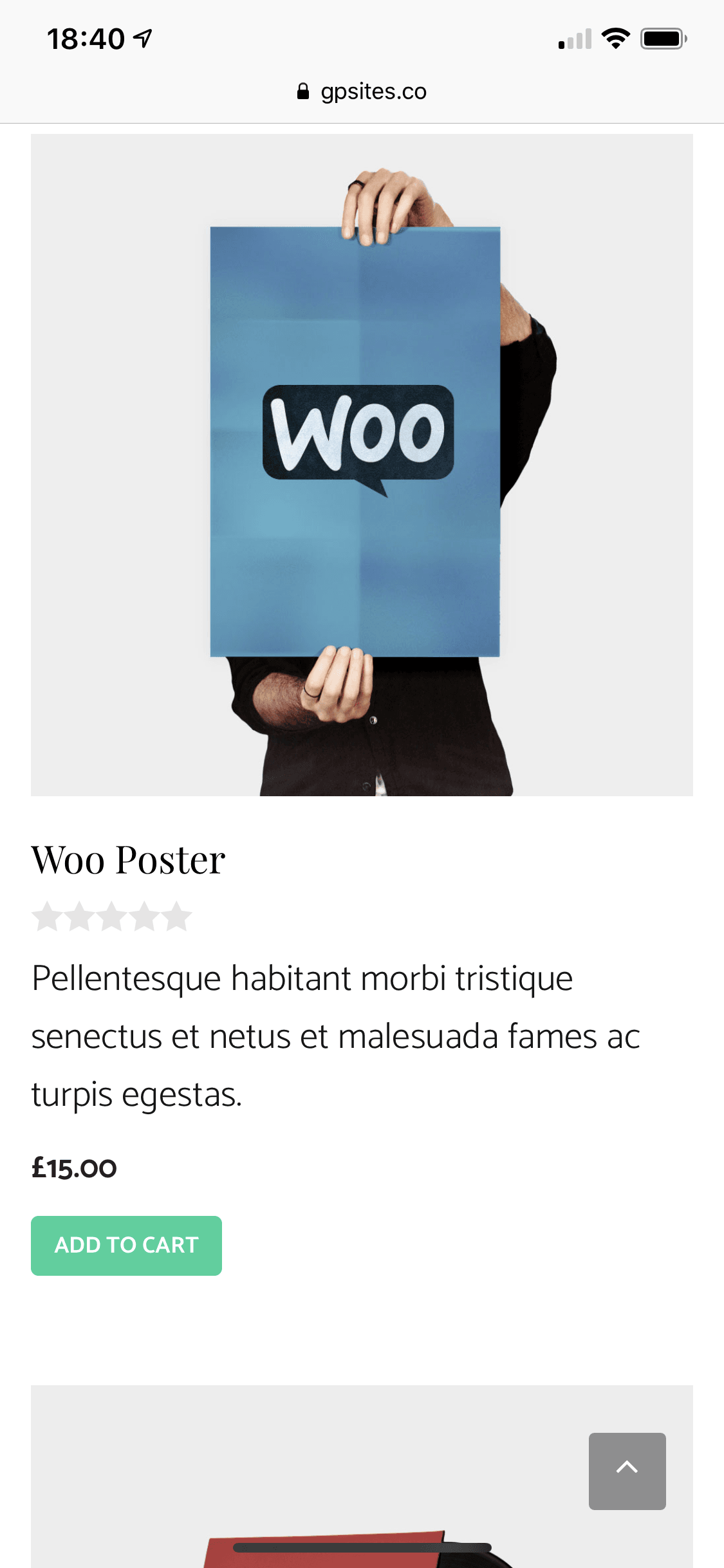
is now
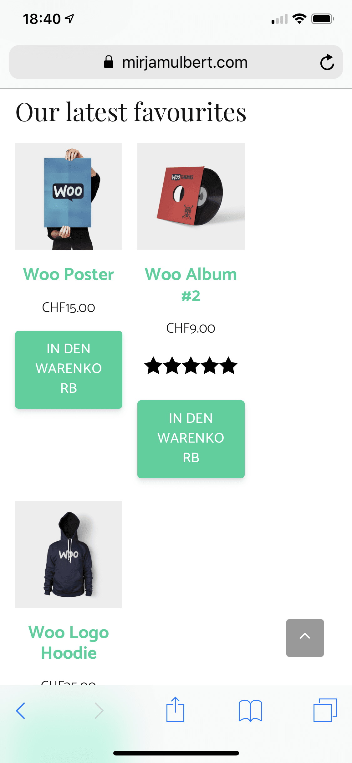
Any ideas how David realized the styling below the product images? Did I miss anything in the setup?
It looks like they updated the Woo Blocks plugin and changed all of the HTML structure.
For now, try this:
.wc-block-grid .wc-block-grid__product {
    box-sizing: border-box;
}

.wc-block-grid .wc-block-grid__products .wc-block-grid__product {
    text-align: left;
}

.wc-block-grid__product-title {
    color: black;
}
We'll need to release a GPP update so our Customizer options apply to their new block structure.
Thank you both. That helped for desktop view.
I will wait for the update. Have a great weekend.
Thanks! You too :)
For responsive mobile view this here works for me:
@media (max-width: 724px) {
    .wc-block-grid__product {
        flex-basis: 100% !important;
        max-width: none !important;
    }
}
For me it's solved now.
Awesome, thanks for sharing :)