
Archived topic
Is there a way to load smaller image versions on mobile?
18 replies · Started by Héctor on June 15, 2021
Hi, I'm having trouble with my site's speed because of its "Largest Contentfull Paint".
I've noticed that it's caused because it shows the full version of the featured image (893x324) instead of a smaller one. Is there a way to make it show the medium version that I have set to a 500 px width?
My featured images settings are:
- Show images
- Don't Show padding
- Position: Above title
- Align: Center
- Size: Full
- Height: Blank
- Width: Blank
This is a post of the site I need help with: https://pcgamia.com/noticias/assassins-creed-valhalla-dlc2/
Thanks in advance. :)
I've seen there used a featured image resizer included in the theme. Is there still something like that and a way to display the new image size on mobile displays?
Hi Hector,
This thread might offer some info:
https://generatepress.com/forums/topic/is-it-possible-to-upload-images-specifically-for-mobile/
Hope this helps.
Thanks Leo!
Improved a bit, but LCP is still high. I've read somewhere in the forum that removing the "lazy" feature from the featured image would help. Is there any way I can achieve it?
So adding a cropped image size using this tutorial and displaying this "version" of the featured image on mobile screens is impossible?
I'd assume the lazy loading option is coming from your caching plugin. Can you confirm?
No. I was using the default WordPress feature. I have disabled it now as it improves my score a lot, but I would like to disable it only for featured image.
Hi there,
Try the following PHP Snippet to force the browser to load a smaller image on smaller devices:
function db_modify_srcset_sizes($sizes, $size) {
	return '(max-width: 550px) 550px, (min-width: 551px) 893px, 100vw';
}
add_filter('wp_calculate_image_sizes', 'db_modify_srcset_sizes', 10 , 2);
I looked at your image src-set i saw a 550px image and the largest was 893px... so hopefully the above should work.
Thanks David,
I added your code to my generatepress-child functions.php, but it still displays the 893px image on mobile.
It is working as that image is no longer being flagged by Google PSI report for Properly size images.
As most devices and the default responsive view in Chrome Developers tools are for a x2/x3 HD device its going to make the request for the larger image. If you manually set the device to DPR: 1.0 it makes the request for the 550px image.
I made the test using https://ready.mobi/#1965067-4l6h and it doesn't show any error about the featured image size. But if I right click the image and try to open it in new tab or save it to my computer it's the big one.
When inspecting it using Chrome tool on a 375x812 virtual cellphone the image code I get is:
<img width="893" height="324" src="https://pcgamia.com/wp-content/uploads/2021/06/AC-Valhalla-DLC2-FI.jpg" class="attachment-full size-full" alt="Assassin's Creed Valhalla - El Asedio de París" itemprop="image" srcset="https://pcgamia.com/wp-content/uploads/2021/06/AC-Valhalla-DLC2-FI.jpg 893w, https://pcgamia.com/wp-content/uploads/2021/06/AC-Valhalla-DLC2-FI-550x200.jpg 550w, https://pcgamia.com/wp-content/uploads/2021/06/AC-Valhalla-DLC2-FI-768x279.jpg 768w" sizes="(max-width: 550px) 550px, (min-width: 551px) 893px, 100vw">
I just checked you site and i no longer see the 550px size image in the Featured Image - dud you change something ?
I just reuploaded it changing its name to be sure that other size versions were created. :S
If you adjust the Image sizes then the code i provided needs to be adjusted too:
function db_modify_srcset_sizes($sizes, $size) {
	return '(max-width: 500px) 500px, (min-width: 501px) 893px, 100vw';
}
add_filter('wp_calculate_image_sizes', 'db_modify_srcset_sizes', 10 , 2);
However, you desktop and the mobile responsive view in browser developers tools will still load the larger size image because of the screen DPR. Change the code above and let me know - and ill provide a screenshot to demonstrate that.
Thanks again David.
I tried the new code and opened the post on my own mobile device. It still shows the big one, but maybe my phone's resolution is too high.
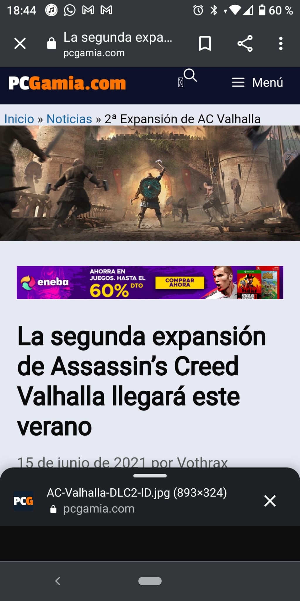
That will be correct.
See here - i set the resolution (DPR) to 1.0 and the browser makes the smaller file request:
