
Archived topic
Is it possible to add a bottom bar?
12 replies · Started by Simon on November 13, 2020
Hi,
I'm looking to add an affiliate disclaimer somewhere prominently on my blog. How do you add a bar like this that's permanently at the bottom of the page?
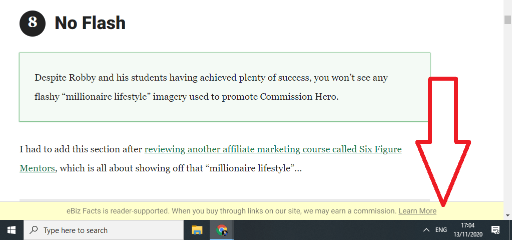
Many thanks in advance!
Simon :)
Hi there,
Will you be needing a close button for that or it can be permanently there?
If a close button is required then I would recommend looking for a plugin.
Let me know :)
Hi Leo, it can be there permanently no problem.
Thank you for your help on this! :-)
Hi there,
try this:
1. Create a new Block Element in Appearance > Elements ( you must have the Elements module enabled):
https://docs.generatepress.com/article/block-element-overview/
2. Add a Text block with your text and link, and in the settings give it a background and text color ( this will automatically add some padding ). Then in Advanced -> Additional CSS Class(es) add bottom-bar
3. Set the Display Rules to Entire Site
4. Publish the Element.
5. Add this CSS to your site:
body {
    margin-bottom: 60px; /* adjust this to the height of the bottom-bar */
}
.bottom-bar {
    position: fixed;
    right: 0;
    bottom: 0;
    left: 0;
}Thank you so much for this. I took all the action steps and it's working, but just a couple of adjustments are needed:
If you see the image, it's showing a gap at the bottom:

Also, visit any review page (see private info) and you'll see it disappears behind the 'At A Glance' box:
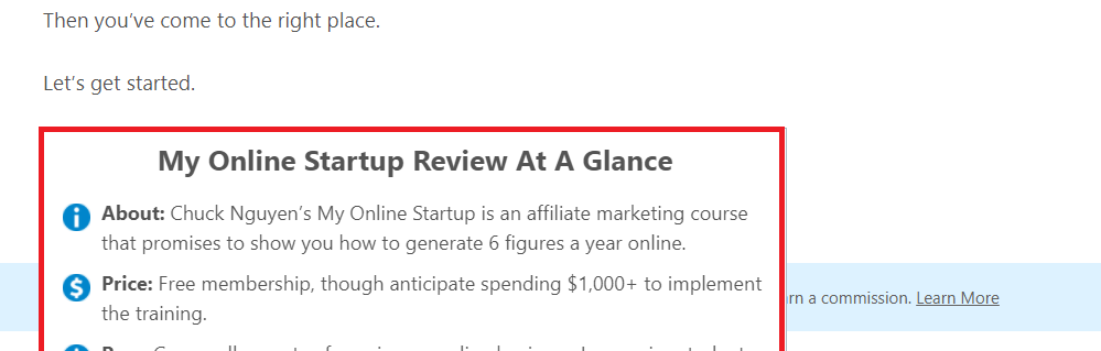
Also, the margin-bottom number doesn't seem to adjust the padding within additional CSS.
Hi,
If you see the image, it’s showing a gap at the bottom:
To remove the gap, add margin-bottom: 0px; to your .bottom-bar selector found on your additional CSS.
Also, visit any review page (see private info) and you’ll see it disappears behind the ‘At A Glance’ box:
To address this, add z-index: 5; to your .bottom-bar selector.
That said, your .bottom-bar selector should look something like this:
.bottom-bar{
    position: fixed;
    right: 0;
    bottom: 0;
    left: 0;
    margin-bottom: 0px;
    z-index: 5;
}
If you want to add/adjust its padding, simply add "padding: 10px;" to the list of properties in .bottom-bar.
Hi,
Thank you, the padding still isn't changing for some reason. Here's the entirety of what's in additional CSS:
.bottom-bar{
padding: 1px;
position: fixed;
right: 0;
bottom: 0;
left: 0;
margin-bottom: 0px;
z-index: 5;
}
Thank you, the padding still isn’t changing for some reason. Here’s the entirety of what’s in additional CSS:
That's because the markup's classlist has .has-background which overrides your padding property from WordPress Core's /style.min.css.
To address this, add !important to your padding property.
Example:
.bottom-bar{
padding: 1px !important;
position: fixed;
right: 0;
bottom: 0;
left: 0;
margin-bottom: 0px;
z-index: 5;
}Brilliant! Thank you so much! :)
Brilliant! Thank you so much! 🙂
No problem. Glad to be of any help. :D
Apologies, one last question: is it possible either make text smaller on mobile only or to remove from mobile altogether?
Many thanks in advance.
When you created your Block element you added this CSS class:
bottom-bar
Update that to: bottom-bar hide-on-mobile
The hide-on-mobile class will remove it on mobile devices.
If you want greater styling control when creating Blocks / Block Elements you may want to try the GenerateBlocks plugin:
https://wordpress.org/plugins/generateblocks/
It provides full responsive style controls - for text you can use the Headline block, instead of a standard text block when you want to change sizes for different device sizes.
