
Archived topic
Bottom Mobile Nav
5 replies · Started by Ivan on November 19, 2018
Hello I want to create a Bottom Menu only on Mobile, I have an screenshot from an other Website that has the Excact same Bottom Nav I want in GP! here it is : BottomNav
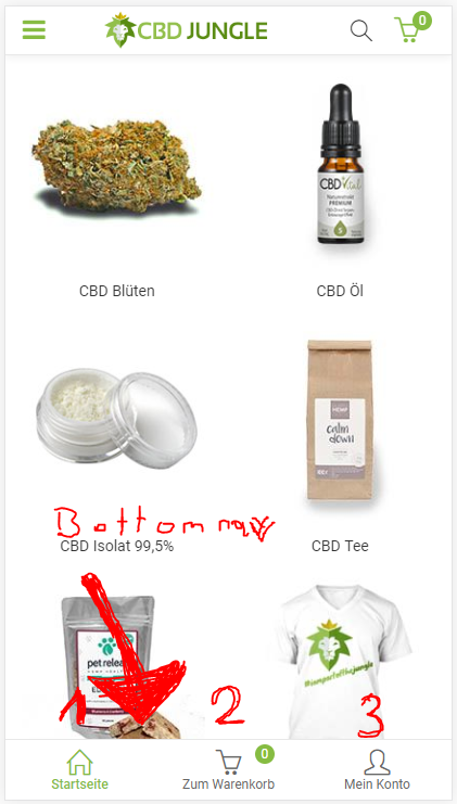
GeneratePress has already an good Woocommerce integration but it would be cool to add this feature as standard option to be able to have on the bottom this bar in addion to the Standart one and then you can choose in the Woocommerce Settings where you want the Cart to show up on the Top or Bottom.
If this is right now not possible how can I do this with CSS? Please Help me. Thank you
Hi there,
Doing something like that right now would involve a decent amount of coding. I can guide you in the right direction if you're comfortable enough with CSS to make it look nice?
We've had a few requests for this. Thinking about adding it to the WooCommerce module :)
That would be cool to have this feature soon in an update!
Ps. Yes I can work with CSS I'm not a pro but i'm good in making things look nice!
Thanks
In that case, you could add something like this into the generate_after_footer hook:
<div class="sticky-commerce-bar">
    <div class="bar-area">
        Stuff in area one
    </div>

    <div class="bar-area">
        Stuff in area two
    </div>

    <div class="bar-area">
        Stuff in area three
    </div>
</div>
Then you can fix it to the bottom:
.sticky-commerce-bar {
    position: fixed;
    bottom: 0;
    left: 0;
    right: 0;

    display: flex;
}

.bar-area {
    width: calc(100% / 3);
}Thank you so much, This Works perfect!
You're welcome :)