Archived topic
How to align the logo on the left when you have too many menu items?
5 replies · Started by Marc on June 27, 2021
Hi all,
I want to have my logo on the top left corner, and my menu items on the right. For that, I've enabled the option "Use navigation as header" in the Layout -> Header menu (that's the best way I found to do it).
Problem: if I have too many menu items, the logo remains on the top right but the menu goes down and is not longer next to the logo. Everything is messed up (see attached picture).
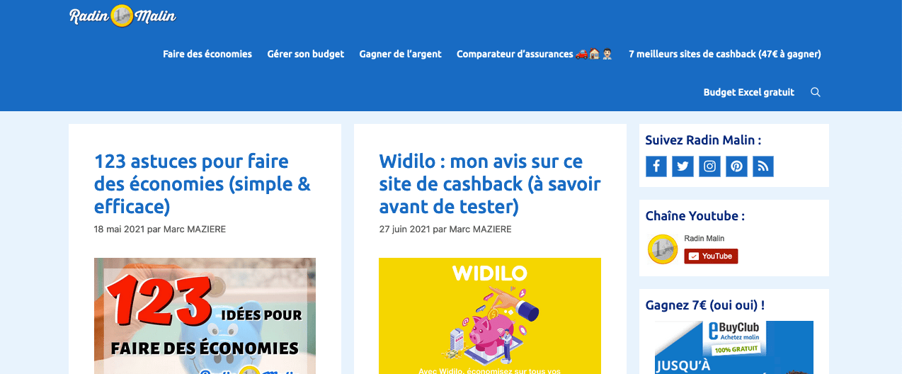
How do I align the logo and the menu items on the same line? And if there are too many menu items, how do I make it so they continue on a new line starting from the left? Thanks!
Hi Marc,
Any chance you can link us to the site in question?
You can use the private information field.
Let me know :)
There you go :)
Hi there,
options:
1. You can increase the Mobile Menu Breakpoint in Customizer > Layout > Primary Navigation so it switches to mobile view on larger screens.
2. Add this CSS - which keep the logo and nav inline and only the menus items will wrap to a new line:
@media(min-width: 769px) {
    #site-navigation .inside-navigation {
        flex-wrap: nowrap;
        align-items: flex-start;
    }

    #site-navigation .inside-navigation .navigation-branding {
        flex: 0 0 200px;
    }
}Thank you David, it worked!
Glad to be of help