
Archived topic
How I can adjust these for responsive/mobile screens
4 replies · Started by Elena on July 26, 2021
Search Theme.
So I see these cropped blocks/pieces of text on my iphone when checking my test site:
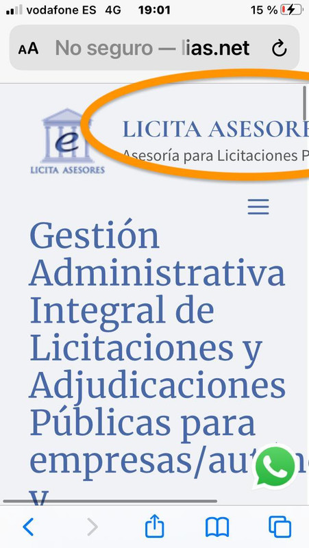
1) how can I make the tagline actually appear on smaller screens? Or have 2 different type of menu behavior (desktop vs tablet/mobile)
https://i.postimg.cc/8PvPxSyt/Whats-App-Image-2021-07-26-at-20-03-33.jpg
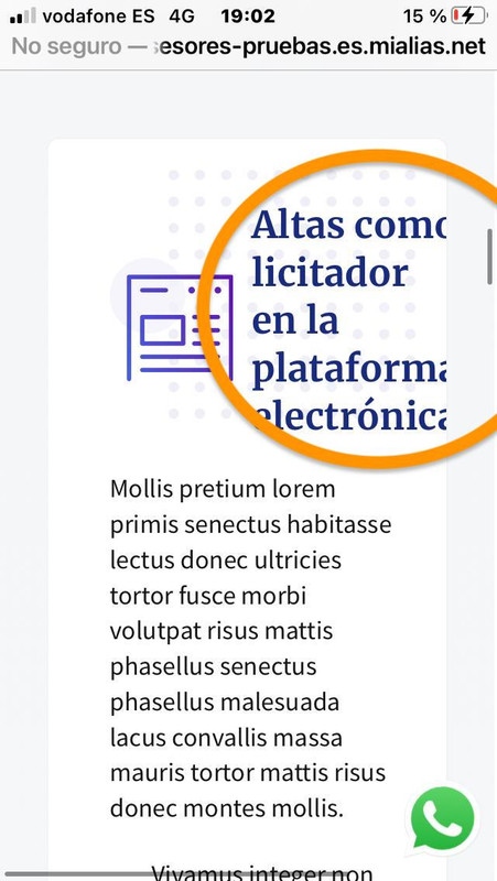
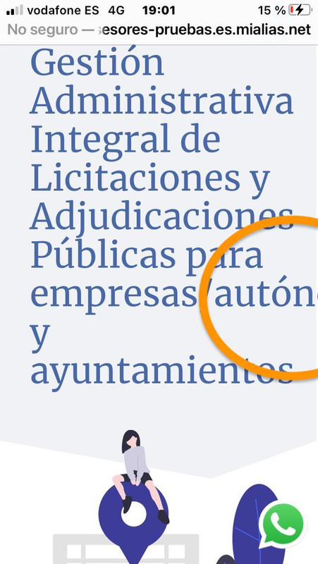
2) Other elements like titles or headings in content blocks cut off in the screen:
https://i.postimg.cc/Fz8z3FTJ/Whats-App-Image-2021-07-26-at-20-03-32.jpg
https://i.postimg.cc/qR7vF6Y3/Whats-App-Image-2021-07-26-at-20-03-33-1.jpg
THANK YOU
Hi Elena,
For 1, go to customizer > typography > Header, you can change the font size for mobile by clicking on the mobile icon:
https://www.screencast.com/t/OrDNnAnE2YPt
For 2, just checked the Search template, don't see the same issue.
https://www.screencast.com/t/zOMNATdlDIx
https://www.screencast.com/t/NKhSimTw6
I'll have to see your site to define what the cause is.
You can use the private information field.
https://docs.generatepress.com/article/using-the-premium-support-forum/#private-information
Let me know :)
And here's a walkthrough video of Search template, hope it's helpful to you:
https://youtu.be/QIN0EaPllO4
Thank you Ying for issues on 2) I am adding the login details in the private information below.
THANK U
For issue 2, it seems just the word is too long and the default setting is not to break the word.
You can try this CSS:
.gb-headline {
    word-break: break-all;
}
oR this CSS,
.gb-headline {
    word-break: break-word;
}
To see which one is working better for you :)
Adding CSS: https://docs.generatepress.com/article/adding-css/