
Archived topic
GeneratePress - Checkout with Klarna - Layout Issues
5 replies · Started by Tommie on May 18, 2019
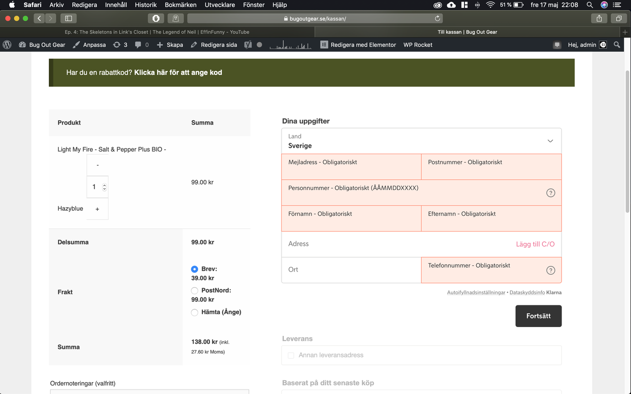
Beneath the product name in the checkout you can add or subtract the number of items (+ or -) but they're not next to each other.
Same when you choose the freight alternative, to narrow so they have to jump to the next line.
I tried to manually edit the width of the column and the width of the whole container but with no result.
Someone else having this issue?
Hi there,
Try adding this CSS:
.product-name .quantity {
    display: flex;
}
Let me know :)
Hi Tom!
Thanks you quick answer. The Diplsay Flex works great for the (+ and -) buttons.
The only thing left now is the width of grey area which says:
Delsumma
Frakt
Summa
It makes the other DIV too narrow.
Hi there,
try this CSS:
.woocommerce table.shop_table tfoot th {
    width: 50% !important;
}
It will however cause all the table columns to have the same width.
It looks much better on desktop now, thank you. Not much different on mobile though, there's so little space.
I will mark this as resolved since I'm almost where I want to be. If you have come up with something else, please write to me.
Kind regards
Tommie
Glad to hear that.
Not easy to fix the mobile layout. Fixing one column width effects all of them so can't really reduce the table heading width for just the shipping. You may want to speak with the plugin author.