
Archived topic
Elment block sidebar creates problem on tablet and mobile
5 replies · Started by Alessandro on September 2, 2021
Hello,
i'm trying to use one block element for the right sidebar, but when i switch to tablet and mobile version, the menu is bigger than the content of the page.
A lot of space appears after the right sidebar, any suggestions please? If i switch off the block element sidebar all works fine...
Thank you very much!
Hi there,
could you provide a screenshot of the issue, so i can make sure i am looking at the right thing ?
Hi David,
thank you for your reply!
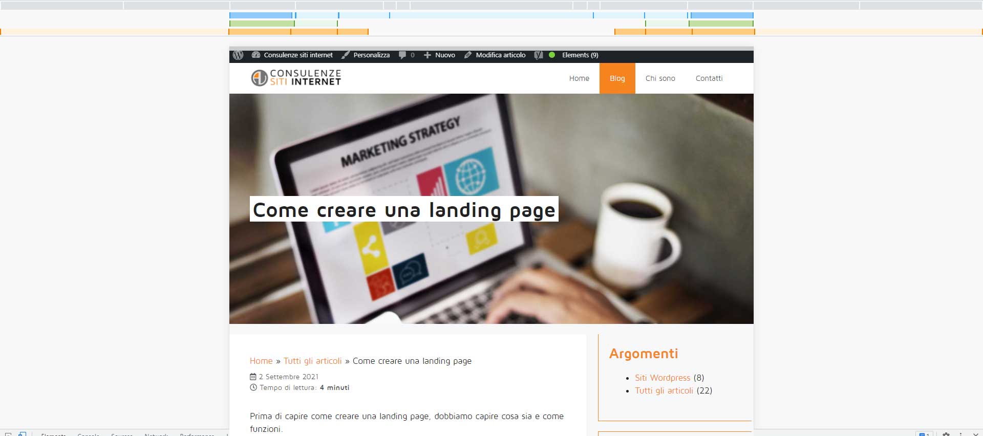
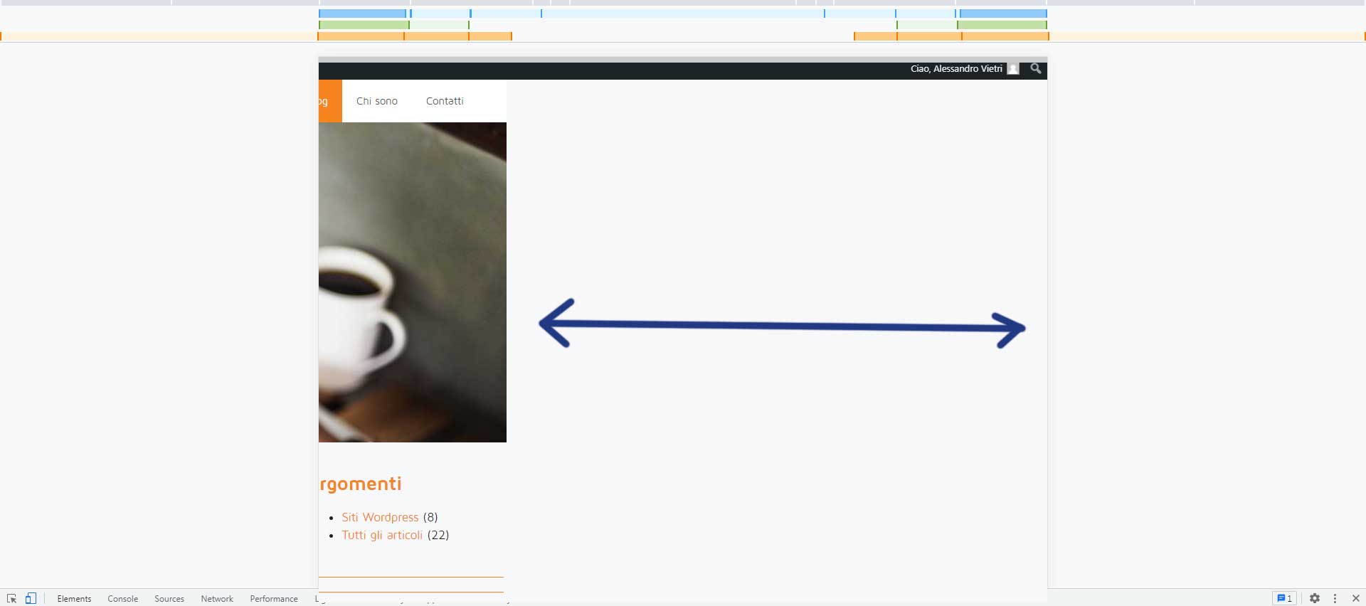
Yes of course...forget the menu issue please, try just to drag the page to the right direction. The effects is like the one in screen1 and screen2.
screen1
screen2
Hi there,
It's the search block in right side bar causing the issue.
It has an element that is wider than the right sidebar, give this CSS a try:
.inside-right-sidebar label.wp-block-search__label.screen-reader-text {
    width: 1px;
}
Let me know if this helps :)
Thank you Ying,
yes it works perfectly!!!! Thank you very much!
You are welcome :)