
Archived topic
container too large on mobile device
16 replies · Started by Janet on July 23, 2019
Hi, I just made my site live and it is not displaying the way it did previously. Something weird is happening with the container size on iPad. The menu and images are way too large.
The site looks fine when I view it in the subdomain, but since the name domain was redirected it looks wrong.
thanks
Hi there,
Is there a specific page I can see the issue?
The page you linked is an error 404 page.
Let me know :)
Sorry, I tried changing the url in WordPress at one point. The home page should be there now.
Not seeing any issues on the home page.
Am I missing something here?
https://www.screencast.com/t/W5YpDAbuNfd
Yes, please look at the larger view - desktop and iPad size. I sent you two urls (the one with a sub domain is the correct version)
Are you saying that the background image doesn't show on mobile?
If so background images aren't responsive by default unfortunately (not a theme thing).
We could try applying a mobile-specific background image for that hero if you want?
Let me know :)
No, what is happening is the navigation is dropping down below the logo, making the header too large and the container content seems to have less padding than the other version so everything is larger. Is there a way I can show you screen shots?
You can upload screenshots using a service like this and post the direct links here:
https://postimages.org/
https://i.postimg.cc/vZbRfbgF/7365-AAD6-B2-B2-4034-BC00-C034635-A56-E5.png
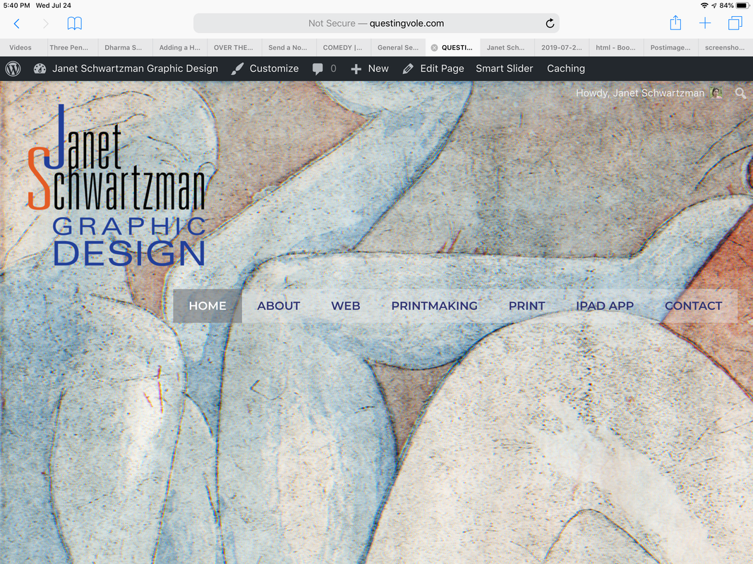
I was only able to upload the image of the home page on my iPad which displays incorrectly (the image is cut off and the navigation has dropped down instead of floating right). When I try to upload the version of the site which displays correctly, it says the image is too large.
Here is the way it should look (I adjusted the image in photoshop to make it small enough to upload).
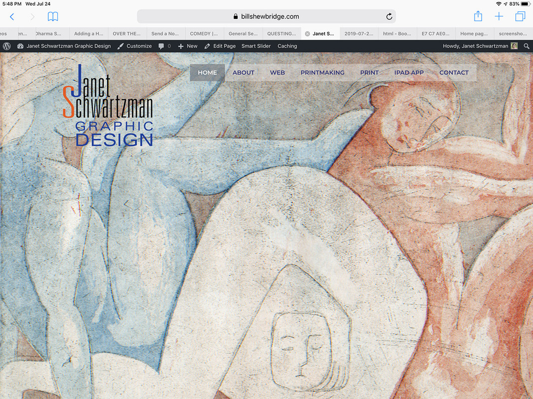
That happens because there simply isn't enough space for the logo and navigation menu to share one row.
What if you try increasing the container width?
You can also consider using this option:
https://docs.generatepress.com/article/navigation-drop-point
But why would it display differently? It is the same website, just pointed to with a different url.
Maybe I'm still a bit confused.
I'm looking at both pages side by side and they look identical to me?
The left is the subdomain and the right is the main site:
https://www.screencast.com/t/nfPg3fwCA
What am I missing?
https://i.postimg.cc/YC7CD5VM/IMG-0016.jpg
This is the sub domain address. It shows the full image and the menu is floating right.
Sorry weren't we talking about mobile (the topic title)?
Both sites are identical to me on desktop as well:
https://www.screencast.com/t/tsAFXTiBsILf
https://www.screencast.com/t/5vRw7nu55